Unraveling the Harmonic Tapestry of Mathematics
The Symphony of Equations
Mathematics
Physics
R Programming
A visual symphony that speaks to the intricate relationship between mathematics and the natural world.
Echoes of Harmony
In the realm where science and art intersect, there exists a gadget that captures the imagination and stirs the soul—a device known as the harmonograph. Imagine a scene reminiscent of a Victorian parlour, where guests gather around an intriguing apparatus, eagerly awaiting the unveiling of its mysterious creations.
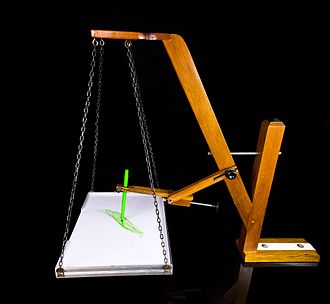
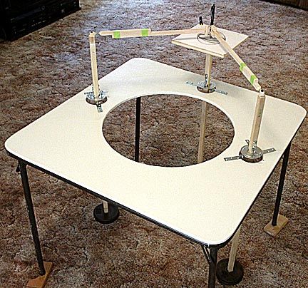
The harmonograph, born in the 19th century, is a mechanical marvel designed to produce intricate and mesmerising drawings through the harmonious movement of pendulums. Picture two pendulums swinging in perfect synchronisation, their motions orchestrated to create harmonious patterns on paper below. It’s as if the very essence of music is translated into visual form, each stroke a note in a silent symphony.
The Enchanting World of the Harmonograph
Let us delve deeper into the story behind this enchanting invention. Legend has it that the harmonograph’s origins can be traced back to the curious minds of mathematicians and artists alike, seeking to explore the connections between mathematics, physics, and aesthetics. Among them stands the figure of Scottish mathematician Hugh Blackburn, credited with popularizing the device in the mid-19th century.
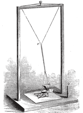
As the tale goes, Blackburn’s harmonograph captured the imagination of the public, becoming a centrepiece of Victorian parlours and scientific salons. Guests would marvel at the intricate patterns produced by the swinging pendulums, each creation a unique expression of mathematical harmony.
But what exactly makes the harmonograph tick?
At its core are the principles of harmonic motion and resonance, concepts deeply rooted in the laws of physics. By harnessing the natural oscillations of pendulums, the harmonograph transforms motion into art, unveiling the hidden beauty of mathematical patterns.
Imagine the scene, a dimly lit room, the air heavy with anticipation as the harmonograph comes to life. With each swing of the pendulum, delicate lines emerge on the paper below, forming elaborate spirals, loops, and curves. It’s a dance of precision and grace, where the laws of nature meet the creative impulses of the human spirit. But the story of the harmonograph does not end in the past. Even today, this captivating device continues to inspire artists, scientists, and enthusiasts around the world. In an age dominated by digital technologies, the harmonograph reminds us of the timeless allure of analogue craftsmanship and the beauty of simplicity. As we bid farewell to our journey through the world of the harmonograph, let us carry with us the memory of its mesmerizing creations—a testament to the enduring marriage of art and science, where imagination knows no bounds.
From Pendulum Swings to Digital Brushstrokes
Here, we present a series of computer-simulated images inspired by the harmonograph’s elegant movements. Each image is a testament to the power of technology to capture the essence of natural phenomena and to explore the boundless possibilities of artistic expression.
Code
f1=jitter(sample(c(2,3),1))
f2=jitter(sample(c(2,3),1))
f3=jitter(sample(c(2,3),1))
f4=jitter(sample(c(2,3),1))
d1=runif(1,0,1e-02)
d2=runif(1,0,1e-02)
d3=runif(1,0,1e-02)
d4=runif(1,0,1e-02)
p1=runif(1,0,pi)
p2=runif(1,0,pi)
p3=runif(1,0,pi)
p4=runif(1,0,pi)
xt = function(t) exp(-d1*t)*sin(t*f1+p1)+exp(-d2*t)*sin(t*f2+p2)
yt = function(t) exp(-d3*t)*sin(t*f3+p3)+exp(-d4*t)*sin(t*f4+p4)
t=seq(1, 100, by=.001)
dat=data.frame(t=t, x=xt(t), y=yt(t))
with(dat, plot(x,y,
               type="l",
               xlim =c(-2,2),
               ylim =c(-2,2),
               xlab = "",
               ylab = "",
               xaxt='n',
               yaxt='n'))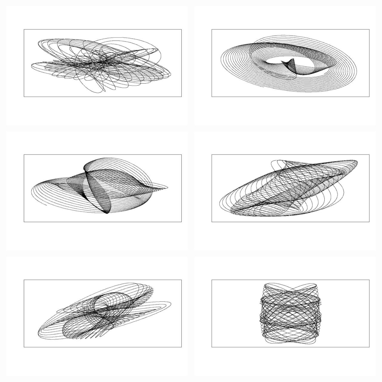
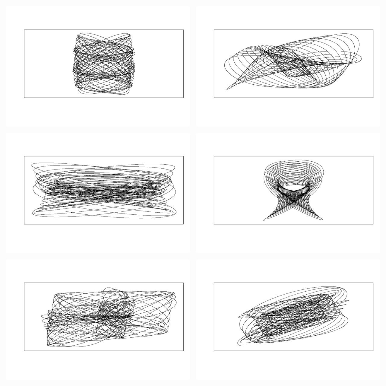
As we behold these digital creations, we are drawn into a world where the boundaries between art and science blur, where the precision of mathematical algorithms intertwines with the boundless creativity of human imagination. In these simulated images, we witness the culmination of centuries of exploration, where the harmonograph’s timeless allure finds new expression in the realm of pixels and code.
Code
library(rgl)
library(scatterplot3d)
#Extending the harmonograph into 3d
#Antonio's functions creating the oscillations
xt = function(t) exp(-d1*t)*sin(t*f1+p1)+exp(-d2*t)*sin(t*f2+p2)
yt = function(t) exp(-d3*t)*sin(t*f3+p3)+exp(-d4*t)*sin(t*f4+p4)
#Plus one more
zt = function(t) exp(-d5*t)*sin(t*f5+p5)+exp(-d6*t)*sin(t*f6+p6)
#Sequence to plot over
t=seq(1, 100, by=.001)
#generate some random inputs
f1=jitter(sample(c(2,3),1))
f2=jitter(sample(c(2,3),1))
f3=jitter(sample(c(2,3),1))
f4=jitter(sample(c(2,3),1))
f5=jitter(sample(c(2,3),1))
f6=jitter(sample(c(2,3),1))
d1=runif(1,0,1e-02)
d2=runif(1,0,1e-02)
d3=runif(1,0,1e-02)
d4=runif(1,0,1e-02)
d5=runif(1,0,1e-02)
d6=runif(1,0,1e-02)
p1=runif(1,0,pi)
p2=runif(1,0,pi)
p3=runif(1,0,pi)
p4=runif(1,0,pi)
p5=runif(1,0,pi)
p6=runif(1,0,pi)
#and turn them into oscillations
x = xt(t)
y = yt(t)
z = zt(t)
#create values for colours normalised and related to x,y,z coordinates
cr = abs(z)/max(abs(z))
cg = abs(x)/max(abs(x))
cb = abs(y)/max(abs(y))
dat=data.frame(t, x, y, z, cr, cg ,cb)
#plot the black and white version
with(dat, scatterplot3d(x,y,z, pch=16,cex.symbols=0.25, axis=FALSE ))
with(dat, scatterplot3d(x,y,z, pch=16, color=rgb(cr,cg,cb),cex.symbols=0.25, axis=FALSE ))
#Set the stage for 3d plots
# clear scene:
clear3d("all")
# white background
bg3d(color="white")
#lights...camera...
light3d()
#action
# draw shperes in an rgl window
#spheres3d(x, y, z, radius=0.025, color=rgb(cr,cg,cb))
#create animated gif (call to ImageMagic is automatic)
#movie3d( spin3d(axis=c(0,0,1),rpm=5),fps=12, duration=12 )
#2d plots to give plan and elevation shots
plot(x,y,col=rgb(cr,cg,cb),cex=.05)
plot(y,z,col=rgb(cr,cg,cb),cex=.05)
plot(x,z,col=rgb(cr,cg,cb),cex=.05)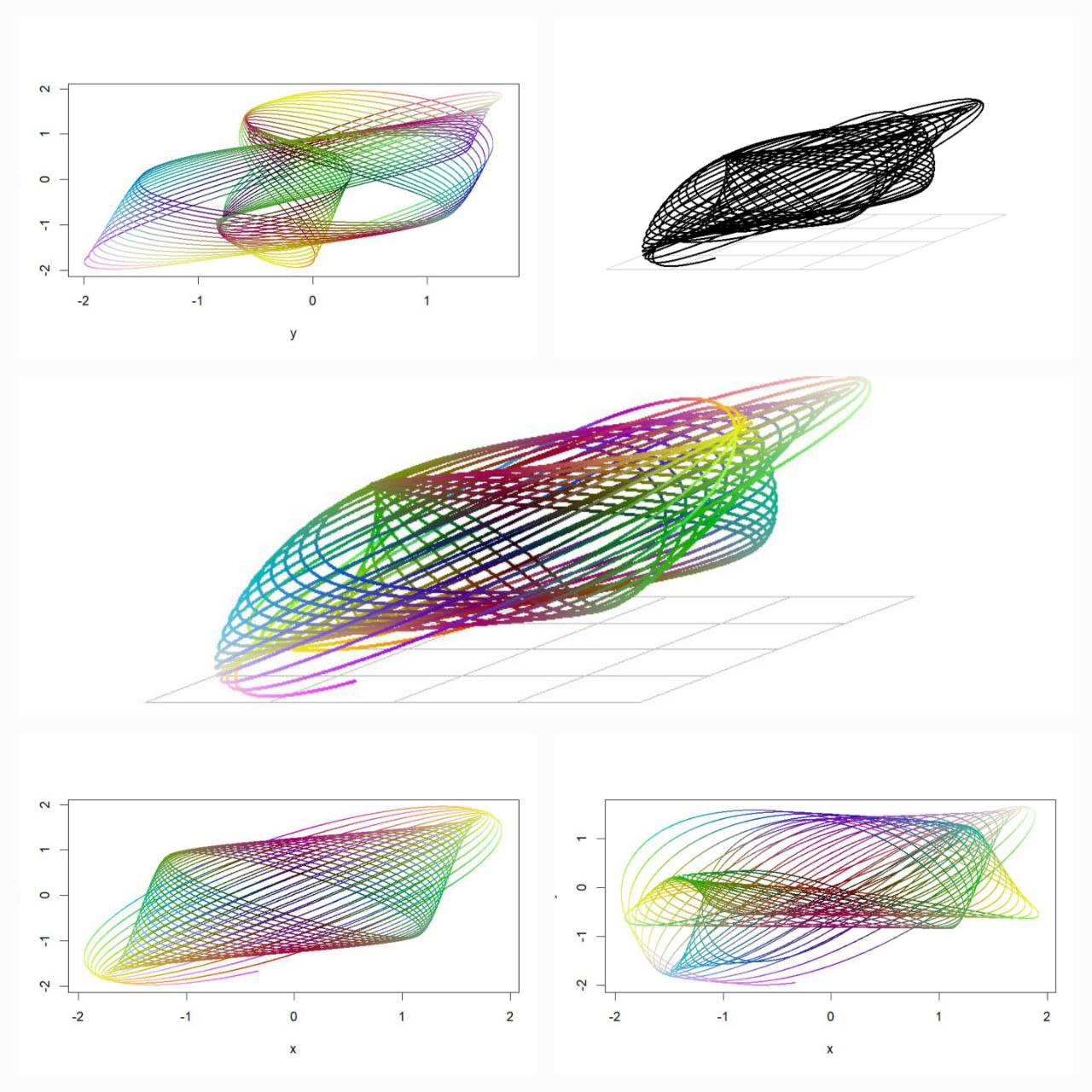
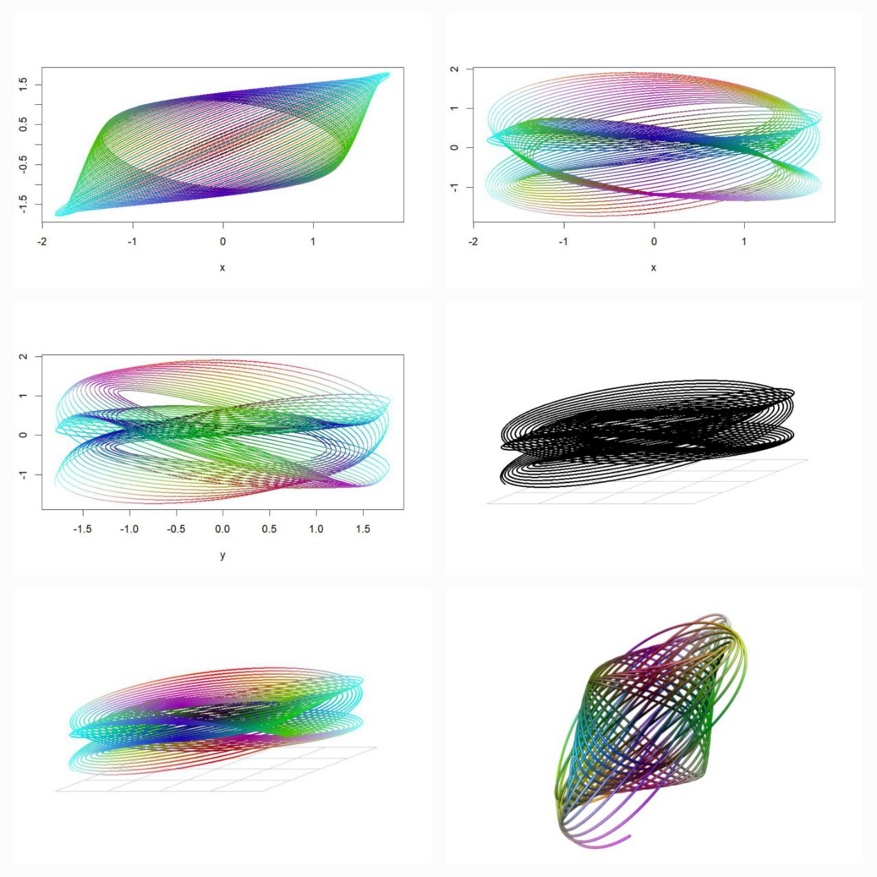
Each stroke, each curve, is a testament to the harmonious interplay between mathematics and aesthetics—a delicate dance of form and function that transcends the limitations of time and space. In these intricate patterns, we find echoes of the harmonograph’s elegant movements, reminding us of the beauty that lies at the intersection of calculation and creativity.
Code
install.packages(c("devtools", "mapproj", "tidyverse", "ggforce", "Rcpp"))
devtools::install_github("marcusvolz/mathart")
library(devtools)
library(mathart)
library(ggforce)
library(Rcpp)
library(tidyverse)
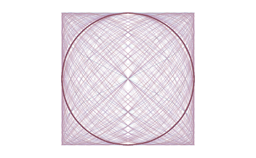
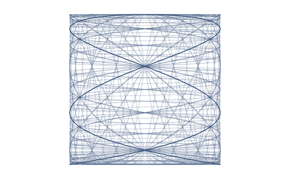
df1 <- harmonograph(A1 = 1, A2 = 1, A3 = 1, A4 = 1,
d1 = 0.004, d2 = 0.0065, d3 = 0.008, d4 = 0.019,
f1 = 3.001, f2 = 2, f3 = 3, f4 = 2,
p1 = 0, p2 = 0, p3 = pi/2, p4 = 3*pi/2) %>% mutate(id = 1)
df2 <- harmonograph(A1 = 1, A2 = 1, A3 = 1, A4 = 1,
d1 = 0.0085, d2 = 0, d3 = 0.065, d4 = 0,
f1 = 2.01, f2 = 3, f3 = 3, f4 = 2,
p1 = 0, p2 = 7*pi/16, p3 = 0, p4 = 0) %>% mutate(id = 2)
df3 <- harmonograph(A1 = 1, A2 = 1, A3 = 1, A4 = 1,
d1 = 0.039, d2 = 0.006, d3 = 0, d4 = 0.0045,
f1 = 10, f2 = 3, f3 = 1, f4 = 2,
p1 = 0, p2 = 0, p3 = pi/2, p4 = 0) %>% mutate(id = 3)
df4 <- harmonograph(A1 = 1, A2 = 1, A3 = 1, A4 = 1,
d1 = 0.02, d2 = 0.0315, d3 = 0.02, d4 = 0.02,
f1 = 2, f2 = 6, f3 = 1.002, f4 = 3,
p1 = pi/16, p2 = 3*pi/2, p3 = 13*pi/16, p4 = pi) %>% mutate(id = 4)
df <- rbind(df1, df2, df3, df4)
p <- ggplot() +
geom_path(aes(x, y), df, alpha = 0.25, size = 0.5) +
coord_equal() +
facet_wrap(~id, nrow = 2) +
theme_blankcanvas(margin_cm = 0)
ggsave("harmonograph01.png", p, width = 20, height = 20, units = "cm")
From Pendulums to Patterns
Lissajous curves are fascinating mathematical patterns that emerge from the interaction of two oscillating systems, typically represented graphically. They’re named after Jules Antoine Lissajous, a French physicist who studied them in the 19th century.
Basic Formalism
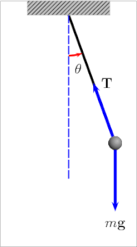
Lissajous curves are the shapes traced out by sinusoidal motion in two dimensions. They are characterised by the equations:
\[ x = A \sin(f_xt - \delta_x) \]
\[ y = B \cos (f_yt - \delta_y) \]
where \(A\) and \(B\) are amplitudes, \(f_x\) and \(f_y\) are frequencies of the motion and \(\delta_x\) and \(\delta_y\) the phase shift.
Mathematical Harmony in Motion
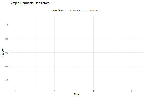
Imagine two simple harmonic oscillators—think of them like pendulums or vibrating strings—moving at right angles to each other. When you plot the positions of these oscillators against each other on a graph (with one oscillator’s position represented on the x-axis and the other on the y-axis), you get these intricate, looping curves.
Code
library(ggplot2)
library(gganimate)
# Function to calculate position of simple harmonic oscillator
sho_position <- function(t, A, omega, phi) {
return(A * sin(omega * t + phi))
}
# Parameters
t <- seq(0, 2*pi, length.out = 100)
A1 <- 1 # Amplitude of oscillator 1
A2 <- 0.5 # Amplitude of oscillator 2
omega1 <- 1 # Angular frequency of oscillator 1
omega2 <- 1.5 # Angular frequency of oscillator 2
phi1 <- 0 # Phase of oscillator 1
phi2 <- pi/2 # Phase of oscillator 2
# Data for oscillator 1
df1 <- data.frame(t = t, position = sho_position(t, A1, omega1, phi1), oscillator = "Oscillator 1")
# Data for oscillator 2
df2 <- data.frame(t = t, position = sho_position(t, A2, omega2, phi2), oscillator = "Oscillator 2")
# Combine data
df <- rbind(df1, df2)
# Create plot
p <- ggplot(df, aes(x = t, y = position, group = oscillator, color = oscillator)) +
geom_line(size = 1) +
ylim(-1.2, 1.2) +
labs(title = "Simple Harmonic Oscillators", x = "Time", y = "Position") +
theme_minimal() +
theme(legend.position = "top") +
transition_reveal(t)
# Animate plot
animate(p, nframes = 100, duration = 10, width = 600, height = 400)
#___________________________________________________________________________
library(gifski)
# Function to calculate position of simple harmonic oscillator
sho_position <- function(t, A, omega, phi) {
return(A * sin(omega * t + phi))
}
# Parameters
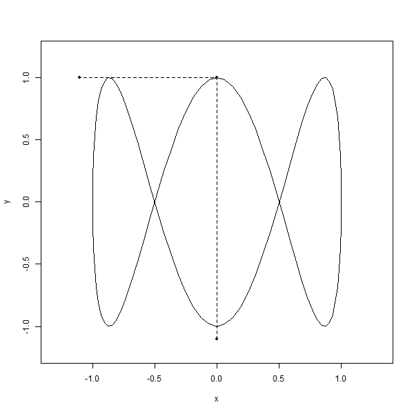
t <- seq(0, 2, by = 0.01)
A <- 1 # Amplitude
omega1 <- 2*pi # Angular frequency of x-axis oscillator
omega2 <- 6*pi # Angular frequency of y-axis oscillator
limits <- c(-1, 1)
save_gif(
lapply(seq(0, 2, length.out = 100), function(i) {
x <- sin(2 * pi * t)
y <- cos(6 * pi * t)
plot(x, y, type = "l", asp = 1, xlim = 1.2 * limits, ylim = 1.2 * limits)
lines(x = c(sin(2 * i * pi), sin(2 * i * pi), -1.1),
y = c(-1.1, cos(6 * pi * i), cos(6 * pi * i)), pch = 20, type = "o", lty = "dashed")
}),
delay = 1 / 10, width = 600, height = 600, gif_file = "sho_animation.gif"
)
It’s like watching two dancers on separate stages, each moving to their own beat. But here’s the kicker—they’re somehow connected, their movements perfectly synchronized, creating this mesmerizing pattern that’s like nothing you’ve ever seen before. It’s like nature’s way of showing off its mathematical chops, weaving these elegant, looping shapes that just make you stop and stare.
Code
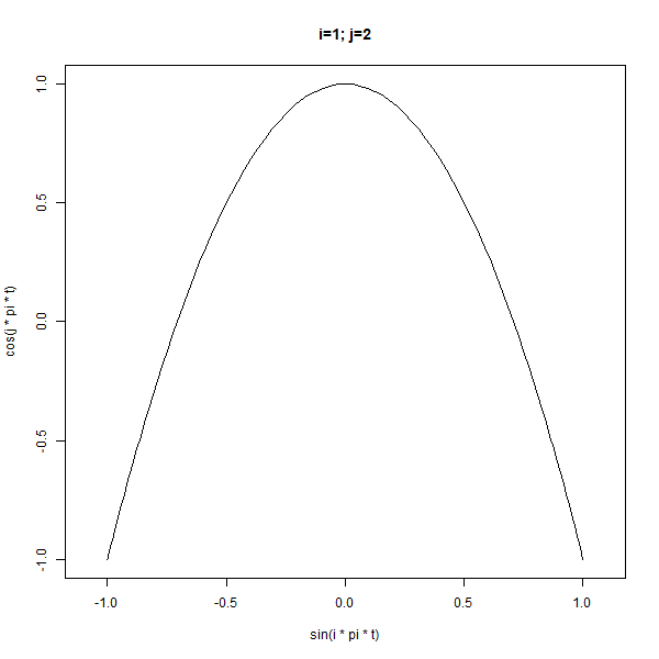
library(gifski)

# Parameters
t <- seq(0, 2, by = 0.01)
limits <- c(-1, 1)

save_gif(
  lapply(1:10, function(i) {
    lapply(2:5, function(j) {
      plot(x = sin(i * pi * t),
           y = cos(j * pi * t),
           type = "l", asp = 1, xlim = limits, ylim = limits,
           main = sprintf("i=%d; j=%d", i, j))
    })
  }),
  delay = 1/3, width = 600, height = 600, gif_file = "animation.gif"
)
And the craziest part i.e., You can find these curves popping up all over the place, from oscilloscopes to laser light shows, proving that even in the world of science, beauty has its own rhythm.
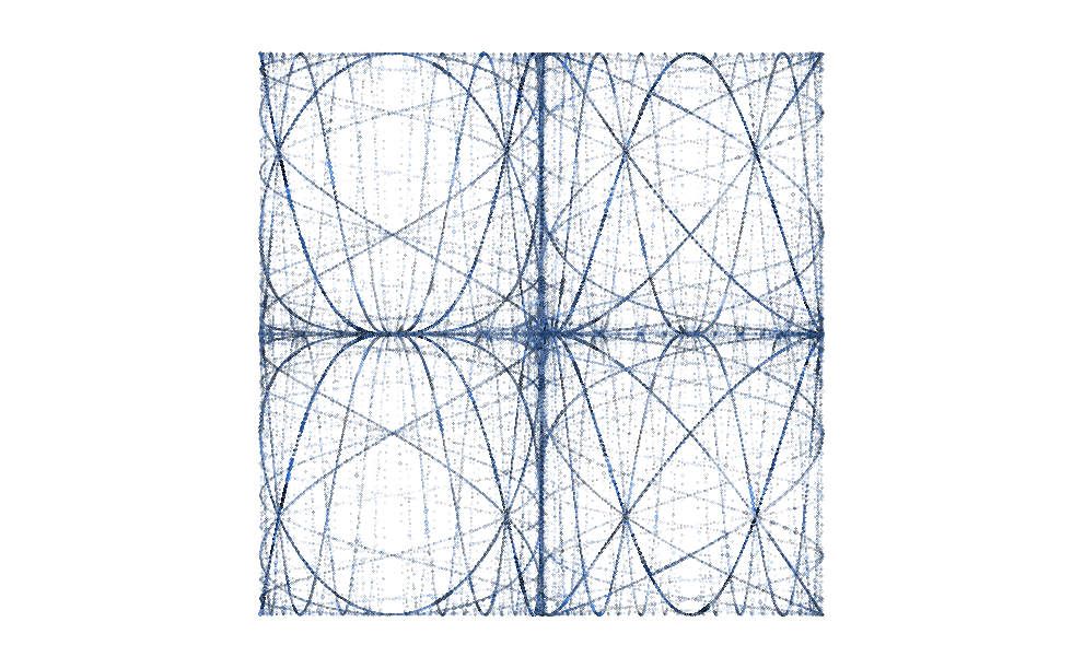
Lissajous curves offer a plethora of intriguing possibilities beyond their initial creation. One fascinating avenue is the exploration of overlaying multiple curves with different frequencies, leading to a captivating array of patterns and forms.
Code
plot(NA, xlim=limits,ylim=limits,asp=1)
for(i in 1:4) for(j in 2:5){
  points(x = sin(i*pi*t),y=cos(j*pi*t),type="l")
}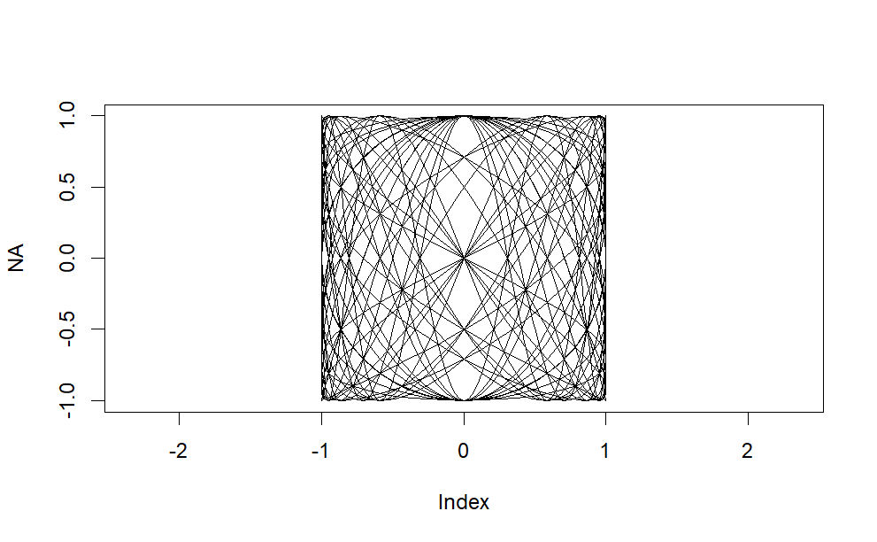
By manipulating the frequencies of the oscillators involved, we can observe how these curves evolve and intertwine, creating intricate compositions of oscillatory motion. Each curve adds its own unique contribution to the visual tapestry, resulting in a rich and dynamic display of mathematical harmony.
Furthermore, experimenting with variations in phase and amplitude adds another layer of complexity to these overlaid curves, offering endless opportunities for exploration and discovery. Whether it’s adjusting the phase relationship between oscillators to produce stunning symmetrical arrangements or modulating the amplitudes to create subtle shifts in intensity, the possibilities are as diverse as they are captivating.
Code
par(mar=c(1,1,1,1))
plot(NA, xlim=limits,ylim=limits,asp=1,axes=F,ann=F)
for(i in 1:10) for(j in -10:10){
  points(x = sin(i*pi*t),
         y = cos(j*pi*t),type="l",
         lwd=5/(abs(i-j)+2),
         col=hsv(h=.5+j/20,
         s=1/(abs(i-j)+2),
         v=1-1/(abs(i-j)+2),
         alpha=1/(abs(i-j)+2)))
}
Beyond their aesthetic appeal, the study of overlaid Lissajous curves holds practical significance in fields such as physics, engineering, and signal processing. Engineers utilize these curves to analyze the behavior of complex systems, while physicists explore their applications in understanding wave phenomena and harmonic motion.
We can make the frequencies increase as a geometric rather than an arithmetic sequence. Here the \(x\) frequency is fixed at \(5\) and the frequency varies from \(2 \times 2^{-4}\) to \(2 \times 2^{4}\). Again this output isn’t especially pretty but its the set of curves we ultimately use for the final output.
Code
t = seq(0,10,0.001)
par(mar=c(1,1,1,1))
limits=c(-1,1)
plot(NA, xlim=limits,ylim=limits,asp=1,axes=F,ann=F)
for(i in 5) for(a in (-4:4)){
  points(x = sin(i*pi*t),
         y = cos(2*2^a*pi*t),type="l",
         lwd=2,
         col=hsv(h=.6,
                 s=.5,v=.5,
                 alpha=1/(abs(a)+1)))
}
The other major innovation is to plot points of random sizes instead of lines, to create the textured effect in the final image. Something else interesting happens when we switch to points instead of lines; since each path has the same number of points the shorter paths become denser so they are more prominent in the image:
Code
t = seq(0,50,l=1e4)
par(mar=c(1,1,1,1))
limits=c(-1,1)
plot(NA, xlim=limits,ylim=limits,asp=1,axes=F,ann=F)
for(i in 5) for(a in (-4:4)){
  points(y = sin(i*pi*t)^3,
         x = cos(2*2^a*pi*t)^3,type="p",
         cex=.5*runif(1000),
         pch=20,
         col=hsv(h=.6,
                 s=runif(1000),v=runif(1000),
                 alpha=runif(1000)/(abs(a)+1)))
}
Tweaking some parameters can improve the balance between the curves, and lead us to something we are happy with.The complete self-contained code for the final image is shown below. We have tweaked the point sizes a bit so they depend on which curve is being drawn, and used a normal distribution for the point sizes to get a longer tail of larger points.The point hue is random, there is an off-white background and the number of points per curve is \(30000\). The frequency is always \(5\) in the \(y\) dimension, but varies from \(2\times 3^{-4}\) to \(2\times 3^{4}\) in the \(x\) dimension.
Code
set.seed(10072022)
N=3e4
t = seq(0,300,l=N)
par(mar=2*c(1,1,1,1),bg="#fafafa")
limits = c(-1,1)

plot(NA, xlim=limits,ylim=limits,ax=F,an=F)
for(j in 2*3^(seq(-4,4,1))){
  points(y = sin(5*pi*t)^3,
         x = cos(j*pi*t)^3,
         type="p",
         pch=20,
         cex=rnorm(N)^1.0*.4*cos(t*pi/4+pi/3)+.05*(j==6)+.1*(j==2), # Random size
         col=hsv(h=rnorm(N,.7,.1)%%1, # Random hue
                 s=runif(N,0,1),      # Random saturation
                 v=runif(N,0,1),      # Random value
                 alpha=runif(N)))}    # Random alpha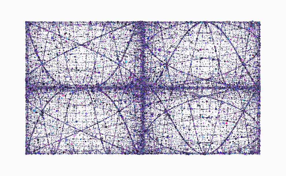
The image presents a pleasing composition. The left and right panels exhibit a harmonious contrast, as do the two primary paths within each. The near-symmetry observed within each panel seems coincidental, yet it adds considerable depth to the overall presentation. The incorporation of cubic elements into the Lissajous curves imparts a sense of familiarity without sacrificing visual interest. Indeed, purely sinusoidal shapes can sometimes lack dynamism. The points where the paths intersect are particularly gratifying, lending an organic feel to the density and distribution of points. Altering the random number seed could yield varied arrangements of sizes and colors. However, the excessively dense cluster of points at the image’s center gives pause for concern. While attempting to artificially lighten this area is an option, it may not yield significant improvement. Additionally, there is a question regarding whether the overall uniformity of color and density might benefit from some variation. Yet, devising a method to achieve this improvement eludes easy formulation.
A Visual Feast
Lissajous curves unveils a world of mathematical beauty and scientific inquiry, inviting us to delve deeper into the intricate relationships between oscillatory systems. Whether as a tool for analysis, a source of artistic inspiration, or simply a captivating visual spectacle, the exploration of overlaid Lissajous curves promises endless fascination and discovery.
Code
set.seed(2)
df <- lissajous(a = runif(1, 0, 2), b = runif(1, 0, 2), A = runif(1, 0, 2), B = runif(1, 0, 2), d = 200) %>%
  sample_n(1001) %>%
  k_nearest_neighbour_graph(40)

p <- ggplot() +
  geom_segment(aes(x, y, xend = xend, yend = yend), df, size = 0.03) +
  coord_equal() +
  theme_blankcanvas(margin_cm = 0)

ggsave("knn_lissajous_002.png", p, width = 25, height = 25, units = "cm")
In physics and engineering, they’re used to analyze and visualize the relationships between oscillating systems, such as in electrical circuits or mechanical vibrations. In art and design, they’re admired for their aesthetic beauty and have inspired creations ranging from visual art to music visualizers. Lissajous curves are a captivating example of how mathematical principles manifest in the natural world, offering both practical insights and aesthetic inspiration.
Conclusion
In the end, the harmonograph invites us to embrace the wonders of the universe, to explore the mysteries of motion and form, and to celebrate the beauty that surrounds us in every moment. So, the next time you find yourself captivated by the dance of a pendulum or the elegance of a mathematical equation, remember the harmonograph and the enchanting tale it tells—a story of harmony, resonance, and the boundless creativity of the human spirit.
Further Readings
References
Turner, Steven (February 1997). “Demonstrating Harmony: Some of the Many Devices Used To Produce Lissajous Curves Before the Oscilloscope”. Rittenhouse. 11 (42): 41.
Baker, Gregory L.; Blackburn, James A. (2005). The Pendulum: a case study in physics. Oxford. ISBN 978-0-19-156530-4.
“Lissajou Curves”. datagenetics.com. Retrieved 2020-07-10.
“The ABC’s of Lissajous figures”. abc.net.au. Australian Broadcasting Corporation.
External Links
Interactive Lissajous curve generator – Javascript applet using JSXGraph
Wolfram Mathematica - Lissajous figures with interactive sliders in Wolfram mathematica