Code
library(ggplot2)
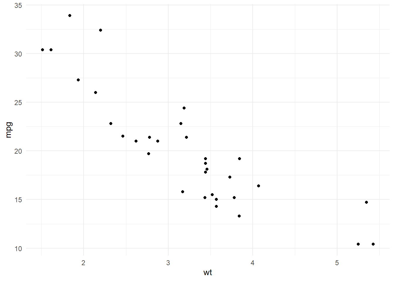
ggplot(mtcars, aes(x = wt, y = mpg)) +
  geom_point() +
  theme_minimal()
Tools, Tips, and Examples
Abhirup Moitra
November 14, 2024
Data visualization is a powerful tool that transforms complex data into clear, compelling visuals, making it easier to discover insights and tell stories. In R, a rich ecosystem of packages enables users to create everything from simple plots to dynamic, interactive graphics. This guide explores the essential tools, techniques, and tips in R for crafting impactful visualizations, offering practical examples that bring your data to life.
Understanding Data: Visualization helps uncover patterns, trends, and outliers in data, which might not be apparent from raw data alone.
Storytelling: Effective visualizations communicate insights and tell a story, making data more accessible and easier to interpret.
Decision Making: Well-crafted charts and plots aid in making informed decisions by simplifying complex data relationships.
Clarity: The purpose of the visualization should be clear, and the audience should easily understand the data being presented.
Simplicity: Avoid clutter and unnecessary elements. Stick to the essentials that best communicate your message.
Accuracy: Ensure that the visual representation of data accurately reflects the underlying dataset.
Consistency: Use consistent colors, scales, and labels throughout the visualizations to avoid confusion.
Interactivity: When appropriate, interactive visualizations can allow users to explore data dynamically, offering deeper insights.
In R, data visualization is one of the core strengths, and there are numerous powerful packages and tools that make it easy to create both static and interactive graphics. Here’s a list of some of the most widely used tools and libraries for data visualization in R:
ggplot2: A versatile and widely-used library for creating static, high-quality graphics based on the “Grammar of Graphics” approach. It allows for easy creation of complex plots and can be extended with custom themes, scales, and other visual elements.
plotly: A library for creating interactive plots that can be embedded in web applications or reports. It integrates seamlessly with ggplot2, allowing users to convert static ggplot graphics into interactive ones.
Example:
Attaching package: 'plotly'The following object is masked from 'package:ggplot2':
last_plotThe following object is masked from 'package:stats':
filterThe following object is masked from 'package:graphics':
layoutlattice: A package for creating multi-panel plots, useful for conditioning (visualizing relationships across multiple variables) and exploring large datasets.
Example:
highcharter: A wrapper around the Highcharts JavaScript library that allows users to create a wide range of interactive visualizations, including bar charts, line graphs, and maps.
Example:
leaflet: A library for creating interactive maps, suitable for geographic data visualizations. It’s commonly used to display data with a spatial component, such as location-based information.
Example:
shiny: An R package for building interactive web applications, allowing users to interact with data dynamically. Shiny apps can include data visualizations made with ggplot2, plotly, or other libraries, and allow for real-time filtering and exploration.
Example:
corrplot: A specialized package for visualizing correlation matrices, making it easy to explore the relationships between variables.
Example:
cowplot and patchwork:
Purpose: For arranging multiple ggplot2 plots into complex layouts.
Features: cowplot and patchwork make it easy to combine multiple ggplot2 plots, creating multi-panel layouts without additional packages.
Common Uses: Multi-panel figures, scientific publications, and custom dashboards.
Example:
RColorBrewer and viridis
Purpose: For creating beautiful color palettes for visualizations.
Features: Both packages provide palettes that are visually appealing and colorblind-friendly. RColorBrewer offers discrete palettes, while viridis provides continuous color scales.
Common Uses: Heatmaps, choropleth maps, and any plot requiring distinct color schemes.
Example
gridExtra
Purpose: For arranging multiple plots on a grid.
Features: Works well for arranging ggplot2 plots into custom layouts. Useful for creating complex dashboards.
Common Uses: Multi-panel visualizations.
Example:
Scatter Plots: Used to show relationships between two continuous variables. They are ideal for detecting trends, correlations, and outliers.
Bar Charts: Useful for comparing categorical data. Can display the frequency or proportion of different categories.
cyl).Histograms: Used for visualizing the distribution of a single continuous variable. They are helpful for understanding the shape of the data, such as skewness or kurtosis.
Box Plots: Provide a visual summary of the distribution of a continuous variable, highlighting the median, quartiles, and potential outliers.
Line Charts: Great for visualizing trends over time or continuous data points.
Heatmaps: Visualize data in matrix form where color represents values. Heatmaps are great for displaying correlation matrices or other grouped data.
Geospatial Maps: Used for visualizing data with geographical components, such as locations, regions, or latitudes/longitudes.
leaflet to create a map that shows the locations of car dealerships or sales.R offers extensive customization options to improve the appearance and clarity of your visualizations:
Themes: Change the overall look and feel of the plot using themes like theme_minimal(), theme_bw(), or theme_light() in ggplot2.
Colors: Use color palettes from libraries like RColorBrewer or viridis to choose color schemes that are visually appealing and accessible.
Annotations: Add titles, axis labels, legends, and textual annotations to provide context for the viewer.
Facets: Create subplots or panels for different categories (e.g., splitting the plot by cyl to visualize different numbers of cylinders in mtcars).
Hover Effects: In plotly, ggplot2, and leaflet, you can enable hover effects to display detailed information when a user moves the mouse over data points.
Dynamic Filtering: With shiny or plotly, you can create interactive widgets (e.g., sliders, dropdowns) that allow users to filter and explore subsets of data in real-time.
Zooming and Panning: Enable users to zoom in and out of areas of interest in the plot, providing an interactive way to explore the data in greater detail.
Static Visualizations: Can be exported to image formats (e.g., PNG, JPEG) using the ggsave() function in ggplot2, or saved as PDFs.
Interactive Visualizations: Can be embedded in web pages, R Markdown reports, or Shiny apps. plotly visualizations can be saved as HTML files for sharing or further interaction.
R provides a rich set of tools for data visualization, making it possible to create static, dynamic, and interactive visualizations tailored to different analysis needs. Whether you’re analyzing trends, exploring relationships, or building interactive dashboards, these tools—like ggplot2, plotly, lattice, and shiny—can help you create meaningful and insightful data visualizations. Always focus on the clarity, simplicity, and interactivity of your visualizations to enhance the understanding and presentation of your data.

---
title: "Unlocking the Power of R for Data Visualization"
subtitle: "Tools, Tips, and Examples"
author: "Abhirup Moitra"
date: 2024-11-14
format:
html:
code-fold: true
code-tools: true
editor: visual
categories : [R Programming]
image: R-gg.png
---
Data visualization is a powerful tool that transforms complex data into clear, compelling visuals, making it easier to discover insights and tell stories. In R, a rich ecosystem of packages enables users to create everything from simple plots to dynamic, interactive graphics. This guide explores the essential tools, techniques, and tips in R for crafting impactful visualizations, offering practical examples that bring your data to life.
### **1. Importance of Data Visualization**
- **Understanding Data**: Visualization helps uncover patterns, trends, and outliers in data, which might not be apparent from raw data alone.
- **Storytelling**: Effective visualizations communicate insights and tell a story, making data more accessible and easier to interpret.
- **Decision Making**: Well-crafted charts and plots aid in making informed decisions by simplifying complex data relationships.
### **2. Key Principles of Good Data Visualization**
- **Clarity**: The purpose of the visualization should be clear, and the audience should easily understand the data being presented.
- **Simplicity**: Avoid clutter and unnecessary elements. Stick to the essentials that best communicate your message.
- **Accuracy**: Ensure that the visual representation of data accurately reflects the underlying dataset.
- **Consistency**: Use consistent colors, scales, and labels throughout the visualizations to avoid confusion.
- **Interactivity**: When appropriate, interactive visualizations can allow users to explore data dynamically, offering deeper insights.
In R, data visualization is one of the core strengths, and there are numerous powerful packages and tools that make it easy to create both static and interactive graphics. Here’s a list of some of the most widely used tools and libraries for data visualization in R:
### **3. Core R Libraries for Data Visualization**
- **`ggplot2`**: A versatile and widely-used library for creating static, high-quality graphics based on the "Grammar of Graphics" approach. It allows for easy creation of complex plots and can be extended with custom themes, scales, and other visual elements.
- **Example**:
```{r}
library(ggplot2)
ggplot(mtcars, aes(x = wt, y = mpg)) +
geom_point() +
theme_minimal()
```
- **`plotly`**: A library for creating interactive plots that can be embedded in web applications or reports. It integrates seamlessly with `ggplot2`, allowing users to convert static `ggplot` graphics into interactive ones.
- **Example**:
```{r,warning=FALSE}
library(plotly)
plot_ly(data = mtcars,
        x = ~wt,
        y = ~mpg,
        type = 'scatter', mode = 'markers')
```
- **`lattice`**: A package for creating multi-panel plots, useful for conditioning (visualizing relationships across multiple variables) and exploring large datasets.
- **Example**:
```{r,warning=FALSE}
library(lattice)
xyplot(mpg ~ wt | cyl, data = mtcars)
```
- **`highcharter`**: A wrapper around the Highcharts JavaScript library that allows users to create a wide range of interactive visualizations, including bar charts, line graphs, and maps.
- **Example**:
```{r,warning=FALSE,message=FALSE}
library(highcharter)
hchart(mtcars, "scatter", hcaes(x = wt, y = mpg))
```
- **`leaflet`**: A library for creating interactive maps, suitable for geographic data visualizations. It’s commonly used to display data with a spatial component, such as location-based information.
- **Example**:
```{r,warning=FALSE}
library(leaflet)
leaflet() %>%
  addTiles() %>%
  addMarkers(lng = -122.4194, lat = 37.7749, popup = "San Francisco")
```
- **`shiny`**: An R package for building interactive web applications, allowing users to interact with data dynamically. Shiny apps can include data visualizations made with `ggplot2`, `plotly`, or other libraries, and allow for real-time filtering and exploration.
- **Example**:
``` r
library(shiny)
ui <- fluidPage(plotOutput("plot"))
server <- function(input, output) {
  output$plot <- renderPlot({ ggplot(mtcars, aes(x = wt, y = mpg)) + geom_point() })
}
shinyApp(ui = ui, server = server)
```
- **`corrplot`**: A specialized package for visualizing correlation matrices, making it easy to explore the relationships between variables.
- **Example**:
```{r,warning=FALSE}
library(corrplot)
corrplot(cor(mtcars), method = "circle")
```
- **`cowplot and patchwork`**:
- **Purpose**: For arranging multiple `ggplot2` plots into complex layouts.
- **Features**: `cowplot` and `patchwork` make it easy to combine multiple `ggplot2` plots, creating multi-panel layouts without additional packages.
- **Common Uses**: Multi-panel figures, scientific publications, and custom dashboards.
- Example:
```{r,warning=FALSE}
library(ggplot2)
library(patchwork)
p1 <- ggplot(mtcars, aes(x = wt, y = mpg)) + geom_point()
p2 <- ggplot(mtcars, aes(x = wt, y = hp)) + geom_point()
p1 + p2
```
- **`RColorBrewer` and `viridis`**
- **Purpose**: For creating beautiful color palettes for visualizations.
- **Features**: Both packages provide palettes that are visually appealing and colorblind-friendly. `RColorBrewer` offers discrete palettes, while `viridis` provides continuous color scales.
- **Common Uses**: Heatmaps, choropleth maps, and any plot requiring distinct color schemes.
- **Example**
```{r,warning=FALSE}
library(ggplot2)
ggplot(mtcars, aes(x = wt, y = mpg, color = cyl)) +
  geom_point() +
  scale_color_viridis_c()
```
- **`gridExtra`**
- **Purpose**: For arranging multiple plots on a grid.
- **Features**: Works well for arranging `ggplot2` plots into custom layouts. Useful for creating complex dashboards.
- **Common Uses**: Multi-panel visualizations.
- **Example**:
```{r,warning=FALSE}
library(ggplot2)
library(gridExtra)
p1 <- ggplot(mtcars, aes(x = wt, y = mpg)) + geom_point()
p2 <- ggplot(mtcars, aes(x = wt, y = hp)) + geom_point()
grid.arrange(p1, p2, ncol = 2)
```
### **4. Types of Data Visualizations in R**
- **Scatter Plots**: Used to show relationships between two continuous variables. They are ideal for detecting trends, correlations, and outliers.
- **Example**: Scatter plot of miles per gallon (mpg) vs. weight (wt) of cars.
- **Bar Charts**: Useful for comparing categorical data. Can display the frequency or proportion of different categories.
- **Example**: Bar chart showing the number of cars by the number of cylinders (`cyl`).
- **Histograms**: Used for visualizing the distribution of a single continuous variable. They are helpful for understanding the shape of the data, such as skewness or kurtosis.
- **Example**: Histogram showing the distribution of car weights.
- **Box Plots**: Provide a visual summary of the distribution of a continuous variable, highlighting the median, quartiles, and potential outliers.
- **Example**: Box plot comparing mpg across different cylinder types.
- **Line Charts**: Great for visualizing trends over time or continuous data points.
- **Example**: Line chart showing the trend of car mpg over increasing weight.
- **Heatmaps**: Visualize data in matrix form where color represents values. Heatmaps are great for displaying correlation matrices or other grouped data.
- **Example**: Heatmap of the correlation matrix between different car attributes.
- **Geospatial Maps**: Used for visualizing data with geographical components, such as locations, regions, or latitudes/longitudes.
- **Example**: Using `leaflet` to create a map that shows the locations of car dealerships or sales.
### **5. Customization and Aesthetics**
R offers extensive customization options to improve the appearance and clarity of your visualizations:
- **Themes**: Change the overall look and feel of the plot using themes like `theme_minimal()`, `theme_bw()`, or `theme_light()` in `ggplot2`.
- **Colors**: Use color palettes from libraries like `RColorBrewer` or `viridis` to choose color schemes that are visually appealing and accessible.
- **Annotations**: Add titles, axis labels, legends, and textual annotations to provide context for the viewer.
- **Facets**: Create subplots or panels for different categories (e.g., splitting the plot by `cyl` to visualize different numbers of cylinders in `mtcars`).
### **6. Interactivity**
- **Hover Effects**: In `plotly`, `ggplot2`, and `leaflet`, you can enable hover effects to display detailed information when a user moves the mouse over data points.
- **Dynamic Filtering**: With `shiny` or `plotly`, you can create interactive widgets (e.g., sliders, dropdowns) that allow users to filter and explore subsets of data in real-time.
- **Zooming and Panning**: Enable users to zoom in and out of areas of interest in the plot, providing an interactive way to explore the data in greater detail.
### **7. Exporting and Sharing**
- **Static Visualizations**: Can be exported to image formats (e.g., PNG, JPEG) using the `ggsave()` function in `ggplot2`, or saved as PDFs.
- **Interactive Visualizations**: Can be embedded in web pages, R Markdown reports, or Shiny apps. `plotly` visualizations can be saved as HTML files for sharing or further interaction.
### **Conclusion**
R provides a rich set of tools for data visualization, making it possible to create static, dynamic, and interactive visualizations tailored to different analysis needs. Whether you're analyzing trends, exploring relationships, or building interactive dashboards, these tools—like `ggplot2`, `plotly`, `lattice`, and `shiny`—can help you create meaningful and insightful data visualizations. Always focus on the clarity, simplicity, and interactivity of your visualizations to enhance the understanding and presentation of your data.
### Further Readings
- [The Best R Packages for Data Visualization](https://r-graph-gallery.com/best-dataviz-packages.html)
- [The R Graph Gallery](https://r-graph-gallery.com/)
{fig-align="center" width="405"}