Elegant Approach Towards Grammar of Graphics
Motivation Behind Data Visualization
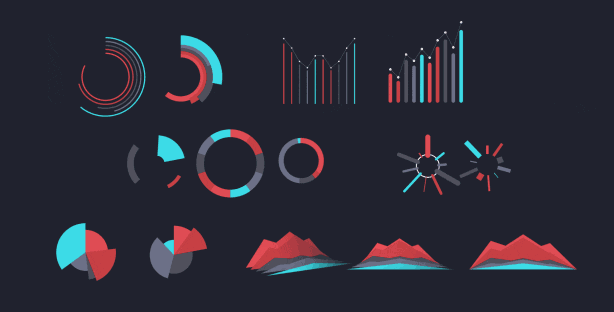
Imagine a science textbook without images. No charts, no graphs, no illustrations or diagrams with arrows and labels. The science would be a lot harder to understand. That’s because humans are visual creatures by nature. People absorb information in graphic form that would elude them in words. Images are effective for all kinds of storytelling, especially when the story is complicated, as it so often is with science. Scientific visuals can be essential for analyzing data, communicating experimental results, and even making surprising discoveries. Visualizations can reveal patterns, trends and connections in data. Improving scientific visualization will require a better understanding of the strengths, weaknesses, and biases of how the human brain perceives the world. Fortunately, research has begun to reveal how people read, and misread, different kinds of visualizations and which types of charts are most effective and easiest to decipher. Applying that knowledge should lead to better visual communication of science.
The Grammar of Graphics
A book The Grammar of Graphics written by Leland Wilkinson, is a grand conception of the nature of scientific graphics. It was written for statisticians, computer scientists, geographers, researchers, and others interested in visualizing data. It relies on an analogy with linguistic grammar: a plot has parts just as a sentence has subject, predicates, and subordinate clauses. His research focused on scientific visualization and statistical graphics. In these communities he was well known for his book The Grammar of Graphics,[1] which was the foundation for the R package ggplot2.
It presents a unique foundation for producing almost every quantitative graphic found in scientific journals, newspapers, statistical packages, and data visualization systems. While the tangible results of this work have been several visualization software libraries, this book focuses on the deep structures involved in producing quantitative graphics from data. What are the rules that underlie the production of pie charts, bar charts, scatterplots, function plots, maps, mosaics, and radar charts? Those less interested in the theoretical and mathematical foundations can still get a sense of the richness and structure of the system by examining the numerous and often unique color graphics it can produce.
From This Point of View, What is a Plot?
A representation of data using objects drawn on a 2D surface, e.g., a page or screen.
The representation may involve statistical transformations.
Properties of the data are mapped onto perceptible qualities, e.g., position, color, shape, size, transparency, ….
All representations involve a choice of scale for each of the perceptible qualities, and a choice of coordinates for the 2D page.
According to the grammar, statistical graphics are composed of elements analogous to the parts of speech:
the data itself,
the geometrical objects that actually representing the data (geoms),
the mappings of data variables onto perceptible qualities called aesthetics,
statistical transformations of the data (stats),
In this conception, a plot is composed of one or more layers. Each layer has the components above. In addition to the layers, plots must have
a set of scales modifying the data-to-aesthetics mapping
a coordinate system mapping the plot onto the page, and
a faceting specification, if there are multiple plots in the graphic.
R For Visualization
Many researchers and students alike have found great help in this area through a free, open-source, and easily accessible software simply called R. R continues to be a friend of both master data-crunchers and those for whom data analysis is a scary task.
The basic functionality of R allows you to create histograms, scatter plots, or line plots with only a tiny bit of code. These are very convenient functions for visualizing your data before even starting any analysis. In a few seconds, you can actually see your data and get insights that are not visible from the tabulated data alone.
However, if you spend some time learning more advanced visualization packages, such as ggplot2, for example, you’ll be able to build some very impressive graphs. R provides seemingly countless ways to visualize your data. These graphs will look very professional. And you’ll get access to a whole host of extra options, such as adding maps to your visualizations or making them animated.
ggplot2()
ggplot2 is an open-source data visualization package for the statistical programming language R. Created by Hadley Wickham in 2005, ggplot2 is an implementation of Leland Wilkinson’s Grammar of Graphics—a general scheme for data visualization which breaks up graphs into semantic components such as scales and layers. ggplot2 can serve as a replacement for the base graphics in R and contains a number of defaults for web and print display of common scales. Since 2005, ggplot2 has grown in use to become one of the most popular R packages. ggplot2() is a system for declaratively creating graphics, based on The Grammar of Graphics. You provide the data, tell ggplot2() how to map variables to aesthetics, what graphical primitives to use, and it takes care of the details.
Elegant Graphics for Data Analysis
This book describes ggplot2, a new data visualization package for R that uses the insights from Leland Wilkison’s Grammar of Graphics to create a powerful and flexible system for creating data graphics. With ggplot2, it’s easy to:
Produce handsome, publication-quality plots, with automatic legends created from the plot specification superpose multiple layers (points, lines, maps, tiles, box plots to name a few) from different data sources, with automatically adjusted common scales to add customizable smoothers that use the powerful modeling capabilities of R, such as loess, linear models, generalized additive models and robust regression save any ggplot2 plot (or part thereof) for later modification or reuse create custom themes that capture in-house or journal style requirements, and that can easily be applied to multiple plots approach your graph from a visual perspective, thinking about how each component of the data is represented on the final plot
This book will be useful to everyone who has struggled with displaying their data in an informative and attractive way. You will need some basic knowledge of R (i.e. you should be able to get your data into R), but ggplot2 is a mini-language specifically tailored for producing graphics, and you’ll learn everything you need in the book. After reading this book you’ll be able to produce graphics customized precisely for your problems, and you’ll find it easy to get graphics out of your head and onto the screen or page.
R Graphics Cookbook
This practical guide provides more than 150 recipes to help you generate high-quality graphs quickly, without having to comb through all the details of R’s graphing systems. Each recipe tackles a specific problem with a solution you can apply to your own project, and includes a discussion of how and why the recipe works.
Most of the recipes use the ggplot2 package, a powerful and flexible way to make graphs in R. If you have a basic understanding of the R language, you’re ready to get started.
Use R’s default graphics for quick exploration of data Create a variety of bar graphs, line graphs, and scatter plots Summarize data distributions with histograms, density curves, box plots, and other examples Provide annotations to help viewers interpret data Control the overall appearance of graphics Render data groups alongside each other for easy comparison Use colors in plots Create network graphs, heat maps, and 3D scatter plots Structure data for graphing.
Fundamentals of Data Visualization: A Primer on Making Informative and Compelling Figures
Effective visualization is the best way to communicate information from increasingly large and complex datasets in the natural and social sciences. But with the increasing power of visualization software today, scientists, engineers, and business analysts often have to navigate a bewildering array of visualization choices and options. This practical book takes you through many commonly encountered visualization problems, and it provides guidelines on how to turn large datasets into clear and compelling figures. What visualization type is best for the story you want to tell? How do you make informative figures that are visually pleasing? Author Claus O. Wilke teaches you the elements most critical to successful data visualization. Explore the basic concepts of color as a tool to highlight, distinguish, or represent a value Understand the importance of redundant coding to ensure you provide key information in multiple ways Use the book’s visualizations directory, a graphical guide to commonly used types of data visualizations Get extensive examples of good and bad figures Learn how to use figures in a document or report and how to employ them effectively to tell a compelling story.
R Graphics
Paul Murrell’s classic book on using R for graphics represents a major update, with a complete overhaul in focus and scope. It focuses primarily on the two core graphics packages in R - graphics and grid - and has a new section on integrating graphics. This section includes three new chapters: importing external images into R; integrating the graphics and grid systems; and advanced SVG graphics. The emphasis in this third edition is on having the ability to produce detailed and customized graphics in a wide variety of formats, on being able to share and reuse those graphics, and on being able to integrate graphics from multiple systems. This book is aimed at all levels of R users. For people who are new to R, this book provides an overview of the graphics facilities, which is useful for understanding what to expect from R’s graphics functions and how to modify or add to the output they produce. For intermediate-level R users, this book provides all of the information necessary to perform sophisticated customizations of plots produced in R. For advanced R users, this book contains vital information for producing coherent, reusable, and extensible graphics functions.
See Also
For More Updates
Follow me on Linkedin.
You are most welcome in my community The Era of Chaos
You can join the group Probability Statistics Forums.