Exploring Local Connectivity and Infinite Complexity in the Mandelbrot and Julia Sets
Mathematics
Author
Abhirup Moitra
Published
June 12, 2024
Exploring the Mandelbrot and Julia sets is like peering into infinity; each zoom reveals an ever-deeper world of intricate beauty and boundless complexity, where mathematics meets art in a dance of eternal fascination.
Voyage Through The World of Fractals
Behold, this infinite mathematical universe. A dizzying cascade of fractals. Arrays of complex patterns filled with both satisfying self-similarity and surprising, novel features. Each iteration delves deeper into a realm where order and chaos intertwine, revealing intricate structures that defy our intuition.
All of the structure and the patterns that you see there really do exist for a reason. There is some sort of innate mathematical cause behind all of the phenomena that you see. ~ Alex Kapiamba (Mathematician, Brown University)
Code
def mandelbrot(x, y, threshold):"""Calculates whether the number c = x + i*y belongs to the Mandelbrot set. In order to belong, the sequence z[i + 1] = z[i]**2 + c must not diverge after 'threshold' number of steps. The sequence diverges if the absolute value of z[i+1] is greater than 4. :param float x: the x component of the initial complex number :param float y: the y component of the initial complex number :param int threshold: the number of iterations to considered it converged """# initial conditions c =complex(x, y) z =complex(0, 0)for i inrange(threshold): z = z**2+ cifabs(z) >4.: # it divergedreturn ireturn threshold -1# it didn't divergeimport numpy as npimport matplotlib.pyplot as pltimport matplotlib.animation as animationx_start, y_start =-2, -1.5# an interesting region starts herewidth, height =3, 3# for 3 units up and rightdensity_per_unit =250# how many pixles per unit# real and imaginary axisre = np.linspace(x_start, x_start + width, width * density_per_unit )im = np.linspace(y_start, y_start + height, height * density_per_unit)fig = plt.figure(figsize=(10, 10)) # instantiate a figure to drawax = plt.axes() # create an axes objectdef animate(i): ax.clear() # clear axes object ax.set_xticks([], []) # clear x-axis ticks ax.set_yticks([], []) # clear y-axis ticks X = np.empty((len(re), len(im))) # re-initialize the array-like image threshold =round(1.15**(i +1)) # calculate the current threshold# iterations for the current thresholdfor i inrange(len(re)):for j inrange(len(im)): X[i, j] = mandelbrot(re[i], im[j], threshold)# associate colors to the iterations with an iterpolation img = ax.imshow(X.T, interpolation="bicubic", cmap='magma')return [img]anim = animation.FuncAnimation(fig, animate, frames=45, interval=120, blit=True)anim.save('mandelbrot.gif',writer='imagemagick')
This is the Mandelbrot Set. These trippy images represent a form of modern algorithmic exploration, one made possible by computers. A handful of mathematicians have devoted their lives uncovering this set’s secrets.
It plays a very central role in our understanding of much more complicated systems. It’s step number one ~ Laura Demarco (Mathematician, Havard)
From the mesmerizing beauty of the Mandelbrot set to the delicate intricacies of Julia sets, these fractals embody the essence of mathematical elegance and complexity. As we explore their boundless depths, we uncover not just shapes and patterns, but the fundamental principles governing dynamical systems, chaos theory, and the very fabric of mathematical reality. This journey through fractals is a testament to the power and beauty of mathematics, offering endless avenues for discovery and inspiration.
Studying of Mandelbrot Set
Code
import numpy as np import matplotlib.pyplot as plt plt.style.use('dark_background')def mandelbrot_set(h_range, w_range, max_iterations): y, x = np.ogrid[-1.4: 1.4: h_range*1j, -1.8: 1: w_range*1j] a_array = x + y*1j z_array = np.zeros(a_array.shape, dtype=complex) # Initialize z_array with dtype complex iterations_till_divergence = np.zeros(a_array.shape, dtype=int) # Initialize as integersfor h inrange(h_range):for w inrange(w_range): z = z_array[h][w] a = a_array[h][w]for i inrange(max_iterations): z = z**2+ aif z * np.conj(z) >4: iterations_till_divergence[h][w] = ibreakreturn iterations_till_divergenceplt.imshow(mandelbrot_set(800, 800, 30), cmap='twilight_shifted')plt.axis('off')plt.show()plt.close()#_____________________________________________________________________________import numpy as np import matplotlib.pyplot as plt plt.style.use('dark_background')def mandelbrot_set(h_range, w_range, max_iterations):# top left to bottom right y, x = np.ogrid[1.4: -1.4: h_range*1j, -1.8: 1: w_range*1j] a_array = x + y*1j z_array = np.zeros(a_array.shape) iterations_till_divergence = max_iterations + np.zeros(a_array.shape)for i inrange(max_iterations):# mandelbrot equation z_array = z_array**2+ a_array# make a boolean array for diverging indicies of z_array z_size_array = z_array * np.conj(z_array) divergent_array = z_size_array >4 iterations_till_divergence[divergent_array] = i# prevent overflow (numbers -> infinity) for diverging locations z_array[divergent_array] =0return iterations_till_divergenceplt.imshow(mandelbrot_set(2000, 2000, 70), cmap='twilight_shifted')plt.axis('off')plt.savefig('mandelbrot.png', dpi=300)plt.close()
The Mandelbrot set is a perfect example of how a simple rule can produce incredible complexity. At it’s core the set is generated by iterating a quadratic equation, \(f(z) = z^2 +c\), a simple formula whose highest exponent is \(2\). To iterate a quadratic equation, choose a value for the variable, plug it into the function, then take the output and feed it back in again and again. The study of how recursive functions like these changes over time is central to a field of math called ‘Complex Dynamical Systems’.
This subject emerged to comprehend the tangible world. What mathematical principles underlie the physical realities we observe? One of the earliest and most crucial examples is the solar system. We delve into dynamical systems, where a set of rules governs the evolution of a space over time, determining the movements and transformations within it.
Starting From The Root
Consider, for instance, the simple function \(f(z)=z+1.\) In this context, we start with an initial value of \(z\)and evaluate the function. The result is then used as the new input parameter, and the function is evaluated again. This iterative process can be formally described as follows:
Start with an initial value \(z_0\).
Compute \(z_1=f(z_0)=z_0+1.\)
Use \(z_1\) as the new input to compute \(z_2=f(z_1)=z_1+1\), and so forth.
Mathematically, this generates a sequence \(\{z_n\}\) where \(z_{n+1}=f(z_n)=z_{n}+1.\) This sequence clearly grows without bound, illustrating a simple yet profound example of iterative processes in dynamical systems. Such iterations lay the groundwork for understanding more complex functions and their behaviors, which ultimately lead to the rich, intricate patterns observed in fractals.
Finally we’ll see that,
\[
f(0) = 0+1 =1
\]
\[
f(1) = 1+1 = 2
\]
\[
f(2) = 2+1 =3
\]
\[
\text{and so on}\ldots
\]
The pattern here is straightforward: we evaluate the function, use the result as the new input, and re-evaluate the function. In this simple case, observing the pattern is easy, as the value increases by one with each iteration. While this example is quite basic, Mandelbrot extended this concept significantly further.
Mandelbrot studied the function \(f(z)=z^2+c\). To illustrate this with a simple example, let’s choose \(c=1\). Therefore,
\[
f(0) =1
\]
\[
f(1) =2
\]
\[
f(2) = 5
\]
\[
f(5) = 26
\]
It becomes apparent that the values will rapidly spiral out of control this time and diverge to infinity. Now let’s try plugging in \(-2\). Therefore,
\[
f(0) = -2
\]
\[
f(-2) = 2
\]
\[
f(2) =2
\]
This process will continually yield the value \(2\). By repeatedly evaluating \(f(2)\) and obtaining \(2\), this iteration continues indefinitely. Consequently, this indicates that \(-2\) lies on the boundary of the Mandelbrot set. To visualize this concept, let’s draw a number line.
Code
# Create a sequence of numbers from -10 to 10numbers <--2:2# Include the additional point 1/4additional_point <-1/4# Plot the number lineplot(numbers, rep(0, length(numbers)), type ="n", xlab ="Number Line", ylab ="", yaxt ="n", bty ="n", main ="Number Line")# Add points to the number linepoints(numbers, rep(0, length(numbers)), pch =16)# Add the additional pointpoints(additional_point, 0, pch =16, col ="red")# Add labels below the pointstext(numbers, rep(-0.1, length(numbers)), labels =as.character(numbers), cex =0.8)# Add label for the additional pointtext(additional_point, -0.1, labels ="1/4", col ="red", cex =0.8)# Draw a horizontal line to represent the number lineabline(h =0, col ="black")# Add arrows at the ends of the number linearrows(-10, 0, 10, 0, length =0.1, code =3)
Here, \(-2\) represents the largest magnitude that remains bounded and does not diverge to infinity when iterated from \(0.\)
Let’s try plugging, \(c= -2.1\). Therefore,
\[
f(0) = 0^2 - 2.1 = -2.1
\]
\[
f(-2.1) = (-2.1)^2 -2.1 = 2.41
\]
\[
f(2.41) = (2.41)^2- 2.1 = 3.81
\]
\[
f(3.81) = (3.81)^2 -2.1 =12.5
\]
Consider the parameter \(c=−2.1.\) Through successive iterations of the function \(f(z)=z^2+c\), we embark on a journey: \(-2.1, 2.41, 3.81, 12.5\), and so forth, each value exponentially greater than the last. This vividly illustrates that the Mandelbrot set’s boundary is encapsulated by \(-2\), beyond which values spiral into infinity.
Now, let’s shift our focus to the positive boundary. Surprisingly, it resides at \(c=\frac{1}{4}\), a less intuitive revelation. When we substitute \(\frac{1}{4}\) for \(c\), the sequence inches closer and closer to \(\frac{1}{2}\), but never quite reaches it. Any departure beyond \(\frac{1}{4}\) propels the sequence into an unbounded trajectory towards infinity.
We may visually represent this by shading the region between these two values on a number line, symbolizing the real numbers encompassed by the Mandelbrot set. The interval stretches from \(-2\) to \(\frac{1}{4}\), delineating the scope of this fractal phenomenon. At this juncture, some individuals might conclude their exploration. However, what follows promises a journey into deeper complexity.
Code
# Create a sequence of numbers from -2 to 2numbers <--2:2# Include the additional point 1/4additional_point <-1/4# Plot the number lineplot(numbers, rep(0, length(numbers)), type ="n", xlab ="Number Line", ylab ="", yaxt ="n", bty ="n", main ="Number Line")# Add a shaded region between -2 and 0rect(-2, -0.05, 0, 0.05, col ="yellow", border =NA)# Add points to the number linepoints(numbers, rep(0, length(numbers)), pch =16)# Add the additional pointpoints(additional_point, 0, pch =16, col ="red")# Add labels below the pointstext(numbers, rep(-0.1, length(numbers)), labels =as.character(numbers), cex =0.8)# Add label for the additional pointtext(additional_point, -0.1, labels ="1/4", col ="red", cex =0.8)# Draw a horizontal line to represent the number lineabline(h =0, col ="black")# Add arrows at the ends of the number linearrows(-10, 0, 10, 0, length =0.1, code =3)
Analysing Julia Set
In the early \(20^{\text{th}}\) century mathematicians, Pierre Fatou and Gaston Julia set the stage for the discovery of the Mandelbrot set with their exploration of Dynamical Systems. To investigate these dynamical systems, mathematicians study intricate shapes which is known as Julia Sets. Julia Sets are produced by iterating a function of complex numbers.
Code
import numpy as np import matplotlib.pyplot as plt import numpy as npdef julia_set(h_range, w_range, max_iterations):''' A function to determine the values of the Julia set. Takes an array size specified by h_range and w_range, in pixels, along with the number of maximum iterations to try. Returns an array with the number of the last bounded iteration at each array value. '''# top left to bottom right y, x = np.ogrid[1.4: -1.4: h_range*1j, -1.4: 1.4: w_range*1j] z_array = x + y*1j a =-0.744+0.148j iterations_till_divergence = max_iterations + np.zeros(z_array.shape)for h inrange(h_range):for w inrange(w_range): z = z_array[h][w]for i inrange(max_iterations): z = z**2+ aif z * np.conj(z) >4: iterations_till_divergence[h][w] = ibreakreturn iterations_till_divergence# Example usage#result = julia_set(100, 100, 100)#print(result)plt.imshow(julia_set(1500, 1500, 1000), cmap='twilight_shifted')plt.axis('off')plt.show()
A complex number is defined as the sum of two components, a real part and an imaginary part. Each complex number can be visualized as a point of a 2D plane. The real part is a number found on the number line. The imaginary part is a multiple of the \(\sqrt{-1}\), which the mathematicians write as \(i\). Despite the name, imaginary numbers play a vital role in solving real-world problems. To construct Julia Set, start with a simple quadratic equation \(f(z) = z^2 +c\)
Code
# Load the necessary librarylibrary(ggplot2)# Define a function to visualize complex numbersvisualize_complex_numbers <-function() {# Create a data frame of sample complex numbers complex_numbers <-data.frame(Real =c(-1, 0, 1, 1.5, -0.5, 2),Imaginary =c(1, -1, 0.5, -1.5, 1.5, -0.5) )# Create a ggplotggplot(complex_numbers, aes(x = Real, y = Imaginary)) +geom_point(color ="blue", size =4) +# Plot points for complex numbersgeom_hline(yintercept =0, linetype ="dashed") +# Horizontal line at y=0 (real axis)geom_vline(xintercept =0, linetype ="dashed") +# Vertical line at x=0 (imaginary axis)labs(title ="Visualization of Complex Numbers",x ="Real Part",y ="Imaginary Part" ) +theme_minimal() +theme(plot.title =element_text(hjust =0.5) ) +annotate("text", x =2, y =0, label ="Real Axis", vjust =-1, color ="red") +annotate("text", x =0, y =1.5, label ="Imaginary Axis", hjust =-0.1, color ="red") +annotate("text", x =-1, y =1, label ="-1 + 1i", hjust =1.2, vjust =-1.2, color ="darkgreen") +annotate("text", x =0, y =-1, label ="0 - 1i", hjust =1.2, vjust =1.2, color ="darkgreen") +annotate("text", x =1, y =0.5, label ="1 + 0.5i",hjust =-0.1, vjust =-1.2, color ="darkgreen") +annotate("text", x =1.5, y =-1.5, label ="1.5 - 1.5i", hjust =-0.1, vjust =1.2, color ="darkgreen") +annotate("text", x =-0.5, y =1.5, label ="-0.5 + 1.5i", hjust =1.2, vjust =-1.2, color ="darkgreen") +annotate("text", x =2, y =-0.5, label ="2 - 0.5i", hjust =-0.1, vjust =1.2, color ="darkgreen")}# Call the function to visualize complex numbersvisualize_complex_numbers()
Choose a value for\(c=-1\)for example. Then consider what happens when you iterate this equation for every possible starting value.
You repeatedly apply the function to the sequence of numbers that you’re generating, and you ask whether or not that sequence is going off to infinity or whether it stay bounded.~ Laura Demarco (Mathematician, Havard)
For some initial values, your equation speeds off to infinity while iterating like these.These values are not in the Julia set. When you start iterating from other initial values, you might instead get a sequence of outputs that stay bounded.
Code
# Load the necessary librarylibrary(ggplot2)# Define a function to visualize complex numbersvisualize_complex_numbers <-function() {# Create a data frame of sample complex numbers complex_numbers <-data.frame(Real =c(-1, 0, 1, 1.5, -0.5, 2, -2, 2.5, -1.5, 0.5),Imaginary =c(1, -1, 0.5, -1.5, 1.5, -0.5, 2, -2, 1.8, -2) )# Identify which points diverge to infinity diverges =c(FALSE, TRUE, FALSE, TRUE, FALSE, TRUE, TRUE, FALSE, TRUE, FALSE)# Add labels in the form of complex numbers complex_numbers$Labels <-paste0(complex_numbers$Real, ifelse(complex_numbers$Imaginary >=0, "+", ""), complex_numbers$Imaginary, "i")# Create a ggplotggplot(complex_numbers, aes(x = Real, y = Imaginary)) +geom_point(aes(color = diverges), size =4) +# Plot points for complex numbers with color indicating divergencegeom_text(aes(label = Labels), vjust =-1.5, color ="black") +# Add labelsscale_color_manual(values =c("blue", "red"), labels =c("Bounded", "Diverges")) +# Color and legend for pointsgeom_hline(yintercept =0, linetype ="dashed") +# Horizontal line at y=0 (real axis)geom_vline(xintercept =0, linetype ="dashed") +# Vertical line at x=0 (imaginary axis)labs(title ="Visualization of Complex Numbers",x ="Real Part",y ="Imaginary Part",color ="Point Type" ) +theme_minimal() +theme(plot.title =element_text(hjust =0.5) ) +annotate("text", x =2, y =0, label ="Real Axis", vjust =-1, color ="red") +annotate("text", x =0, y =1.5, label ="Imaginary Axis", hjust =-0.1, color ="red") +coord_fixed(ratio =1, xlim =c(-3, 3), ylim =c(-3, 3)) # Adjust plot limits}# Call the function to visualize complex numbersvisualize_complex_numbers()# Load the necessary librarylibrary(ggplot2)# Define a function to visualize complex numbers and their iterationsvisualize_complex_numbers <-function() {# Create a data frame of sample complex numbers complex_numbers <-data.frame(Real =c(-1, 0, 1, 1.5, -0.5, 2, -2, 2.5, -1.5, 0.5),Imaginary =c(1, -1, 0.5, -1.5, 1.5, -0.5, 2, -2, 1.8, -2) )# Identify which points diverge to infinity diverges <-c(FALSE, TRUE, FALSE, TRUE, FALSE, TRUE, TRUE, FALSE, TRUE, FALSE)# Add labels in the form of complex numbers complex_numbers$Labels <-paste0(complex_numbers$Real, ifelse(complex_numbers$Imaginary >=0, "+", ""), complex_numbers$Imaginary, "i")# Simulate iterations by adding more data points# Here we add a few iterations to demonstrate the idea iterations <-data.frame(Real =c(-1, -0.5, -0.5, 0, 0, 1, 1, 1.5, 1.5, -0.25, -0.25, 0.75, 0.75, 2, 2, -2, -2, -1.5, -1.5, 2.5, 2.5, -1.5, -1.5, 0.5, 0.5, 0.75),Imaginary =c(1, 0.5, 0.5, -1, -1, 0, 0, 1.5, 1.5, -0.75, -0.75, 0.25, 0.25, -0.5, -0.5, 2, 2, 1.8, 1.8,-2, -2, 0.9, 0.9, -2, -2, -1),Group =rep(1:13, each =2) # Grouping for lines )# Create a ggplotggplot(complex_numbers, aes(x = Real, y = Imaginary)) +geom_point(aes(color = diverges), size =4) +# Plot points for complex numbers with color indicating divergencegeom_text(aes(label = Labels), vjust =-1.5, color ="black") +# Add labelsgeom_path(data = iterations, aes(x = Real, y = Imaginary, group = Group), color ="purple", linetype ="longdash") +# Connect iteration pointsscale_color_manual(values =c("blue", "red"), labels =c("Bounded", "Diverges")) +# Color and legend for pointsgeom_hline(yintercept =0, linetype ="dashed") +# Horizontal line at y=0 (real axis)geom_vline(xintercept =0, linetype ="dashed") +# Vertical line at x=0 (imaginary axis)labs(title ="Visualization of Complex Numbers",x ="Real Part",y ="Imaginary Part",color ="Point Type" ) +theme_minimal() +theme(plot.title =element_text(hjust =0.5) ) +annotate("text", x =2, y =0, label ="Real Axis", vjust =-1, color ="red") +annotate("text", x =0, y =1.5, label ="Imaginary Axis", hjust =-0.1, color ="red") +coord_fixed(ratio =1, xlim =c(-3, 3), ylim =c(-3, 3)) # Adjust plot limits}# Call the function to visualize complex numbersvisualize_complex_numbers()
When something comes back to itself, we often call that recurrent behaviour, & that’s where the complexity arises.
Code
# Load the necessary librarylibrary(plotly)# Define a function to visualize complex numbers and their iterationsvisualize_complex_numbers_plotly <-function() {# Create a data frame of sample complex numbers complex_numbers <-data.frame(Real =c(-1, 0, 1, 1.5, -0.5, 2, -2, 2.5, -1.5, 0.5),Imaginary =c(1, -1, 0.5, -1.5, 1.5, -0.5, 2, -2, 1.8, -2),Diverges =c(FALSE, TRUE, FALSE, TRUE, FALSE, TRUE, TRUE, FALSE, TRUE, FALSE) )# Add labels in the form of complex numbers complex_numbers$Labels <-paste0(complex_numbers$Real, ifelse(complex_numbers$Imaginary >=0, "+", ""), complex_numbers$Imaginary, "i")# Simulate iterations by adding more data points# Here we add a few iterations to demonstrate the idea iterations <-data.frame(Real =c(-1, -0.5, -0.5, 0, 0, 1, 1, 1.5, 1.5, -0.25, -0.25, 0.75, 0.75, 2, 2, -2, -2, -1.5, -1.5, 2.5, 2.5, -1.5, -1.5, 0.5, 0.5, 0.75),Imaginary =c(1, 0.5, 0.5, -1, -1, 0, 0, 1.5, 1.5, -0.75, -0.75, 0.25, 0.25, -0.5, -0.5, 2, 2, 1.8, 1.8,-2, -2, 0.9, 0.9, -2, -2, -1),Group =rep(1:13, each =2) # Grouping for lines )# Create a plotly plot fig <-plot_ly() %>%add_markers(data = complex_numbers[complex_numbers$Diverges ==FALSE,], x =~Real, y =~Imaginary, text =~Labels, textposition ='top center',marker =list(size =10, color ='blue'),hoverinfo ='text', name ='Bounded') %>%add_markers(data = complex_numbers[complex_numbers$Diverges ==TRUE,], x =~Real, y =~Imaginary, text =~Labels, textposition ='top center',marker =list(size =10, color ='red'),hoverinfo ='text', name ='Diverges') %>%add_lines(data = iterations, x =~Real, y =~Imaginary, line =list(color ='purple', dash ='dash'),split =~Group,showlegend =FALSE) %>%layout(title ="Visualization of Complex Numbers",xaxis =list(title ="Real Part", range =c(-3, 3), zeroline =TRUE, zerolinewidth =1, zerolinecolor ='black'),yaxis =list(title ="Imaginary Part", range =c(-3, 3), zeroline =TRUE, zerolinewidth =1,zerolinecolor ='black'),shapes =list(list(type ="line", x0 =-3, x1 =3,y0 =0, y1 =0, line =list(dash ='dash')),list(type ="line", x0 =0, x1 =0, y0 =-3, y1 =3, line =list(dash ='dash')) ),annotations =list(list(x =2, y =0, text ="Real Axis", showarrow =FALSE, font =list(color ="red")),list(x =0, y =1.5, text ="Imaginary Axis", showarrow =FALSE, font =list(color ="red")) ))# Display the plot fig}# Call the function to visualize complex numbersvisualize_complex_numbers_plotly()
The boundary between points that stay bounded and those that don’t is a Julia set. You can fill it in by including all the bounded values.
Filled Julia sets can be divided into two categories. Sets are connected so that you can draw a line from one point to another without lifting your pen. Sets where points look like scattered pieces of dust are disconnected.
Elementary Complex Number
Let’s quickly explore the realm of complex numbers. The square root function identifies a number which, when multiplied by itself, yields the number under the radical. For instance, \(\sqrt{4}\) implies that since \(2\) times itself is \(4\), \(\sqrt{4}\) is \(2\).
Now, let’s consider the square root of a negative number. For example, what if we have\(\sqrt{-4}\)? Can you identify a number which, when multiplied by itself, equals\(-4\)?
The answer is you can’t, because there are no real numbers that satisfy this condition. This is because the square of any real number is always non-negative.
Similar questions arise with\(\sqrt{−1}\). What is the square root of\(-1\)?
The answer is that there are no real numbers that satisfy this condition. To address this, mathematicians introduced the concept of imaginary numbers. The square root of -1 is defined as \(i\), where \(i\) is the imaginary unit. Also, now we can answer about \(\sqrt{-4}\) i.e., \(\sqrt{-4} = 2i \times2i = (2.2) \times (i.i) = -4\).
Extension of \(f(z) = z^2 +c\) With Imaginary Number
So, Mandelbrot wanted to Inlcude imaginary numbers as well in his analysis of his function.
\[
f(z) = z^2 +c
\]
Let’s try plug in \(i\) for \(c\) i.e., \(c =i\).
\[
f(0) = i
\]
\[
f(i) = (i)^2 +1 = -1+i
\]
\[
f(-1+i) = (-1+i)^2 + i = -i
\]
Continuing the iterations by hand becomes increasingly complex, so we will pause here. It’s important to note that \(i\) is not included in the Mandelbrot set, as this function diverges to infinity. To visualize this, we can set up an imaginary number line. The bounds for this function are approximately \(-0.6i\) & \(0.6i\)
Code
# Set up the plot area focusing on the imaginary part horizontallyplot(0, 0, type ="n", ylab ="", xlab ="Imaginary", xlim =c(-1, 1), ylim =c(-0.1, 0.1), yaxt ="n", main ="Imaginary Number Line")# Draw the imaginary number line from -i to iabline(h =0, v =0, col ="gray", lty =2) # Reference lines at the real axisarrows(-1, 0, 1, 0, col ="black", length =0.1) # Arrow from -i to i# Draw the shaded region from -0.6i to 0.6irect(-0.6, -0.02, 0.6, 0.02, col ="green", border =NA)# Mark -i and ipoints(-1, 0, pch =16, col ="blue")text(-1, -0.05, labels ="-i", col ="blue")points(1, 0, pch =16, col ="blue")text(1, -0.05, labels ="i", col ="blue")# Add labels for shaded regionpoints(-0.6, 0, pch =16, col ="blue")text(-0.6, -0.05, labels ="-0.6i", col ="blue")points(0.6, 0, pch =16, col ="blue")text(0.6, -0.05, labels ="0.6i", col ="blue")
Many mathematicians might have stopped at this point, having defined the set for all real numbers and all imaginary numbers. However, there remains one more set of numbers to explore: complex numbers. Complex numbers consist of both a real and an imaginary component. This extension allows us to include complex numbers in our number system. A complex number can be expressed in the form \(a+bi\), where \(a\) and \(b\) are real numbers. This could be something as simple as \(1+i\) or as complex as \(6+9i\). If we let 𝑐c be any complex number, it can represent any combination of real and imaginary components.
Roughly\(-0.2 +1.12i\)is included in the Mandelbrot set
But where do we place this on the number line? We can’t simply put it above \(−0.2\) because we have \(0.2+1.12i\), where the real part is \(−0.2.\) If only there were some way to simultaneously represent both real and imaginary components. We need something like this:
Code
# Set up the plot areaplot(0, 0, type ="n", xlab ="Real", ylab ="Imaginary", xlim =c(-2, 2), ylim =c(-3, 1), main ="Number Line")# Draw the imaginary number line from -3i to 1iabline(h =0, v =0, col ="gray", lty =2) # Reference lines at real and imaginary axesarrows(0, -3, 0, 1, col ="black", length =0.1) # Arrow from -3i to 1i# Draw the real number line from -2 to 2arrows(-2, 0, 2, 0, col ="black", length =0.1) # Arrow from -2 to 2# Draw the shaded region from -2 to 0 on the real number linerect(-2, -0.05, 0, 0.05, col ="yellow", border =NA)# Draw the shaded region from -0.6i to 0.6i on the imaginary number linerect(-0.05, -0.6, 0.05, 0.6, col ="green", border =NA)# Mark -i and i on the imaginary axispoints(0, -1, pch =16, col ="blue")text(0.1, -1, labels ="-i", col ="blue")points(0, 1, pch =16, col ="blue")text(0.1, 1, labels ="i", col ="blue")# Add labels for shaded regions on the imaginary axispoints(0, -0.6, pch =16, col ="blue")text(0.1, -0.6, labels ="-0.6i", col ="blue")points(0, 0.6, pch =16, col ="blue")text(0.1, 0.6, labels ="0.6i", col ="blue")# Add labels for shaded regions on the real axispoints(-2, 0, pch =16, col ="blue")text(-2, 0.1, labels ="-2", col ="blue")points(0, 0, pch =16, col ="blue")text(0, 0.1, labels ="0", col ="blue")# Mark 1/4 on the real axispoints(0.25, 0, pch =16, col ="red")text(0.25, 0.1, labels ="1/4", col ="red")# Load the necessary librarylibrary(ggplot2)# Create a data frame for the points and labelspoints_data <-data.frame(x =c(0, 0, 0, 0, 0.25, -2, 0),y =c(-1, 1, -0.6, 0.6, 0, 0, 0),label =c("-i", "i", "-0.6i", "0.6i", "1/4", "-2", "0"),color =c("blue", "blue", "blue", "blue", "red", "blue", "blue"))# Create the base plotp <-ggplot() +# Add the real number linegeom_segment(aes(x =-2, y =0, xend =2, yend =0), arrow =arrow(length =unit(0.1, "inches")), color ="black") +# Add the imaginary number linegeom_segment(aes(x =0, y =-3, xend =0, yend =1), arrow =arrow(length =unit(0.1, "inches")), color ="black") +# Add the shaded region on the real number lineannotate("rect", xmin =-2, xmax =0, ymin =-0.05, ymax =0.05, alpha =0.2, fill ="yellow") +# Add the shaded region on the imaginary number lineannotate("rect", xmin =-0.05, xmax =0.05, ymin =-0.6, ymax =0.6, alpha =0.2, fill ="green") +# Add the points and labelsgeom_point(data = points_data, aes(x = x, y = y, color = color), size =3) +geom_text(data = points_data, aes(x = x, y = y, label = label, color = color), hjust =1.2, vjust =-0.5, size =4) +# Set the axis labels and titlelabs(x ="Real", y ="Imaginary", title ="Number Line") +# Set the plot limitsxlim(-2, 2) +ylim(-3, 1) +# Customize the themetheme_minimal() +theme(legend.position ="none")# Display the plotprint(p)
In this complex plane, we can plot complex numbers in the form \(a+bi\). The horizontal axis (real axis) represents the real part \(a\), and the vertical axis (imaginary axis) represents the imaginary part \(bi\). In this complex plane, each point \((a,b)\) corresponds to the complex number \(a+bi\). This way, both the real and imaginary parts of the number can be viewed together.
Code
# Load the necessary librarylibrary(ggplot2)# Create a data frame for plotting the axes and labelsaxes_data <-data.frame(x =c(3.5, 0),y =c(0, 3.5),label =c("Real Part", "Imaginary Part"),hjust =c(0.5, -0.1),vjust =c(-0.5, 0.5))# Create the base plotp <-ggplot() +# Add the real axisgeom_segment(aes(x =-3, y =0, xend =3, yend =0), arrow =arrow(length =unit(0.2, "inches")), color ="black") +# Add the imaginary axisgeom_segment(aes(x =0, y =-3, xend =0, yend =3), arrow =arrow(length =unit(0.2, "inches")), color ="black") +# Add axis labelsgeom_text(data = axes_data, aes(x = x, y = y, label = label, hjust = hjust, vjust = vjust), size =5) +# Set the plot limitsxlim(-3.5, 3.5) +ylim(-3.5, 3.5) +# Customize the themetheme_minimal() +theme(axis.title =element_blank(),axis.text =element_blank(),axis.ticks =element_blank())# Display the plotprint(p)
Given this framework, we are equipped to graph the Mandelbrot set. The Mandelbrot set consists of all complex numbers \(c\) for which the iterative sequence defined by the recurrence relation \(z_{n+1} = z_n^2+c\) (with \(z_0=0\) ) does not diverge to infinity. Mathematically, the Mandelbrot set is the set of all \(c\) in the complex plane such that the magnitude of \(z_n\) remains bounded as \(n\) approaches infinity. This intricate and beautiful set reveals the boundary between stability and chaos in complex dynamics, showcasing both self-similarity and fractal structure.
The Discovery of The Mandelbrot Set
The first rough plot of the Mandelbrot set appeared in a 1978 paper by the mathematicians Robert Brooks and J. Peter Matelski. Soon after Benoit Mandelbrot, a researcher at IBM, who had access to more computing power, also discovered the set. This led to further explorations. These early computer graphics were crude, but the patterns revealed the presence of something far more complex.
Even with fuzzy, poorly made pictures in the eighties, they were able to glean a lot of interesting insight into what was going on.
Mandelbrot went on to popularize his now-eponymous set to the world and became known as the father of fractals. Today mathematicians can use computers to explore the Mandelbrot set in far greater detail.
As soon as you have the images just opens up this whole world.
The Mandelbrot set is drawn in the complex plane. It is constructed by iterating the same quadratic equations used to produce Julia sets. But here things are flipped around. Instead of iterating all values of \(z\) for a fixed value of \(c\), we fix the starting value of the iteration at \(0\) and vary \(c\). Value of \(c\) where iteration of \(z^2+c\) stays bounded inside the Mandelbrot set. while those that go to infinity are not.
Here we can select points inside the Mandelbrot set to reveal their corresponding filled Julia sets. The Mandelbrot set acts like an atlas, cataloguing the different kinds of Julia sets. Values of \(c\) inside the Mandelbrot set are associated with connected Julia sets. While values outside the set correspond to disconnected dust.
The Mandelbrot set has many intriguing features, but the biggest mysteries lie in its complex fractal boundary. Zooming into different boundary regions reveals some astounding features. A valley of seahorses, parades of elephants and a miniature version of the set itself.
So, we can sort of keep finding nests, a sequence of smaller and smaller Mandelbrot sets. all one inside of the next.
Here at the boundary, mathematicians are probing for answers.
Code
from PIL import Imageimport colorsysimport mathpx, py =-0.7746806106269039, -0.1374168856037867#Tante RenateR =3max_iteration =2500w, h =1024,1024mfactor =0.5def Mandelbrot(x,y,max_iteration,minx,maxx,miny,maxy): zx =0 zy =0 RX1, RX2, RY1, RY2 = px-R/2, px+R/2,py-R/2,py+R/2 cx = (x-minx)/(maxx-minx)*(RX2-RX1)+RX1 cy = (y-miny)/(maxy-miny)*(RY2-RY1)+RY1 i=0while zx**2+ zy**2<=4and i < max_iteration: temp = zx**2- zy**2 zy =2*zx*zy + cy zx = temp + cx i +=1return idef gen_Mandelbrot_image(sequence): bitmap = Image.new("RGB", (w, h), "white") pix = bitmap.load()for x inrange(w):for y inrange(h): c=Mandelbrot(x,y,max_iteration,0,w-1,0,h-1) v = c**mfactor/max_iteration**mfactor hv =0.67-vif hv<0: hv+=1 r,g,b = colorsys.hsv_to_rgb(hv,1,1-(v-0.1)**2/0.9**2) r =min(255,round(r*255)) g =min(255,round(g*255)) b =min(255,round(b*255)) pix[x,y] =int(r) + (int(g) <<8) + (int(b) <<16) bitmap.save("Mandelbrot_"+str(sequence)+".jpg")R=3f =0.975RZF =1/1000000000000k=1while R>RZF:if k>100: break mfactor =0.5+ (1/1000000000000)**0.1/R**0.1print(k,mfactor) gen_Mandelbrot_image(k) R *= f k+=1
As you look at it, it sort of seems like one blob, but if you really ask, is it all connected? or maybe if we zoom in far enough, there’s some separating piece.
Mandelbrot Locally Connected Conjecture(MLC)
This question is central to a 40-year-old problem called the Mandelbrot Locally Connected Conjecture(MLC). If the set is locally connected, that means that no matter what point you choose to examine or how far you zoom in, the are will always look like one nice connected section.
For example, if we closely examine a circle, we can see that it’s locally connected a every point, but take a fine-toothed comb and zoom in while the comb is one connected shape, at close range, it can look disconnected. If mathematicians can prove that MLC is true then a complete understanding of the Mandelbrot set would be within reach.
Normal Map Effect, Mercator Projection and Deep Zoom Images
Normalization, Distance Estimation and Boundary Detection
Partial antialiasing is also applied to enhance boundary detection. The \(e^{-|z|}-\)smoothing technique ensures smooth transitions of colours based on the exponential decay of the distance from the Mandelbrot set boundary. Normalized iteration count allows for the differentiation of points based on how quickly they escape to infinity, and exterior distance estimation provides precise measurements of how far points are from the set’s boundary, thus aiding in accurate boundary depiction.
Code
import numpy as npimport matplotlib.pyplot as pltd, h =800, 500# pixel density (= image width) and image heightn, r =200, 500# number of iterations and escape radius (r > 2)x = np.linspace(0, 2, num=d+1)y = np.linspace(0, 2* h / d, num=h+1)A, B = np.meshgrid(x -1, y - h / d)C =2.0* (A + B *1j) -0.5Z, dZ = np.zeros_like(C), np.zeros_like(C)D, S, T = np.zeros(C.shape), np.zeros(C.shape), np.zeros(C.shape)for k inrange(n): M =abs(Z) < r S[M], T[M] = S[M] + np.exp(-abs(Z[M])), T[M] +1 Z[M], dZ[M] = Z[M] **2+ C[M], 2* Z[M] * dZ[M] +1plt.imshow(S **0.1, cmap=plt.cm.twilight_shifted, origin="lower")plt.savefig("Mandelbrot_set_1.png", dpi=200)N =abs(Z) >= r # normalized iteration countT[N] = T[N] - np.log2(np.log(np.abs(Z[N])) / np.log(r))plt.imshow(T **0.1, cmap=plt.cm.twilight_shifted, origin="lower")plt.savefig("Mandelbrot_set_2.png", dpi=200)N =abs(Z) >2# exterior distance estimationD[N] = np.log(abs(Z[N])) *abs(Z[N]) /abs(dZ[N])plt.imshow(D **0.1, cmap=plt.cm.twilight_shifted, origin="lower")plt.savefig("Mandelbrot_set_3.png", dpi=200)N, thickness = D >0, 0.01# boundary detectionD[N] = np.maximum(1- D[N] / thickness, 0)plt.imshow(D **2.0, cmap=plt.cm.binary, origin="lower")plt.savefig("Mandelbrot_set_4.png", dpi=200)
These sophisticated methods not only enhance the visual appeal of the Mandelbrot set but also provide deeper insights into its complex structure. The use of NumPy and complex matrices allows for efficient computation and visualization, making it possible to explore the detailed and intricate patterns of this fascinating fractal.
Normal Map Effect and Stripe Average Coloring
The Mandelbrot set is often visualized using advanced techniques such as Normal Maps and Stripe Average Coloring, enhancing its visual representation. Developed by Jussi Härkönen and building on Arnaud Chéritat’s work, these methods significantly enrich the fractal’s appearance.
The Normal Map Effect simulates lighting by perturbing surface normals, giving the fractal a three-dimensional look. Stripe Average Coloring adds patterns to highlight complex boundaries. Due to the rapid growth of the second derivative, Stripe Average Coloring is most effective for iterations \(n \leq 400.\)
To achieve stripe patterns similar to Arnaud Chéritat’s:
Increase stripe density.
Use the cosine function (\(\cos\)) instead of sine function (\(\sin\)).
Apply a binary colormap for high contrast.
Implementation Techniques
Using NumPy and complex matrices, these methods leverage normalized iteration count and exterior distance estimation for smooth transitions and precise boundary detection. Techniques like \(e^{-|z|}-\)smoothing ensure smooth color gradients based on exponential decay from the Mandelbrot set boundary.
Code
#Normal Map Effect and Stripe Average Coloringimport numpy as npimport matplotlib.pyplot as pltd, h =800, 500# pixel density (= image width) and image heightn, r =200, 500# number of iterations and escape radius (r > 2)direction, height =45.0, 1.5# direction and height of the lightdensity, intensity =4.0, 0.5# density and intensity of the stripesx = np.linspace(0, 2, num=d+1)y = np.linspace(0, 2* h / d, num=h+1)A, B = np.meshgrid(x -1, y - h / d)C = (2.0+1.0j) * (A + B *1j) -0.5Z, dZ, ddZ = np.zeros_like(C), np.zeros_like(C), np.zeros_like(C)D, S, T = np.zeros(C.shape), np.zeros(C.shape), np.zeros(C.shape)for k inrange(n): M =abs(Z) < r S[M], T[M] = S[M] + np.sin(density * np.angle(Z[M])), T[M] +1 Z[M], dZ[M], ddZ[M] = Z[M] **2+ C[M], 2* Z[M] * dZ[M] +1, 2* (dZ[M] **2+ Z[M] * ddZ[M])N =abs(Z) >= r # basic normal map effect and stripe average coloring (potential function)P, Q = S[N] / T[N], (S[N] + np.sin(density * np.angle(Z[N]))) / (T[N] +1)U, V = Z[N] / dZ[N], 1+ (np.log2(np.log(np.abs(Z[N])) / np.log(r)) * (P - Q) + Q) * intensityU, v = U /abs(U), np.exp(direction /180* np.pi *1j) # unit normal vectors and light vectorD[N] = np.maximum((U.real * v.real + U.imag * v.imag + V * height) / (1+ height), 0)plt.imshow(D **1.0, cmap=plt.cm.bone, origin="lower")plt.savefig("Mandelbrot_normal_map_1.png", dpi=200)N =abs(Z) >2# advanced normal map effect using higher derivatives (distance estimation)U = Z[N] * dZ[N] * ((1+ np.log(abs(Z[N]))) * np.conj(dZ[N] **2) - np.log(abs(Z[N])) * np.conj(Z[N] * ddZ[N]))U, v = U /abs(U), np.exp(direction /180* np.pi *1j) # unit normal vectors and light vectorD[N] = np.maximum((U.real * v.real + U.imag * v.imag + height) / (1+ height), 0)plt.imshow(D **1.0, cmap=plt.cm.afmhot, origin="lower")plt.savefig("Mandelbrot_normal_map_2.png", dpi=200)
Practical Applications
Platforms like Shadertoy showcase practical implementations of these methods, such as in sections “Mixing it all” and “Julia Stripes,” allowing interactive visualizations of the Mandelbrot set. Normal Map Effect and Stripe Average Coloring enhance the visualization of the Mandelbrot set, revealing its intricate beauty and complexity. These advanced techniques provide deeper insights into fractal geometry and complex dynamics.
Mercator Mandelbrot Maps and Zoom Images
A small modification in the code allows for the creation of Mercator maps of the Mandelbrot set, as demonstrated by David Madore and Anders Sandberg. These maps offer a unique perspective on the fractal’s structure, enabling detailed exploration and magnification. The maximum magnification achievable with this method is approximately:
This represents the maximum magnification for \(64-\)bit arithmetic. Anders Sandberg, however, employs a different scaling approach. He uses:
\[
10^{3.\frac{h}{d}} = 1000^{\frac{h}{d}}
\]
This scaling method results in images that appear slightly compressed compared to those generated using \(e^{2\pi. \frac{h}{d}} \approx 535.5^{\frac{h}{d}}\). Despite this difference, the compression is minimal because:
\[
1000^{5.0} \approx 535.5^{5.5}
\]
With identical pixel density and maximum magnification, the height difference between the maps is only about \(10\)%.
Zooming into the Mandelbrot Set & Julia Set
Zooming into the Mandelbrot set and Julia set reveals the intricate and infinitely complex nature of these famous fractals. The Mandelbrot set, plotted in the complex plane, is defined by iterating the function \(f(z) = z^2+c\) and determining whether the sequence remains bounded. Each zoom into the Mandelbrot set unveils self-similar structures and increasingly detailed patterns, showcasing its fractal nature.
Similarly, Julia sets are generated using a similar iterative process, but for each fixed complex parameter \(c\). Each point in the complex plane is tested to see if the sequence remains bounded. Julia sets exhibit a variety of shapes, depending on the value of \(c\), ranging from connected, cloud-like formations to disconnected, dust-like patterns.
Advanced visualization techniques, such as deep zoom images and projections, enhance the exploration of these sets. These tools allow mathematicians and enthusiasts to delve into the fine details, revealing the endless complexity and beauty hidden within the Mandelbrot and Julia sets. This exploration not only serves as a source of aesthetic pleasure but also provides insights into the mathematical properties and dynamics of complex systems.
Zooming\(10^{13}\)Times into Mandelbrot Set Animation
Code
from PIL import Imageimport colorsysimport mathpx, py =-0.7746806106269039, -0.1374168856037867#Tante RenateR =3max_iteration =2500w, h =1024,1024mfactor =0.5def Mandelbrot(x,y,max_iteration,minx,maxx,miny,maxy): zx =0 zy =0 RX1, RX2, RY1, RY2 = px-R/2, px+R/2,py-R/2,py+R/2 cx = (x-minx)/(maxx-minx)*(RX2-RX1)+RX1 cy = (y-miny)/(maxy-miny)*(RY2-RY1)+RY1 i=0while zx**2+ zy**2<=4and i < max_iteration: temp = zx**2- zy**2 zy =2*zx*zy + cy zx = temp + cx i +=1return idef gen_Mandelbrot_image(sequence): bitmap = Image.new("RGB", (w, h), "white") pix = bitmap.load()for x inrange(w):for y inrange(h): c=Mandelbrot(x,y,max_iteration,0,w-1,0,h-1) v = c**mfactor/max_iteration**mfactor hv =0.67-vif hv<0: hv+=1 r,g,b = colorsys.hsv_to_rgb(hv,1,1-(v-0.1)**2/0.9**2) r =min(255,round(r*255)) g =min(255,round(g*255)) b =min(255,round(b*255)) pix[x,y] =int(r) + (int(g) <<8) + (int(b) <<16) bitmap.save("Mandelbrot_"+str(sequence)+".jpg")R=3f =0.975RZF =1/1000000000000k=1while R>RZF:if k>100: break mfactor =0.5+ (1/1000000000000)**0.1/R**0.1print(k,mfactor) gen_Mandelbrot_image(k) R *= f k+=1
Zooming\(10^{13}\)Times into Julia Set Animation
Code
from PIL import Imageimport colorsyscx =-0.7269cy =0.1889R = (1+(1+4*(cx**2+cy**2)**0.5)**0.5)/2+0.001max_iteration =512print(R)w, h, zoom =1500,1500,1def julia(cx,cy,RZ,px,py,R,max_iteration,x,y,minx,maxx,miny,maxy): zx = (x-minx)/(maxx-minx)*2*RZ-RZ+px zy = (y-miny)/(maxy-miny)*2*RZ-RZ+py i=0while zx**2+ zy**2< R**2and i < max_iteration: temp = zx**2- zy**2 zy =2*zx*zy + cy zx = temp + cx i +=1return idef gen_julia_image(sequence,cx,cy,RZ): bitmap = Image.new("RGB", (w, h), "white") pix = bitmap.load()for x inrange(w):for y inrange(h):# smllaer: right,down c=julia(cx,cy,RZ,0.0958598997051,1.1501990019993,R,max_iteration,x,y,0,w-1,0,h-1) v = c/max_iteration hv =0.67-v*0.67 r,g,b = colorsys.hsv_to_rgb(hv,1,v/2+0.45) r =min(255,round(r*255)) g =min(255,round(g*255)) b =min(255,round(b*255)) pix[x,y] =int(r) + (int(g) <<8) + (int(b) <<16) bitmap.save("julia_"+str(sequence)+".jpg")# bitmap.show()f =0.95RZF =1/1000000000000RZ =1k=1while RZ>RZF:print(k,RZ) gen_julia_image(k,0.355,0.355,RZ) RZ *= f k+=1
Mathematical Insight
The Mercator projection, traditionally used for geographical maps, can be adapted to map the complex plane of the Mandelbrot set. The projection formula \(e^{2\pi \cdot \frac{h}{d}}\) reflects the exponential growth in magnification as one zooms into the fractal. This exponential scaling is essential for revealing the intricate details of the Mandelbrot set, which are not apparent at lower magnifications. In contrast, Sandberg’s use of the logarithmic scaling \(10^{3 \cdot \frac{h}{d}}\) provides an alternative method for visualizing the fractal. This logarithmic approach, although slightly different, still captures the essential features of the Mandelbrot set, highlighting its complex boundaries and internal structures.
The use of Mercator maps and innovative plotting techniques opens new avenues for exploring the Mandelbrot set. These methods reveal the fractal’s rich and intricate structure, offering insights into its mathematical beauty. By leveraging different scaling approaches and visualization techniques, researchers can gain a deeper understanding of the complex dynamics underlying the Mandelbrot set. For further exploration, one can refer to works such as David Madore’s “Mandelbrot set images and videos” and Anders Sandberg’s “Mercator Mandelbrot Maps,” which provide practical implementations and visualizations of these concepts.
Practical Considerations
Creating high-quality zoom images of the Mandelbrot set requires careful consideration of computational limits. The maximum magnification achievable with 64-bit arithmetic imposes a constraint on the depth of zoom. This constraint necessitates efficient algorithms and data structures to handle the large numbers and extensive computations involved in rendering detailed fractal images.
Code
# Mercator Mandelbrot Maps and Zoom Imagesimport numpy as npimport matplotlib.pyplot as pltd, h =200, 1200# pixel density (= image width) and image heightn, r =8000, 10000# number of iterations and escape radius (r > 2)a =-.743643887037158704752191506114774# https://mathr.co.uk/web/m-location-analysis.htmlb =0.131825904205311970493132056385139# try: a, b, n = -1.748764520194788535, 3e-13, 800x = np.linspace(0, 2, num=d+1)y = np.linspace(0, 2* h / d, num=h+1)A, B = np.meshgrid(x * np.pi, y * np.pi)C =8.0* np.exp((A + B *1j) *1j) + (a + b *1j)Z, dZ = np.zeros_like(C), np.zeros_like(C)D = np.zeros(C.shape)for k inrange(n): M = Z.real **2+ Z.imag **2< r **2 Z[M], dZ[M] = Z[M] **2+ C[M], 2* Z[M] * dZ[M] +1N =abs(Z) >2# exterior distance estimationD[N] = np.log(abs(Z[N])) *abs(Z[N]) /abs(dZ[N])plt.imshow(D.T **0.05, cmap=plt.cm.nipy_spectral, origin="lower")plt.savefig("Mercator_Mandelbrot_map.png", dpi=200)X, Y = C.real, C.imag # zoom images (adjust circle size 100 and zoom level 20 as needed)R, c, z =100* (2/ d) * np.pi * np.exp(- B), min(d, h) +1, max(0, h - d) //20fig, ax = plt.subplots(2, 2, figsize=(12, 12))ax[0,0].scatter(X[1*z:1*z+c,0:d], Y[1*z:1*z+c,0:d], s=R[0:c,0:d]**2, c=D[1*z:1*z+c,0:d]**.5, cmap=plt.cm.nipy_spectral)ax[0,1].scatter(X[2*z:2*z+c,0:d], Y[2*z:2*z+c,0:d], s=R[0:c,0:d]**2, c=D[2*z:2*z+c,0:d]**.4, cmap=plt.cm.nipy_spectral)ax[1,0].scatter(X[3*z:3*z+c,0:d], Y[3*z:3*z+c,0:d], s=R[0:c,0:d]**2, c=D[3*z:3*z+c,0:d]**.3, cmap=plt.cm.nipy_spectral)ax[1,1].scatter(X[4*z:4*z+c,0:d], Y[4*z:4*z+c,0:d], s=R[0:c,0:d]**2, c=D[4*z:4*z+c,0:d]**.2, cmap=plt.cm.nipy_spectral)plt.savefig("Mercator_Mandelbrot_zoom.png", dpi=100)
Perturbation Theory and Deep Mercator Maps
For generating deep zoom images of the Mandelbrot set, a highly efficient technique involves calculating a single point with high precision and using perturbation theory to approximate all other points. This approach significantly reduces the computational burden while maintaining the accuracy of the fractal’s intricate details.
Mathematical Insight
Perturbation Theory: Perturbation theory is a set of approximation schemes directly related to small changes in the known solutions of a problem. When applied to the Mandelbrot set, this theory allows us to use the high-precision calculation of a single point to estimate the behaviour of nearby points with standard accuracy. The primary advantage is that it minimizes the need for high-precision calculations across the entire image, which would otherwise be computationally prohibitive.
\[
z_{n+1}=z^2_n+c
\]
In the context of perturbation theory, the initial point \(z\) is calculated with high precision. Then, small perturbations \(\delta z\) are applied to approximate the positions of other points. The corrections needed to account for these perturbations are typically small, which makes this approach efficient.
Rebasing: As the zoom level increases, small numerical errors can accumulate, potentially leading to glitches in the rendered image. Rebasing is a technique used to mitigate these errors. It involves periodically recalculating the base high-precision point and resetting the perturbation calculations to this new base. This step ensures that any accumulated errors are corrected, thereby maintaining the integrity of the deep zoom visualization.
Code
# Perturbation Theory and Deep Mercator Mapsimport numpy as npimport matplotlib.pyplot as pltimport decimal as dc # decimal floating point arithmetic with arbitrary precisiondc.getcontext().prec =80# set precision to 80 digits (about 256 bits)d, h =50, 1000# pixel density (= image width) and image heightn, r =80000, 100000# number of iterations and escape radius (r > 2)a = dc.Decimal("-1.256827152259138864846434197797294538253477389787308085590211144291")b = dc.Decimal(".37933802890364143684096784819544060002129071484943239316486643285025")S = np.zeros(n+1, dtype=np.complex128)u, v = dc.Decimal(0), dc.Decimal(0)for k inrange(n+1): S[k] =float(u) +float(v) *1jif u **2+ v **2< r **2: u, v = u **2- v **2+ a, 2* u * v + belse:print("The reference sequence diverges within %s iterations."% k)breakx = np.linspace(0, 2, num=d+1, dtype=np.float64)y = np.linspace(0, 2* h / d, num=h+1, dtype=np.float64)A, B = np.meshgrid(x * np.pi, y * np.pi)C =8.0* np.exp((A + B *1j) *1j)E, Z, dZ = np.zeros_like(C), np.zeros_like(C), np.zeros_like(C)D, I, J = np.zeros(C.shape), np.zeros(C.shape, dtype=np.int64), np.zeros(C.shape, dtype=np.int64)for k inrange(n): Z2 = Z.real **2+ Z.imag **2 M, R = Z2 < r **2, Z2 < E.real **2+ E.imag **2 E[R], I[R] = Z[R], J[R] # rebase when z is closer to zero E[M], I[M] = (2* S[I[M]] + E[M]) * E[M] + C[M], I[M] +1 Z[M], dZ[M] = S[I[M]] + E[M], 2* Z[M] * dZ[M] +1N =abs(Z) >2# exterior distance estimationD[N] = np.log(abs(Z[N])) *abs(Z[N]) /abs(dZ[N])plt.imshow(D.T **0.015, cmap=plt.cm.nipy_spectral, origin="lower")plt.savefig("Mercator_Mandelbrot_deep_map.png", dpi=200)
Advanced Techniques in Mandelbrot Set Visualization
The Mandelbrot set, a cornerstone of fractal geometry and complex dynamics, has been the subject of extensive research and visualization techniques. Through various methods, researchers have enhanced our ability to explore and understand this intricate set. The advanced techniques discussed here—Normalization, Distance Estimation, Boundary Detection, Normal Map Effect, Stripe Average Coloring, Mercator Projection, and Perturbation Theory—each contribute uniquely to the visualization and exploration of the Mandelbrot set.
Integrating Techniques for Comprehensive Exploration
By integrating these advanced visualization techniques, researchers can explore the Mandelbrot set in ways that were previously unimaginable. Normalization, distance estimation, and boundary detection provide the groundwork for accurate and detailed images. The Normal Map Effect and Stripe Average Coloring add depth and highlight complex patterns. Mercator projection and perturbation theory enable deep zoom explorations, revealing the fractal’s infinite complexity at various scales.
These techniques collectively push the boundaries of fractal visualization, allowing for a deeper understanding and appreciation of the Mandelbrot set. As computational methods and visualization tools continue to advance, we can expect even more detailed and insightful explorations of this fascinating mathematical object. The work of researchers like Jussi Härkönen, Arnaud Chéritat, David Madore, and Anders Sandberg exemplifies the innovative approaches that drive this field forward, opening new avenues for both mathematical research and artistic expression.
Connection with the Mandelbrot Locally Connected Conjecture (MLC)
The MLC conjecture suggests that no matter how much you zoom into the Mandelbrot set, it will always appear as one connected piece. The tools and techniques mentioned above play a significant role in exploring and visualizing this conjecture:
Normal Map Effect: Enhances the visual details of the Mandelbrot set, making it easier to see the connections and structures within the set at various zoom levels.
Mercator Projection: Offers ways to represent and analyze different sections of the complex plane, aiding in understanding the global and local structure of the Mandelbrot set.
Deep Zoom Images: Enable continuous and detailed examination of the Mandelbrot set, which is essential for investigating its local connectivity properties.
Conclusion
Using advanced visualization techniques such as the normal map effect, projections like Mercator, and deep zoom images allows for a better exploration and understanding of the Mandelbrot set. These tools help in visualizing the complex, detailed structures of the set and are essential in investigating mathematical properties such as local connectivity. This local connectivity question, if it can be solved, will give us almost complete control and understanding of the Mandelbrot set. The hope is that once we fully comprehend quadratic polynomials, we can extend our insights to more complicated dynamical systems and describe them in greater detail. However, a complete understanding of the Mandelbrot set would not diminish our collective fascination with this famous fractal. The richness, complexity, and beauty of the Mandelbrot set continue to inspire and captivate mathematicians and enthusiasts alike, ensuring its lasting allure and significance in the realm of mathematics.
---title: "The Enigmatic World of Fractals"subtitle: "Exploring Local Connectivity and Infinite Complexity in the Mandelbrot and Julia Sets"author: "Abhirup Moitra"date: 2024-06-12format: html: code-fold: true code-tools: true# execute: # enabled: falsetoc: truecategories: [Mathematics]image: wallpaper.jpg---::: {style="color: navy; font-size: 18px; font-family: Garamond; text-align: center; border-radius: 3px; background-image: linear-gradient(#C3E5E5, #F6F7FC);"}**Exploring the Mandelbrot and Julia sets is like peering into infinity; each zoom reveals an ever-deeper world of intricate beauty and boundless complexity, where mathematics meets art in a dance of eternal fascination.**:::# **Voyage Through The World of Fractals**Behold, this infinite mathematical universe. A dizzying cascade of fractals. Arrays of complex patterns filled with both satisfying self-similarity and surprising, novel features. Each iteration delves deeper into a realm where order and chaos intertwine, revealing intricate structures that defy our intuition.::: {style="font-family: Georgia; text-align: center; font-size: 16.5px"}**All of the structure and the patterns that you see there really do exist for a reason. There is some sort of innate mathematical cause behind all of the phenomena that you see. \~ Alex Kapiamba (Mathematician, Brown University)**:::```{python}#| eval: falsedef mandelbrot(x, y, threshold):"""Calculates whether the number c = x + i*y belongs to the Mandelbrot set. In order to belong, the sequence z[i + 1] = z[i]**2 + c must not diverge after 'threshold' number of steps. The sequence diverges if the absolute value of z[i+1] is greater than 4. :param float x: the x component of the initial complex number :param float y: the y component of the initial complex number :param int threshold: the number of iterations to considered it converged """# initial conditions c =complex(x, y) z =complex(0, 0)for i inrange(threshold): z = z**2+ cifabs(z) >4.: # it divergedreturn ireturn threshold -1# it didn't divergeimport numpy as npimport matplotlib.pyplot as pltimport matplotlib.animation as animationx_start, y_start =-2, -1.5# an interesting region starts herewidth, height =3, 3# for 3 units up and rightdensity_per_unit =250# how many pixles per unit# real and imaginary axisre = np.linspace(x_start, x_start + width, width * density_per_unit )im = np.linspace(y_start, y_start + height, height * density_per_unit)fig = plt.figure(figsize=(10, 10)) # instantiate a figure to drawax = plt.axes() # create an axes objectdef animate(i): ax.clear() # clear axes object ax.set_xticks([], []) # clear x-axis ticks ax.set_yticks([], []) # clear y-axis ticks X = np.empty((len(re), len(im))) # re-initialize the array-like image threshold =round(1.15**(i +1)) # calculate the current threshold# iterations for the current thresholdfor i inrange(len(re)):for j inrange(len(im)): X[i, j] = mandelbrot(re[i], im[j], threshold)# associate colors to the iterations with an iterpolation img = ax.imshow(X.T, interpolation="bicubic", cmap='magma')return [img]anim = animation.FuncAnimation(fig, animate, frames=45, interval=120, blit=True)anim.save('mandelbrot.gif',writer='imagemagick')```{fig-align="center" width="455"}This is the Mandelbrot Set. These trippy images represent a form of modern algorithmic exploration, one made possible by computers. A handful of mathematicians have devoted their lives uncovering this set's secrets.::: {style="font-family: Georgia; text-align: center; font-size: 16.5px"}**It plays a very central role in our understanding of much more complicated systems. It's step number one** \~ **Laura Demarco (Mathematician, Havard)**:::From the mesmerizing beauty of the Mandelbrot set to the delicate intricacies of Julia sets, these fractals embody the essence of mathematical elegance and complexity. As we explore their boundless depths, we uncover not just shapes and patterns, but the fundamental principles governing dynamical systems, chaos theory, and the very fabric of mathematical reality. This journey through fractals is a testament to the power and beauty of mathematics, offering endless avenues for discovery and inspiration.# **Studying of Mandelbrot Set**```{python}#| eval: falseimport numpy as np import matplotlib.pyplot as plt plt.style.use('dark_background')def mandelbrot_set(h_range, w_range, max_iterations): y, x = np.ogrid[-1.4: 1.4: h_range*1j, -1.8: 1: w_range*1j] a_array = x + y*1j z_array = np.zeros(a_array.shape, dtype=complex) # Initialize z_array with dtype complex iterations_till_divergence = np.zeros(a_array.shape, dtype=int) # Initialize as integersfor h inrange(h_range):for w inrange(w_range): z = z_array[h][w] a = a_array[h][w]for i inrange(max_iterations): z = z**2+ aif z * np.conj(z) >4: iterations_till_divergence[h][w] = ibreakreturn iterations_till_divergenceplt.imshow(mandelbrot_set(800, 800, 30), cmap='twilight_shifted')plt.axis('off')plt.show()plt.close()#_____________________________________________________________________________import numpy as np import matplotlib.pyplot as plt plt.style.use('dark_background')def mandelbrot_set(h_range, w_range, max_iterations):# top left to bottom right y, x = np.ogrid[1.4: -1.4: h_range*1j, -1.8: 1: w_range*1j] a_array = x + y*1j z_array = np.zeros(a_array.shape) iterations_till_divergence = max_iterations + np.zeros(a_array.shape)for i inrange(max_iterations):# mandelbrot equation z_array = z_array**2+ a_array# make a boolean array for diverging indicies of z_array z_size_array = z_array * np.conj(z_array) divergent_array = z_size_array >4 iterations_till_divergence[divergent_array] = i# prevent overflow (numbers -> infinity) for diverging locations z_array[divergent_array] =0return iterations_till_divergenceplt.imshow(mandelbrot_set(2000, 2000, 70), cmap='twilight_shifted')plt.axis('off')plt.savefig('mandelbrot.png', dpi=300)plt.close()```::: {layout-ncol="2"}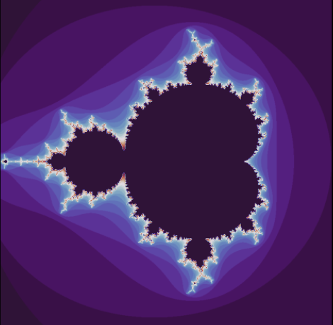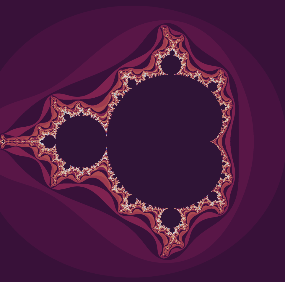:::The Mandelbrot set is a perfect example of how a simple rule can produce incredible complexity. At it's core the set is generated by iterating a quadratic equation, $f(z) = z^2 +c$, a simple formula whose highest exponent is $2$. To iterate a quadratic equation, choose a value for the variable, plug it into the function, then take the output and feed it back in again and again. The study of how recursive functions like these changes over time is central to a field of math called '**Complex Dynamical Systems**'.::: {style="font-family: Georgia; text-align: center; font-size: 17px"}***This subject emerged to comprehend the tangible world. What mathematical principles underlie the physical realities we observe? One of the earliest and most crucial examples is the solar system. We delve into dynamical systems, where a set of rules governs the evolution of a space over time, determining the movements and transformations within it.***:::## **Starting From The Root**Consider, for instance, the simple function $f(z)=z+1.$ In this context, we start with an initial value of $z$and evaluate the function. The result is then used as the new input parameter, and the function is evaluated again. This iterative process can be formally described as follows:1. Start with an initial value $z_0$.2. Compute $z_1=f(z_0)=z_0+1.$3. Use $z_1$ as the new input to compute $z_2=f(z_1)=z_1+1$, and so forth.Mathematically, this generates a sequence $\{z_n\}$ where $z_{n+1}=f(z_n)=z_{n}+1.$ This sequence clearly grows without bound, illustrating a simple yet profound example of iterative processes in dynamical systems. Such iterations lay the groundwork for understanding more complex functions and their behaviors, which ultimately lead to the rich, intricate patterns observed in fractals.Finally we'll see that,$$f(0) = 0+1 =1$$$$f(1) = 1+1 = 2$$$$f(2) = 2+1 =3 $$$$\text{and so on}\ldots$$The pattern here is straightforward: we evaluate the function, use the result as the new input, and re-evaluate the function. In this simple case, observing the pattern is easy, as the value increases by one with each iteration. While this example is quite basic, Mandelbrot extended this concept significantly further.Mandelbrot studied the function $f(z)=z^2+c$. To illustrate this with a simple example, let's choose $c=1$. Therefore,$$f(0) =1$$$$f(1) =2 $$$$f(2) = 5$$$$f(5) = 26$$It becomes apparent that the values will rapidly spiral out of control this time and diverge to infinity. Now let's try plugging in $-2$. Therefore,$$f(0) = -2$$$$f(-2) = 2$$$$f(2) =2$$This process will continually yield the value $2$. By repeatedly evaluating $f(2)$ and obtaining $2$, this iteration continues indefinitely. Consequently, this indicates that $-2$ lies on the boundary of the Mandelbrot set. To visualize this concept, let's draw a number line.```{r, eval=FALSE}# Create a sequence of numbers from -10 to 10numbers <- -2:2# Include the additional point 1/4additional_point <- 1/4# Plot the number lineplot(numbers, rep(0, length(numbers)), type = "n", xlab = "Number Line", ylab = "", yaxt = "n", bty = "n", main = "Number Line")# Add points to the number linepoints(numbers, rep(0, length(numbers)), pch = 16)# Add the additional pointpoints(additional_point, 0, pch = 16, col = "red")# Add labels below the pointstext(numbers, rep(-0.1, length(numbers)), labels = as.character(numbers), cex = 0.8)# Add label for the additional pointtext(additional_point, -0.1, labels = "1/4", col = "red", cex = 0.8)# Draw a horizontal line to represent the number lineabline(h = 0, col = "black")# Add arrows at the ends of the number linearrows(-10, 0, 10, 0, length = 0.1, code = 3)```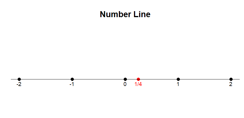{fig-align="center" width="378"}Here, $-2$ represents the largest magnitude that remains bounded and does not diverge to infinity when iterated from $0.$Let's try plugging, $c= -2.1$. Therefore,$$f(0) = 0^2 - 2.1 = -2.1$$$$f(-2.1) = (-2.1)^2 -2.1 = 2.41$$$$f(2.41) = (2.41)^2- 2.1 = 3.81$$$$f(3.81) = (3.81)^2 -2.1 =12.5$$Consider the parameter $c=−2.1.$ Through successive iterations of the function $f(z)=z^2+c$, we embark on a journey: $-2.1, 2.41, 3.81, 12.5$, and so forth, each value exponentially greater than the last. This vividly illustrates that the Mandelbrot set's boundary is encapsulated by $-2$, beyond which values spiral into infinity.Now, let's shift our focus to the positive boundary. Surprisingly, it resides at $c=\frac{1}{4}$, a less intuitive revelation. When we substitute $\frac{1}{4}$ for $c$, the sequence inches closer and closer to $\frac{1}{2}$, but never quite reaches it. Any departure beyond $\frac{1}{4}$ propels the sequence into an unbounded trajectory towards infinity.We may visually represent this by shading the region between these two values on a number line, symbolizing the real numbers encompassed by the Mandelbrot set. The interval stretches from $-2$ to $\frac{1}{4}$, delineating the scope of this fractal phenomenon. At this juncture, some individuals might conclude their exploration. However, what follows promises a journey into deeper complexity.```{r,eval=FALSE}# Create a sequence of numbers from -2 to 2numbers <- -2:2# Include the additional point 1/4additional_point <- 1/4# Plot the number lineplot(numbers, rep(0, length(numbers)), type = "n", xlab = "Number Line", ylab = "", yaxt = "n", bty = "n", main = "Number Line")# Add a shaded region between -2 and 0rect(-2, -0.05, 0, 0.05, col = "yellow", border = NA)# Add points to the number linepoints(numbers, rep(0, length(numbers)), pch = 16)# Add the additional pointpoints(additional_point, 0, pch = 16, col = "red")# Add labels below the pointstext(numbers, rep(-0.1, length(numbers)), labels = as.character(numbers), cex = 0.8)# Add label for the additional pointtext(additional_point, -0.1, labels = "1/4", col = "red", cex = 0.8)# Draw a horizontal line to represent the number lineabline(h = 0, col = "black")# Add arrows at the ends of the number linearrows(-10, 0, 10, 0, length = 0.1, code = 3)```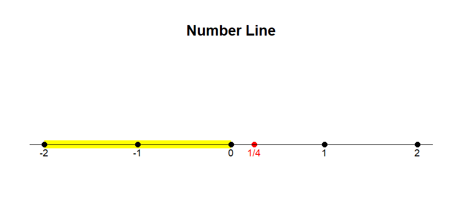{fig-align="center" width="416"}### **Analysing Julia Set**In the early $20^{\text{th}}$ century mathematicians, [Pierre Fatou](https://en.wikipedia.org/wiki/Pierre_Fatou) and [Gaston Julia](https://en.wikipedia.org/wiki/Gaston_Julia) set the stage for the discovery of the Mandelbrot set with their exploration of *Dynamical Systems.* To investigate these dynamical systems, mathematicians study intricate shapes which is known as **Julia Sets**. Julia Sets are produced by iterating a function of complex numbers.```{python}#| eval: falseimport numpy as np import matplotlib.pyplot as plt import numpy as npdef julia_set(h_range, w_range, max_iterations):''' A function to determine the values of the Julia set. Takes an array size specified by h_range and w_range, in pixels, along with the number of maximum iterations to try. Returns an array with the number of the last bounded iteration at each array value. '''# top left to bottom right y, x = np.ogrid[1.4: -1.4: h_range*1j, -1.4: 1.4: w_range*1j] z_array = x + y*1j a =-0.744+0.148j iterations_till_divergence = max_iterations + np.zeros(z_array.shape)for h inrange(h_range):for w inrange(w_range): z = z_array[h][w]for i inrange(max_iterations): z = z**2+ aif z * np.conj(z) >4: iterations_till_divergence[h][w] = ibreakreturn iterations_till_divergence# Example usage#result = julia_set(100, 100, 100)#print(result)plt.imshow(julia_set(1500, 1500, 1000), cmap='twilight_shifted')plt.axis('off')plt.show()```::: {layout-nrow="2"}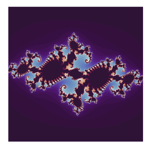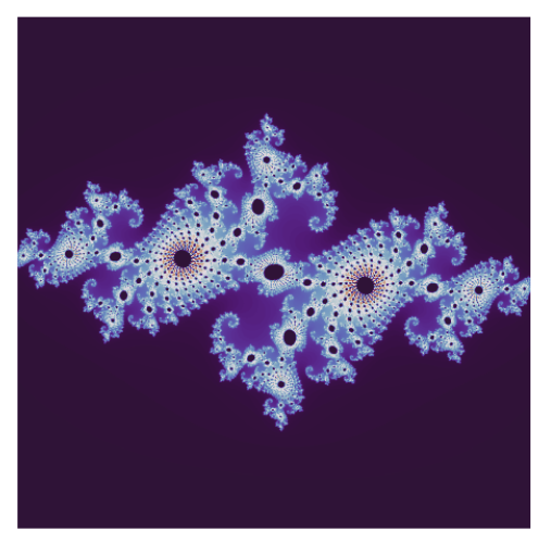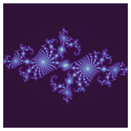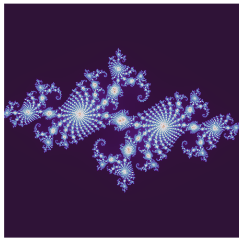:::A complex number is defined as the sum of two components, a real part and an imaginary part. Each complex number can be visualized as a point of a 2D plane. The real part is a number found on the number line. The imaginary part is a multiple of the $\sqrt{-1}$, which the mathematicians write as $i$. Despite the name, imaginary numbers play a vital role in solving real-world problems. To construct Julia Set, start with a simple quadratic equation $f(z) = z^2 +c$```{r,eval=FALSE}# Load the necessary librarylibrary(ggplot2)# Define a function to visualize complex numbersvisualize_complex_numbers <- function() { # Create a data frame of sample complex numbers complex_numbers <- data.frame( Real = c(-1, 0, 1, 1.5, -0.5, 2), Imaginary = c(1, -1, 0.5, -1.5, 1.5, -0.5) ) # Create a ggplot ggplot(complex_numbers, aes(x = Real, y = Imaginary)) + geom_point(color = "blue", size = 4) + # Plot points for complex numbers geom_hline(yintercept = 0, linetype = "dashed") + # Horizontal line at y=0 (real axis) geom_vline(xintercept = 0, linetype = "dashed") + # Vertical line at x=0 (imaginary axis) labs( title = "Visualization of Complex Numbers", x = "Real Part", y = "Imaginary Part" ) + theme_minimal() + theme( plot.title = element_text(hjust = 0.5) ) + annotate("text", x = 2, y = 0, label = "Real Axis", vjust = -1, color = "red") + annotate("text", x = 0, y = 1.5, label = "Imaginary Axis", hjust = -0.1, color = "red") + annotate("text", x = -1, y = 1, label = "-1 + 1i", hjust = 1.2, vjust = -1.2, color = "darkgreen") + annotate("text", x = 0, y = -1, label = "0 - 1i", hjust = 1.2, vjust = 1.2, color = "darkgreen") + annotate("text", x = 1, y = 0.5, label = "1 + 0.5i", hjust = -0.1, vjust = -1.2, color = "darkgreen") + annotate("text", x = 1.5, y = -1.5, label = "1.5 - 1.5i", hjust = -0.1, vjust = 1.2, color = "darkgreen") + annotate("text", x = -0.5, y = 1.5, label = "-0.5 + 1.5i", hjust = 1.2, vjust = -1.2, color = "darkgreen") + annotate("text", x = 2, y = -0.5, label = "2 - 0.5i", hjust = -0.1, vjust = 1.2, color = "darkgreen")}# Call the function to visualize complex numbersvisualize_complex_numbers()```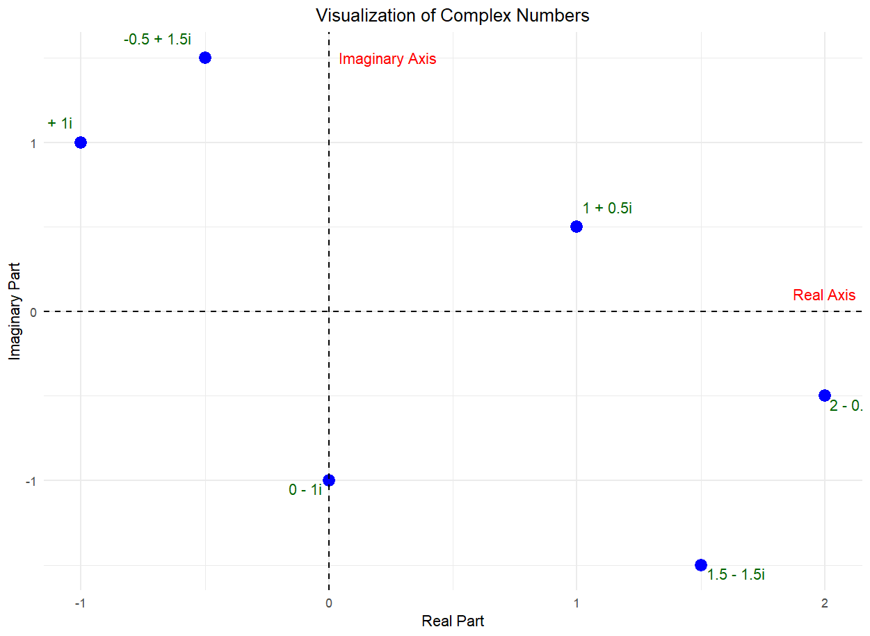{fig-align="center"}::: {style="font-family: Georgia; text-align: center; font-size: 17px"}**Choose a value for** $c=-1$ **for example. Then consider what happens when you iterate this equation for every possible starting value.**:::::: {style="color: navy; font-size: 18px; font-family: Garamond; text-align: center; border-radius: 3px; background-image: linear-gradient(#C3E5E5, #F6F7FC);"}**You repeatedly apply the function to the sequence of numbers that you're generating, and you ask whether or not that sequence is going off to infinity or whether it stay bounded.**\~ **Laura Demarco (Mathematician, Havard)**:::For some initial values, your equation speeds off to infinity while iterating like these.These values are not in the Julia set. When you start iterating from other initial values, you might instead get a sequence of outputs that stay bounded.```{r, eval=FALSE}# Load the necessary librarylibrary(ggplot2)# Define a function to visualize complex numbersvisualize_complex_numbers <- function() { # Create a data frame of sample complex numbers complex_numbers <- data.frame( Real = c(-1, 0, 1, 1.5, -0.5, 2, -2, 2.5, -1.5, 0.5), Imaginary = c(1, -1, 0.5, -1.5, 1.5, -0.5, 2, -2, 1.8, -2) ) # Identify which points diverge to infinity diverges = c(FALSE, TRUE, FALSE, TRUE, FALSE, TRUE, TRUE, FALSE, TRUE, FALSE) # Add labels in the form of complex numbers complex_numbers$Labels <- paste0(complex_numbers$Real, ifelse(complex_numbers$Imaginary >= 0, "+", ""), complex_numbers$Imaginary, "i") # Create a ggplot ggplot(complex_numbers, aes(x = Real, y = Imaginary)) + geom_point(aes(color = diverges), size = 4) + # Plot points for complex numbers with color indicating divergence geom_text(aes(label = Labels), vjust = -1.5, color = "black") + # Add labels scale_color_manual(values = c("blue", "red"), labels = c("Bounded", "Diverges")) + # Color and legend for points geom_hline(yintercept = 0, linetype = "dashed") + # Horizontal line at y=0 (real axis) geom_vline(xintercept = 0, linetype = "dashed") + # Vertical line at x=0 (imaginary axis) labs( title = "Visualization of Complex Numbers", x = "Real Part", y = "Imaginary Part", color = "Point Type" ) + theme_minimal() + theme( plot.title = element_text(hjust = 0.5) ) + annotate("text", x = 2, y = 0, label = "Real Axis", vjust = -1, color = "red") + annotate("text", x = 0, y = 1.5, label = "Imaginary Axis", hjust = -0.1, color = "red") + coord_fixed(ratio = 1, xlim = c(-3, 3), ylim = c(-3, 3)) # Adjust plot limits}# Call the function to visualize complex numbersvisualize_complex_numbers()# Load the necessary librarylibrary(ggplot2)# Define a function to visualize complex numbers and their iterationsvisualize_complex_numbers <- function() { # Create a data frame of sample complex numbers complex_numbers <- data.frame( Real = c(-1, 0, 1, 1.5, -0.5, 2, -2, 2.5, -1.5, 0.5), Imaginary = c(1, -1, 0.5, -1.5, 1.5, -0.5, 2, -2, 1.8, -2) ) # Identify which points diverge to infinity diverges <- c(FALSE, TRUE, FALSE, TRUE, FALSE, TRUE, TRUE, FALSE, TRUE, FALSE) # Add labels in the form of complex numbers complex_numbers$Labels <- paste0(complex_numbers$Real, ifelse(complex_numbers$Imaginary >= 0, "+", ""), complex_numbers$Imaginary, "i") # Simulate iterations by adding more data points # Here we add a few iterations to demonstrate the idea iterations <- data.frame( Real = c(-1, -0.5, -0.5, 0, 0, 1, 1, 1.5, 1.5, -0.25, -0.25, 0.75, 0.75, 2, 2, -2, -2, -1.5, -1.5, 2.5, 2.5, -1.5, -1.5, 0.5, 0.5, 0.75), Imaginary = c(1, 0.5, 0.5, -1, -1, 0, 0, 1.5, 1.5, -0.75, -0.75, 0.25, 0.25, -0.5, -0.5, 2, 2, 1.8, 1.8, -2, -2, 0.9, 0.9, -2, -2, -1), Group = rep(1:13, each = 2) # Grouping for lines ) # Create a ggplot ggplot(complex_numbers, aes(x = Real, y = Imaginary)) + geom_point(aes(color = diverges), size = 4) + # Plot points for complex numbers with color indicating divergence geom_text(aes(label = Labels), vjust = -1.5, color = "black") + # Add labels geom_path(data = iterations, aes(x = Real, y = Imaginary, group = Group), color = "purple", linetype = "longdash") + # Connect iteration points scale_color_manual(values = c("blue", "red"), labels = c("Bounded", "Diverges")) + # Color and legend for points geom_hline(yintercept = 0, linetype = "dashed") + # Horizontal line at y=0 (real axis) geom_vline(xintercept = 0, linetype = "dashed") + # Vertical line at x=0 (imaginary axis) labs( title = "Visualization of Complex Numbers", x = "Real Part", y = "Imaginary Part", color = "Point Type" ) + theme_minimal() + theme( plot.title = element_text(hjust = 0.5) ) + annotate("text", x = 2, y = 0, label = "Real Axis", vjust = -1, color = "red") + annotate("text", x = 0, y = 1.5, label = "Imaginary Axis", hjust = -0.1, color = "red") + coord_fixed(ratio = 1, xlim = c(-3, 3), ylim = c(-3, 3)) # Adjust plot limits}# Call the function to visualize complex numbersvisualize_complex_numbers()```::: {layout-ncol="2"}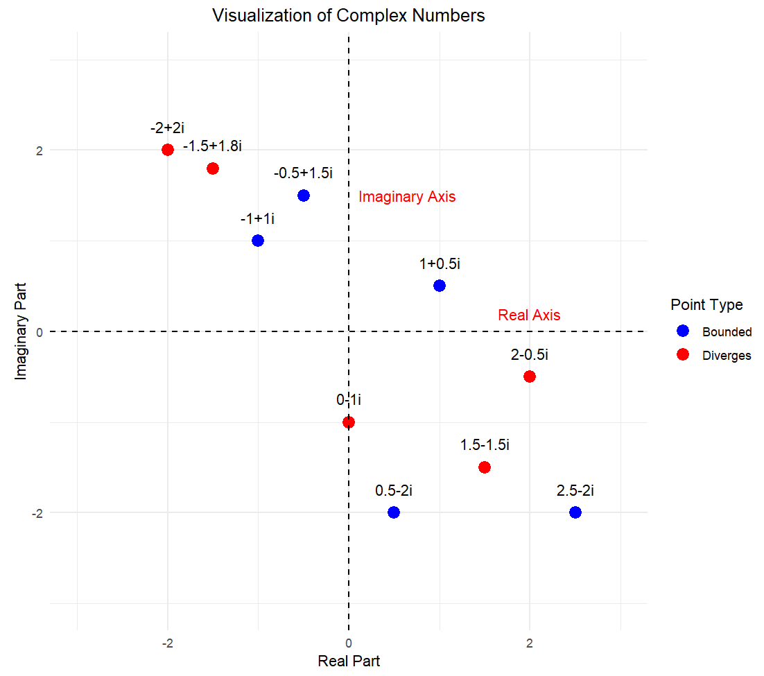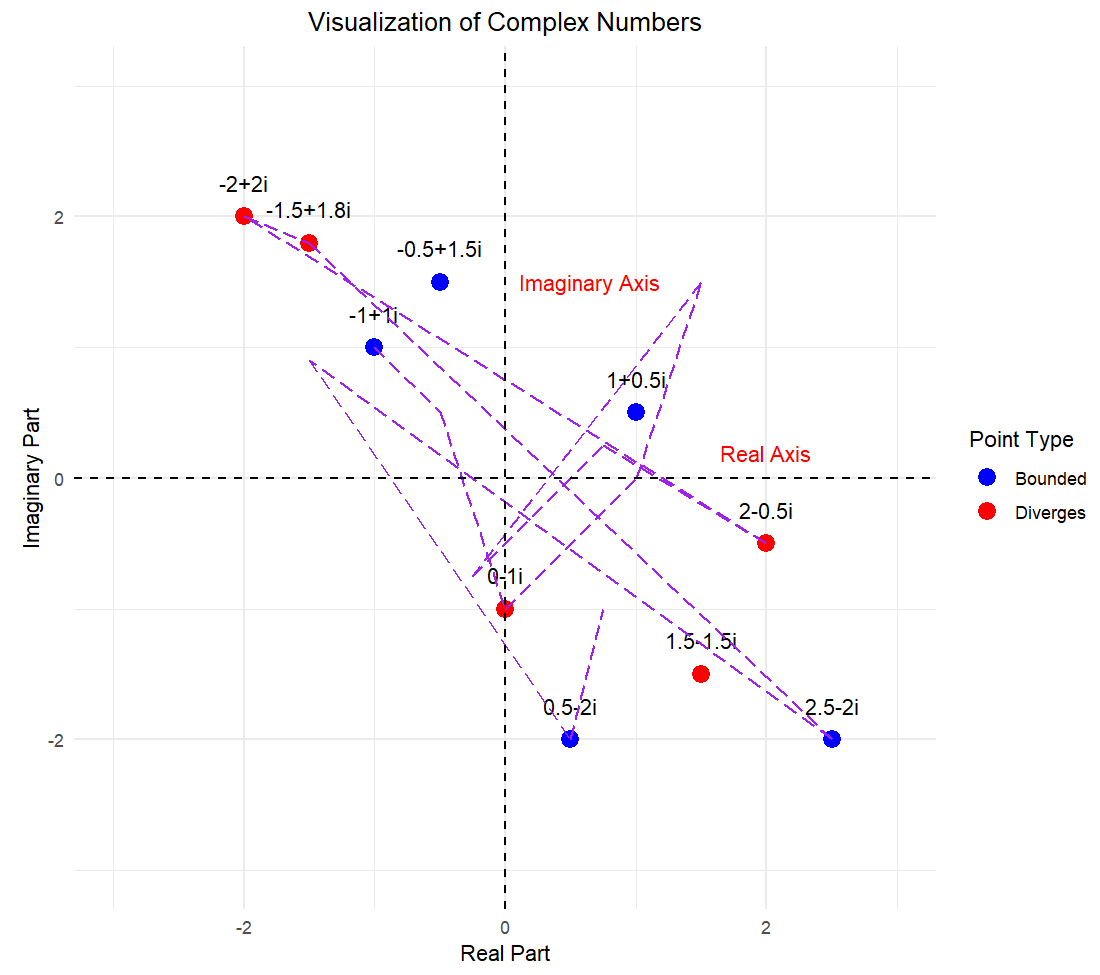:::::: {style="color: navy; font-size: 18px; font-family: Garamond; text-align: center; border-radius: 3px; background-image: linear-gradient(#C3E5E5, #F6F7FC);"}**When something comes back to itself, we often call that recurrent behaviour, & that's where the complexity arises.**:::```{r,message=FALSE,warning=FALSE}# Load the necessary librarylibrary(plotly)# Define a function to visualize complex numbers and their iterationsvisualize_complex_numbers_plotly <- function() { # Create a data frame of sample complex numbers complex_numbers <- data.frame( Real = c(-1, 0, 1, 1.5, -0.5, 2, -2, 2.5, -1.5, 0.5), Imaginary = c(1, -1, 0.5, -1.5, 1.5, -0.5, 2, -2, 1.8, -2), Diverges = c(FALSE, TRUE, FALSE, TRUE, FALSE, TRUE, TRUE, FALSE, TRUE, FALSE) ) # Add labels in the form of complex numbers complex_numbers$Labels <- paste0(complex_numbers$Real, ifelse(complex_numbers$Imaginary >= 0, "+", ""), complex_numbers$Imaginary, "i") # Simulate iterations by adding more data points # Here we add a few iterations to demonstrate the idea iterations <- data.frame( Real = c(-1, -0.5, -0.5, 0, 0, 1, 1, 1.5, 1.5, -0.25, -0.25, 0.75, 0.75, 2, 2, -2, -2, -1.5, -1.5, 2.5, 2.5, -1.5, -1.5, 0.5, 0.5, 0.75), Imaginary = c(1, 0.5, 0.5, -1, -1, 0, 0, 1.5, 1.5, -0.75, -0.75, 0.25, 0.25, -0.5, -0.5, 2, 2, 1.8, 1.8, -2, -2, 0.9, 0.9, -2, -2, -1), Group = rep(1:13, each = 2) # Grouping for lines ) # Create a plotly plot fig <- plot_ly() %>% add_markers(data = complex_numbers[complex_numbers$Diverges == FALSE,], x = ~Real, y = ~Imaginary, text = ~Labels, textposition = 'top center', marker = list(size = 10, color = 'blue'), hoverinfo = 'text', name = 'Bounded') %>% add_markers(data = complex_numbers[complex_numbers$Diverges == TRUE,], x = ~Real, y = ~Imaginary, text = ~Labels, textposition = 'top center', marker = list(size = 10, color = 'red'), hoverinfo = 'text', name = 'Diverges') %>% add_lines(data = iterations, x = ~Real, y = ~Imaginary, line = list(color = 'purple', dash = 'dash'), split = ~Group, showlegend = FALSE) %>% layout(title = "Visualization of Complex Numbers", xaxis = list(title = "Real Part", range = c(-3, 3), zeroline = TRUE, zerolinewidth = 1, zerolinecolor = 'black'), yaxis = list(title = "Imaginary Part", range = c(-3, 3), zeroline = TRUE, zerolinewidth = 1, zerolinecolor = 'black'), shapes = list( list(type = "line", x0 = -3, x1 = 3, y0 = 0, y1 = 0, line = list(dash = 'dash')), list(type = "line", x0 = 0, x1 = 0, y0 = -3, y1 = 3, line = list(dash = 'dash')) ), annotations = list( list(x = 2, y = 0, text = "Real Axis", showarrow = FALSE, font = list(color = "red")), list(x = 0, y = 1.5, text = "Imaginary Axis", showarrow = FALSE, font = list(color = "red")) )) # Display the plot fig}# Call the function to visualize complex numbersvisualize_complex_numbers_plotly()```The boundary between points that stay bounded and those that don't is a Julia set. You can fill it in by including all the bounded values.```{r,eval=FALSE}library(Julia)imageN <- 2000centre <- 0.0L <- 4.0C <- -0.8 + 0.156iimage_matrix <- JuliaImage(imageN, centre, L, C)par(mar=c(0, 0, 0, 0))image(image_matrix[550:1450, 200:1800], col=hcl.colors(2000, palette="Roma"), axes=FALSE, useRaster=TRUE)```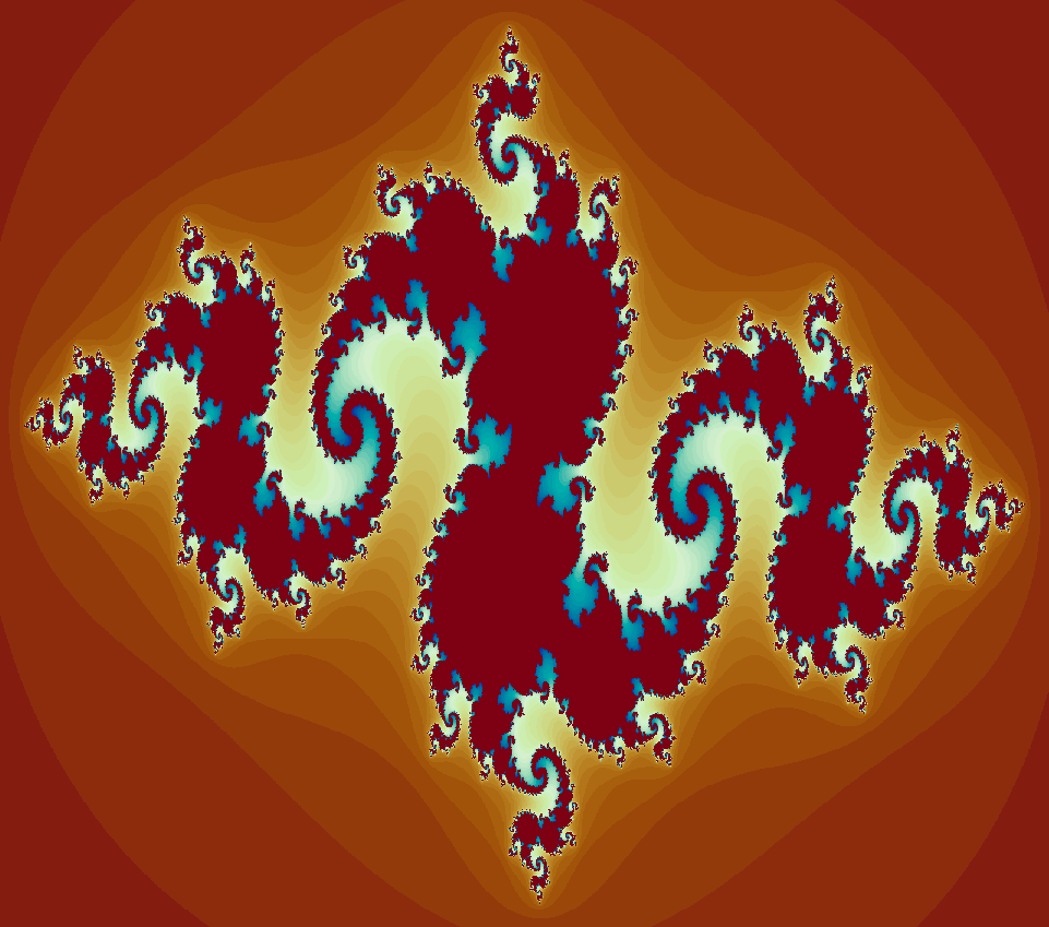{fig-align="center" width="560"}Different quadratic equations generate a wide range of filled Julia sets. From basic Blobs to intricate twisting tendrils.```{python}#| eval: falseimport argparseimport numpy as npimport cv2from tqdm import tqdmdef generate_colors(n): palette = [(0, 0, 0)] img = np.zeros([1, 1, 3], dtype=np.uint8)for i inrange(n): img[:] = ((i/n) *255, 255*0.85, 255) rgb = cv2.cvtColor(img, cv2.COLOR_HSV2BGR) palette.append((rgb[0,0][0], rgb[0,0][1], rgb[0,0][2]))return palettedef interpolate(c1, c2, steps): delta1 = (c2[0] - c1[0]) / steps delta2 = (c2[1] - c1[1]) / steps res = [] cc1 = c1[0] cc2 = c1[1]for i inrange(steps): res.append((cc1, cc2)) cc1 += delta1 cc2 += delta2return resdef process_julia(max_iter, c, palette, width, height): w, h, zoom = width, height, 0.7 move_x =0.0 move_y =0.0 img = np.zeros([h, w, 3], dtype=np.uint8) c_x = c[0] c_y = c[1]for x inrange(w):for y inrange(h): zx =1.5* (x - w /2) / (0.5* zoom * w) + move_x zy =1.0* (y - h /2) / (0.5* zoom * h) + move_y i = max_iterwhile zx * zx + zy * zy <20and i >1: tmp = zx * zx - zy * zy + c_x zy, zx =2.0* zx * zy + c_y, tmp i -=1 index = (i *len(palette)) // max_iter img[y, x] = (palette[index][0], palette[index][1], palette[index][2]) cv2.imshow('', img) cv2.waitKey(1)return imgif__name__=='__main__': parser = argparse.ArgumentParser() parser.add_argument('-o', '--output', default='interpolate_Julia.mp4', type=str, help='resulting video') parser.add_argument('-i', '--iterations', default=100, type=int, help='number of iterations') args = parser.parse_args()print(args) width =800 height =600 interps = [] num_iter = args.iterations interps.append(interpolate((-0.16, 1.0405), (-0.722, 0.246), num_iter)) interps.append(interpolate((-0.722, 0.246), (-0.235125, 0.827215), num_iter)) interps.append(interpolate((-0.235125, 0.827215),(-1.25066, 0.02012), num_iter)) interps.append(interpolate((-1.25066, 0.02012), (-0.748, 0.1), num_iter)) interps.append(interpolate((-0.748, 0.1), (-0.16, 1.0405), num_iter)) pbar = tqdm(total=(num_iter *len(interps))) palette = generate_colors(2000) fourcc = cv2.VideoWriter_fourcc('F', 'M', 'P', '4') out_cutter_name = args.output fps =24 out = cv2.VideoWriter(out_cutter_name, fourcc, fps, (width, height))for interp in interps:for p in interp: r = process_julia(num_iter, p, palette, width, height) out.write(r) pbar.update(1) out.release()```{{< video interpolate.mp4 >}}Filled Julia sets can be divided into two categories. Sets are connected so that you can draw a line from one point to another without lifting your pen. Sets where points look like scattered pieces of dust are disconnected.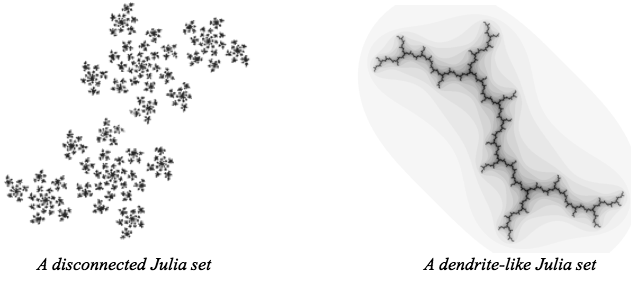{fig-align="center" width="524"}### **Elementary Complex Number**Let's quickly explore the realm of complex numbers. The square root function identifies a number which, when multiplied by itself, yields the number under the radical. For instance, $\sqrt{4}$ implies that since $2$ times itself is $4$, $\sqrt{4}$ is $2$.::: {style="font-family: Georgia; text-align: center; font-size: 16px"}***Now, let's consider the square root of a negative number. For example, what if we have*** $\sqrt{-4}$***? Can you identify a number which, when multiplied by itself, equals*** $-4$***?***:::The answer is you can't, because there are no real numbers that satisfy this condition. This is because the square of any real number is always non-negative.::: {style="font-family: Georgia; text-align: center; font-size: 16px"}***Similar questions arise with*** $\sqrt{−1}$***. What is the square root of*** $-1$***?***:::The answer is that there are no real numbers that satisfy this condition. To address this, mathematicians introduced the concept of imaginary numbers. The square root of -1 is defined as $i$, where $i$ is the imaginary unit. Also, now we can answer about $\sqrt{-4}$ i.e., $\sqrt{-4} = 2i \times2i = (2.2) \times (i.i) = -4$.## Extension of $f(z) = z^2 +c$ With Imaginary NumberSo, Mandelbrot wanted to Inlcude imaginary numbers as well in his analysis of his function.$$f(z) = z^2 +c$$Let's try plug in $i$ for $c$ i.e., $c =i$.$$f(0) = i $$$$f(i) = (i)^2 +1 = -1+i$$$$f(-1+i) = (-1+i)^2 + i = -i$$Continuing the iterations by hand becomes increasingly complex, so we will pause here. It's important to note that $i$ is not included in the Mandelbrot set, as this function diverges to infinity. To visualize this, we can set up an imaginary number line. The bounds for this function are approximately $-0.6i$ & $0.6i$```{r,eval=FALSE}# Set up the plot area focusing on the imaginary part horizontallyplot(0, 0, type = "n", ylab = "", xlab = "Imaginary", xlim = c(-1, 1), ylim = c(-0.1, 0.1), yaxt = "n", main = "Imaginary Number Line")# Draw the imaginary number line from -i to iabline(h = 0, v = 0, col = "gray", lty = 2) # Reference lines at the real axisarrows(-1, 0, 1, 0, col = "black", length = 0.1) # Arrow from -i to i# Draw the shaded region from -0.6i to 0.6irect(-0.6, -0.02, 0.6, 0.02, col = "green", border = NA)# Mark -i and ipoints(-1, 0, pch = 16, col = "blue")text(-1, -0.05, labels = "-i", col = "blue")points(1, 0, pch = 16, col = "blue")text(1, -0.05, labels = "i", col = "blue")# Add labels for shaded regionpoints(-0.6, 0, pch = 16, col = "blue")text(-0.6, -0.05, labels = "-0.6i", col = "blue")points(0.6, 0, pch = 16, col = "blue")text(0.6, -0.05, labels = "0.6i", col = "blue")```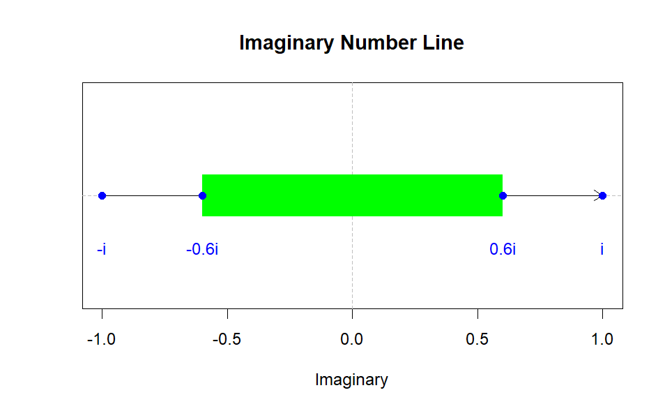{fig-align="center" width="443"}Many mathematicians might have stopped at this point, having defined the set for all real numbers and all imaginary numbers. However, there remains one more set of numbers to explore: complex numbers. Complex numbers consist of both a real and an imaginary component. This extension allows us to include complex numbers in our number system. A complex number can be expressed in the form $a+bi$, where $a$ and $b$ are real numbers. This could be something as simple as $1+i$ or as complex as $6+9i$. If we let 𝑐c be any complex number, it can represent any combination of real and imaginary components.::: {style="font-family: Georgia; text-align: center; font-size: 16px"}***Roughly*** $-0.2 +1.12i$ ***is included in the Mandelbrot set***:::But where do we place this on the number line? We can't simply put it above $−0.2$ because we have $0.2+1.12i$, where the real part is $−0.2.$ If only there were some way to simultaneously represent both real and imaginary components. We need something like this:```{r,eval=FALSE}# Set up the plot areaplot(0, 0, type = "n", xlab = "Real", ylab = "Imaginary", xlim = c(-2, 2), ylim = c(-3, 1), main = "Number Line")# Draw the imaginary number line from -3i to 1iabline(h = 0, v = 0, col = "gray", lty = 2) # Reference lines at real and imaginary axesarrows(0, -3, 0, 1, col = "black", length = 0.1) # Arrow from -3i to 1i# Draw the real number line from -2 to 2arrows(-2, 0, 2, 0, col = "black", length = 0.1) # Arrow from -2 to 2# Draw the shaded region from -2 to 0 on the real number linerect(-2, -0.05, 0, 0.05, col = "yellow", border = NA)# Draw the shaded region from -0.6i to 0.6i on the imaginary number linerect(-0.05, -0.6, 0.05, 0.6, col = "green", border = NA)# Mark -i and i on the imaginary axispoints(0, -1, pch = 16, col = "blue")text(0.1, -1, labels = "-i", col = "blue")points(0, 1, pch = 16, col = "blue")text(0.1, 1, labels = "i", col = "blue")# Add labels for shaded regions on the imaginary axispoints(0, -0.6, pch = 16, col = "blue")text(0.1, -0.6, labels = "-0.6i", col = "blue")points(0, 0.6, pch = 16, col = "blue")text(0.1, 0.6, labels = "0.6i", col = "blue")# Add labels for shaded regions on the real axispoints(-2, 0, pch = 16, col = "blue")text(-2, 0.1, labels = "-2", col = "blue")points(0, 0, pch = 16, col = "blue")text(0, 0.1, labels = "0", col = "blue")# Mark 1/4 on the real axispoints(0.25, 0, pch = 16, col = "red")text(0.25, 0.1, labels = "1/4", col = "red")# Load the necessary librarylibrary(ggplot2)# Create a data frame for the points and labelspoints_data <- data.frame( x = c(0, 0, 0, 0, 0.25, -2, 0), y = c(-1, 1, -0.6, 0.6, 0, 0, 0), label = c("-i", "i", "-0.6i", "0.6i", "1/4", "-2", "0"), color = c("blue", "blue", "blue", "blue", "red", "blue", "blue"))# Create the base plotp <- ggplot() + # Add the real number line geom_segment(aes(x = -2, y = 0, xend = 2, yend = 0), arrow = arrow(length = unit(0.1, "inches")), color = "black") + # Add the imaginary number line geom_segment(aes(x = 0, y = -3, xend = 0, yend = 1), arrow = arrow(length = unit(0.1, "inches")), color = "black") + # Add the shaded region on the real number line annotate("rect", xmin = -2, xmax = 0, ymin = -0.05, ymax = 0.05, alpha = 0.2, fill = "yellow") + # Add the shaded region on the imaginary number line annotate("rect", xmin = -0.05, xmax = 0.05, ymin = -0.6, ymax = 0.6, alpha = 0.2, fill = "green") + # Add the points and labels geom_point(data = points_data, aes(x = x, y = y, color = color), size = 3) + geom_text(data = points_data, aes(x = x, y = y, label = label, color = color), hjust = 1.2, vjust = -0.5, size = 4) + # Set the axis labels and title labs(x = "Real", y = "Imaginary", title = "Number Line") + # Set the plot limits xlim(-2, 2) + ylim(-3, 1) + # Customize the theme theme_minimal() + theme(legend.position = "none")# Display the plotprint(p)```::: {layout-ncol="2"}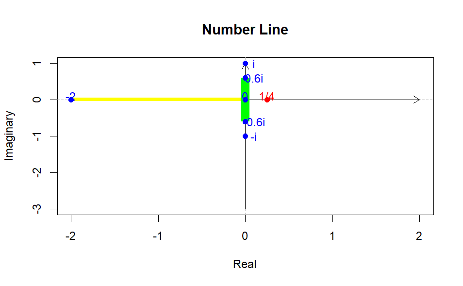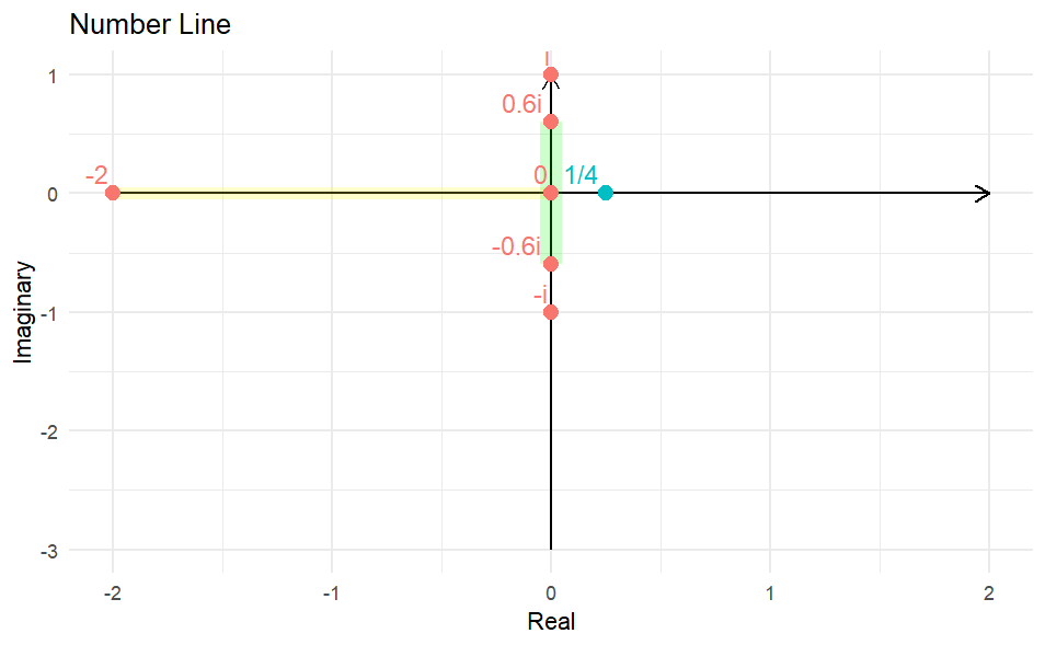:::In this complex plane, we can plot complex numbers in the form $a+bi$. The horizontal axis (real axis) represents the real part $a$, and the vertical axis (imaginary axis) represents the imaginary part $bi$. In this complex plane, each point $(a,b)$ corresponds to the complex number $a+bi$. This way, both the real and imaginary parts of the number can be viewed together.```{r}#| eval: false# Load the necessary librarylibrary(ggplot2)# Create a data frame for plotting the axes and labelsaxes_data <-data.frame(x =c(3.5, 0),y =c(0, 3.5),label =c("Real Part", "Imaginary Part"),hjust =c(0.5, -0.1),vjust =c(-0.5, 0.5))# Create the base plotp <-ggplot() +# Add the real axisgeom_segment(aes(x =-3, y =0, xend =3, yend =0), arrow =arrow(length =unit(0.2, "inches")), color ="black") +# Add the imaginary axisgeom_segment(aes(x =0, y =-3, xend =0, yend =3), arrow =arrow(length =unit(0.2, "inches")), color ="black") +# Add axis labelsgeom_text(data = axes_data, aes(x = x, y = y, label = label, hjust = hjust, vjust = vjust), size =5) +# Set the plot limitsxlim(-3.5, 3.5) +ylim(-3.5, 3.5) +# Customize the themetheme_minimal() +theme(axis.title =element_blank(),axis.text =element_blank(),axis.ticks =element_blank())# Display the plotprint(p)```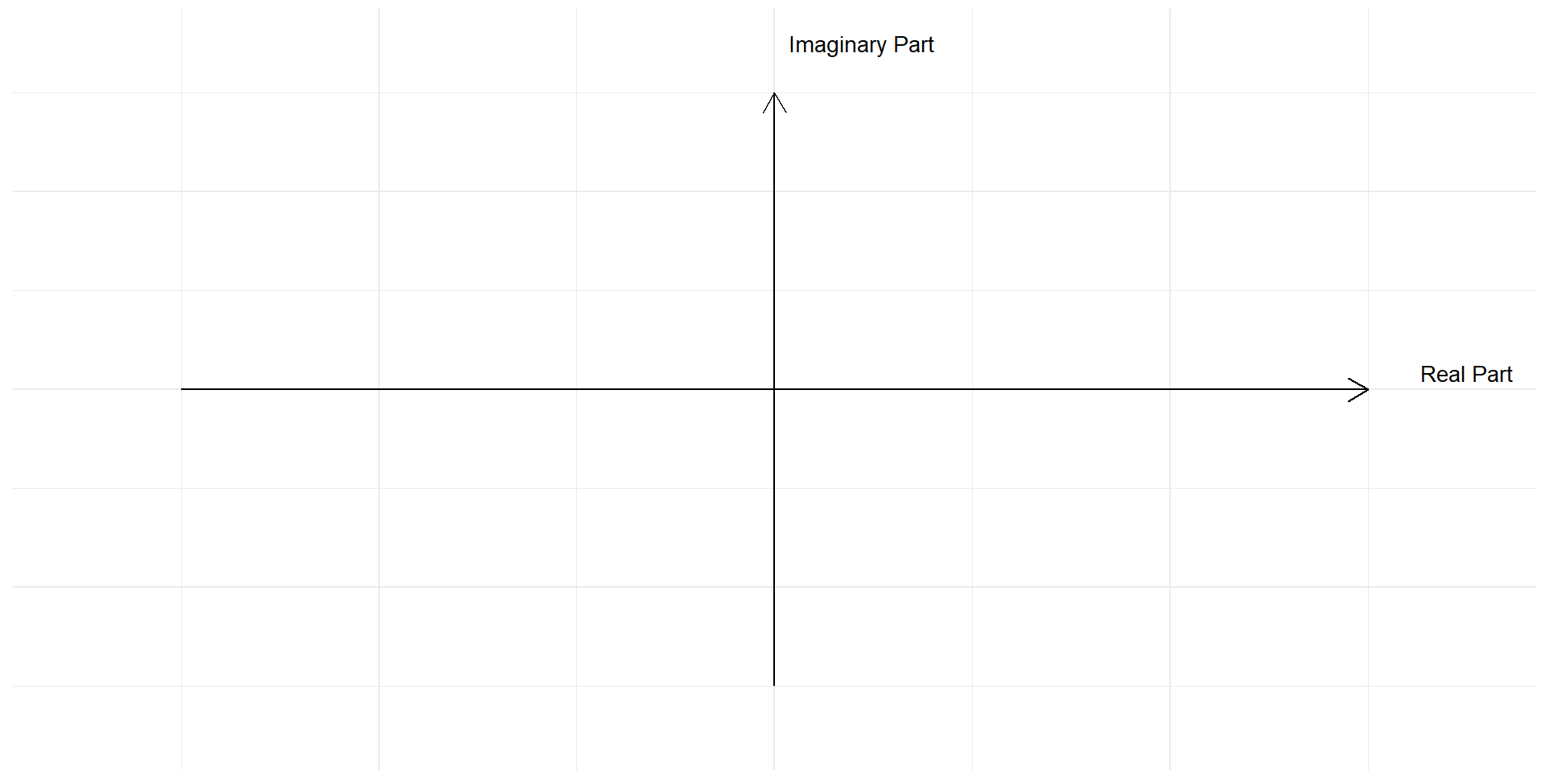{fig-align="center" width="600"}Given this framework, we are equipped to graph the Mandelbrot set. The Mandelbrot set consists of all complex numbers $c$ for which the iterative sequence defined by the recurrence relation $z_{n+1} = z_n^2+c$ (with $z_0=0$ ) does not diverge to infinity. Mathematically, the Mandelbrot set is the set of all $c$ in the complex plane such that the magnitude of $z_n$ remains bounded as $n$ approaches infinity. This intricate and beautiful set reveals the boundary between stability and chaos in complex dynamics, showcasing both self-similarity and fractal structure.# **The Discovery of The Mandelbrot Set**The first rough plot of the Mandelbrot set appeared in a 1978 paper by the mathematicians Robert Brooks and J. Peter Matelski. Soon after Benoit Mandelbrot, a researcher at IBM, who had access to more computing power, also discovered the set. This led to further explorations. These early computer graphics were crude, but the patterns revealed the presence of something far more complex.::: {style="font-family: Georgia; text-align: center; font-size: 17px"}**Even with fuzzy, poorly made pictures in the eighties, they were able to glean a lot of interesting insight into what was going on.**:::Mandelbrot went on to popularize his now-eponymous set to the world and became known as the father of fractals. Today mathematicians can use computers to explore the Mandelbrot set in far greater detail.::: {style="font-family: Georgia; text-align: center; font-size: 17px"}**As soon as you have the images just opens up this whole world.**:::The Mandelbrot set is drawn in the complex plane. It is constructed by iterating the same quadratic equations used to produce Julia sets. But here things are flipped around. Instead of iterating all values of $z$ for a fixed value of $c$, we fix the starting value of the iteration at $0$ and vary $c$. Value of $c$ where iteration of $z^2+c$ stays bounded inside the Mandelbrot set. while those that go to infinity are not.{{< video https://youtu.be/FFftmWSzgmk?si=iExoY0ghsEfgJ1-8 >}}Here we can select points inside the Mandelbrot set to reveal their corresponding filled Julia sets. The Mandelbrot set acts like an atlas, cataloguing the different kinds of Julia sets. Values of $c$ inside the Mandelbrot set are associated with connected Julia sets. While values outside the set correspond to disconnected dust.{{< video https://youtu.be/LqbZpur38nw?si=oqhgv2JAaBbpY7WE>}}The Mandelbrot set has many intriguing features, but the biggest mysteries lie in its complex fractal boundary. Zooming into different boundary regions reveals some astounding features. A valley of *seahorses, parades of elephants and a miniature version of the set itself.*::: {style="font-family: Georgia; text-align: center; font-size: 17px"}***So, we can sort of keep finding nests, a sequence of smaller and smaller Mandelbrot sets. all one inside of the next.***:::Here at the boundary, mathematicians are probing for answers.```{python}#| eval: falsefrom PIL import Imageimport colorsysimport mathpx, py =-0.7746806106269039, -0.1374168856037867#Tante RenateR =3max_iteration =2500w, h =1024,1024mfactor =0.5def Mandelbrot(x,y,max_iteration,minx,maxx,miny,maxy): zx =0 zy =0 RX1, RX2, RY1, RY2 = px-R/2, px+R/2,py-R/2,py+R/2 cx = (x-minx)/(maxx-minx)*(RX2-RX1)+RX1 cy = (y-miny)/(maxy-miny)*(RY2-RY1)+RY1 i=0while zx**2+ zy**2<=4and i < max_iteration: temp = zx**2- zy**2 zy =2*zx*zy + cy zx = temp + cx i +=1return idef gen_Mandelbrot_image(sequence): bitmap = Image.new("RGB", (w, h), "white") pix = bitmap.load()for x inrange(w):for y inrange(h): c=Mandelbrot(x,y,max_iteration,0,w-1,0,h-1) v = c**mfactor/max_iteration**mfactor hv =0.67-vif hv<0: hv+=1 r,g,b = colorsys.hsv_to_rgb(hv,1,1-(v-0.1)**2/0.9**2) r =min(255,round(r*255)) g =min(255,round(g*255)) b =min(255,round(b*255)) pix[x,y] =int(r) + (int(g) <<8) + (int(b) <<16) bitmap.save("Mandelbrot_"+str(sequence)+".jpg")R=3f =0.975RZF =1/1000000000000k=1while R>RZF:if k>100: break mfactor =0.5+ (1/1000000000000)**0.1/R**0.1print(k,mfactor) gen_Mandelbrot_image(k) R *= f k+=1```{{< video animation.mp4 >}}::: {style="font-family: Georgia; text-align: center; font-size: 17px"}***As you look at it, it sort of seems like one blob, but if you really ask, is it all connected? or maybe if we zoom in far enough, there's some separating piece.***:::# **Mandelbrot Locally Connected Conjecture(MLC)**This question is central to a 40-year-old problem called the *Mandelbrot Locally Connected Conjecture(MLC)*. If the set is locally connected, that means that no matter what point you choose to examine or how far you zoom in, the are will always look like one nice connected section.For example, if we closely examine a circle, we can see that it's locally connected a every point, but take a fine-toothed comb and zoom in while the comb is one connected shape, at close range, it can look disconnected. If mathematicians can prove that MLC is true then a complete understanding of the Mandelbrot set would be within reach.# **Normal Map Effect, Mercator Projection and Deep Zoom Images**## **Normalization, Distance Estimation and Boundary Detection**To visualize the Mandelbrot set with smooth colours, advanced colouring algorithms are employed. Techniques such as $e^{-|z|}-$smoothing, normalized iteration count, and exterior distance estimation are utilized. These methods are implemented using `NumPy` and complex matrices, as detailed in works by [*Javier Barrallo*](https://www.researchgate.net/profile/Javier-Barrallo) *&* *Damien M. Jones* ("[Coloring Algorithms for Dynamical Systems in the Complex Plane](https://www.mi.sanu.ac.rs/vismath/javier/index.html)") and [Arnaud Chéritat](https://en.wikipedia.org/wiki/Arnaud_Ch%C3%A9ritat) ("[Boundary detection methods via distance estimators](https://www.math.univ-toulouse.fr/~cheritat/wiki-draw/index.php/Mandelbrot_set#Boundary_detection_methods_via_distance_estimators)").Partial antialiasing is also applied to enhance boundary detection. The $e^{-|z|}-$smoothing technique ensures smooth transitions of colours based on the exponential decay of the distance from the Mandelbrot set boundary. Normalized iteration count allows for the differentiation of points based on how quickly they escape to infinity, and exterior distance estimation provides precise measurements of how far points are from the set’s boundary, thus aiding in accurate boundary depiction.```{python}#| eval: falseimport numpy as npimport matplotlib.pyplot as pltd, h =800, 500# pixel density (= image width) and image heightn, r =200, 500# number of iterations and escape radius (r > 2)x = np.linspace(0, 2, num=d+1)y = np.linspace(0, 2* h / d, num=h+1)A, B = np.meshgrid(x -1, y - h / d)C =2.0* (A + B *1j) -0.5Z, dZ = np.zeros_like(C), np.zeros_like(C)D, S, T = np.zeros(C.shape), np.zeros(C.shape), np.zeros(C.shape)for k inrange(n): M =abs(Z) < r S[M], T[M] = S[M] + np.exp(-abs(Z[M])), T[M] +1 Z[M], dZ[M] = Z[M] **2+ C[M], 2* Z[M] * dZ[M] +1plt.imshow(S **0.1, cmap=plt.cm.twilight_shifted, origin="lower")plt.savefig("Mandelbrot_set_1.png", dpi=200)N =abs(Z) >= r # normalized iteration countT[N] = T[N] - np.log2(np.log(np.abs(Z[N])) / np.log(r))plt.imshow(T **0.1, cmap=plt.cm.twilight_shifted, origin="lower")plt.savefig("Mandelbrot_set_2.png", dpi=200)N =abs(Z) >2# exterior distance estimationD[N] = np.log(abs(Z[N])) *abs(Z[N]) /abs(dZ[N])plt.imshow(D **0.1, cmap=plt.cm.twilight_shifted, origin="lower")plt.savefig("Mandelbrot_set_3.png", dpi=200)N, thickness = D >0, 0.01# boundary detectionD[N] = np.maximum(1- D[N] / thickness, 0)plt.imshow(D **2.0, cmap=plt.cm.binary, origin="lower")plt.savefig("Mandelbrot_set_4.png", dpi=200)```These sophisticated methods not only enhance the visual appeal of the Mandelbrot set but also provide deeper insights into its complex structure. The use of `NumPy` and complex matrices allows for efficient computation and visualization, making it possible to explore the detailed and intricate patterns of this fascinating fractal.::: {layout-nrow="2"}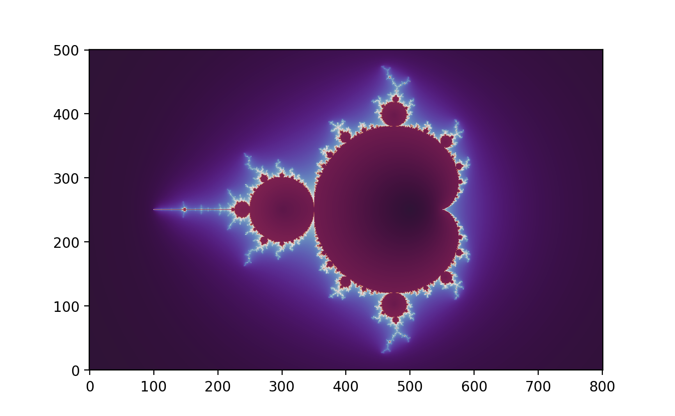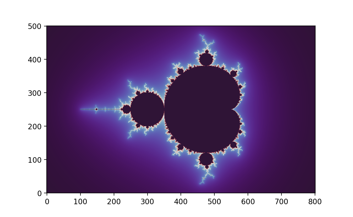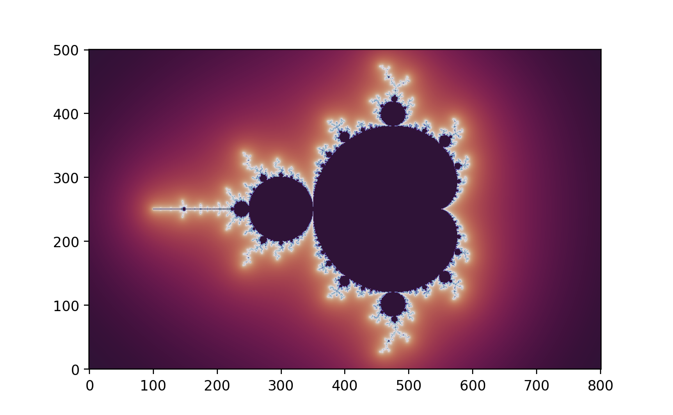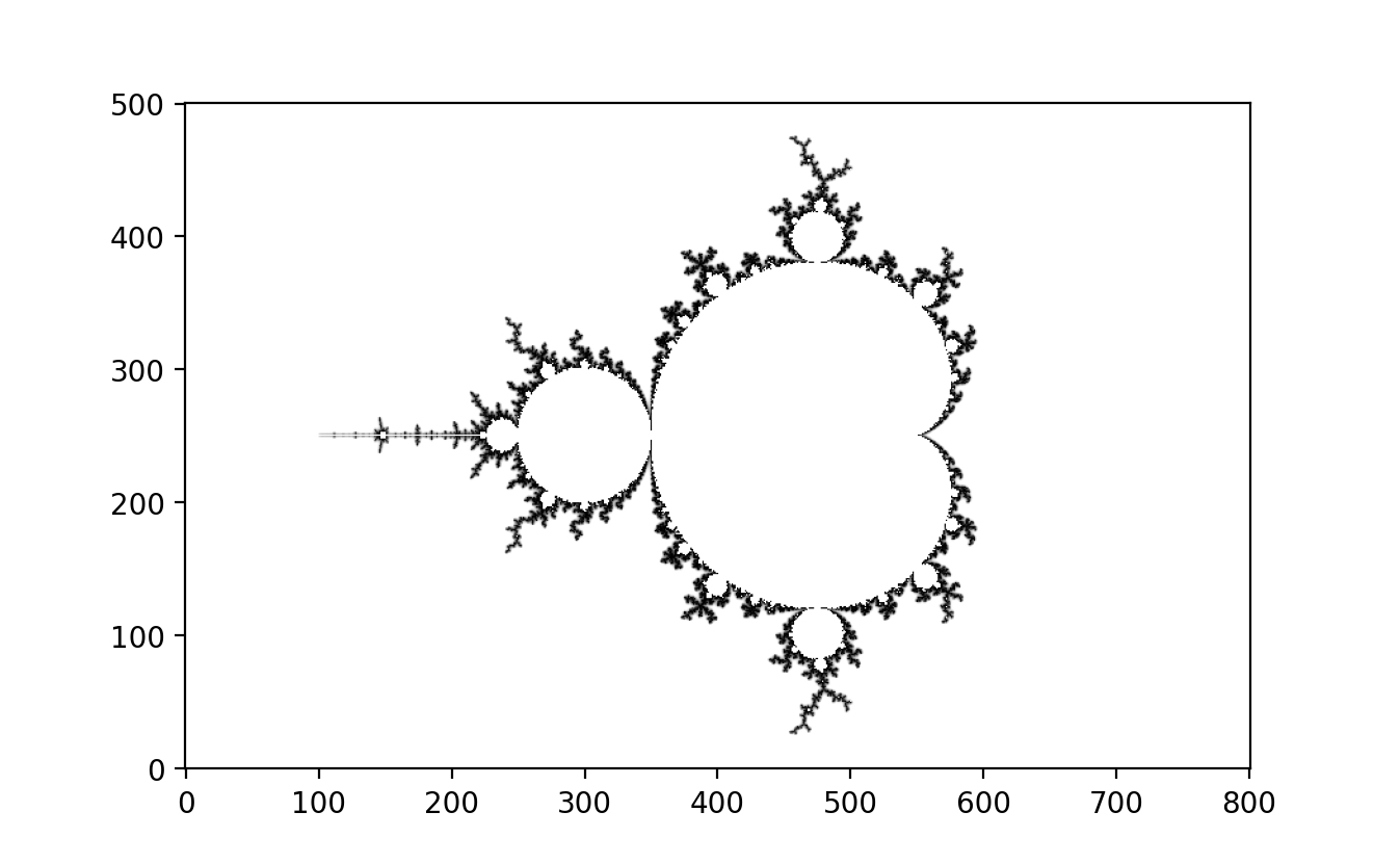:::## **Normal Map Effect and Stripe Average Coloring**The Mandelbrot set is often visualized using advanced techniques such as Normal Maps and Stripe Average Coloring, enhancing its visual representation. Developed by [Jussi Härkönen](https://www.linkedin.com/in/jussi-h%C3%A4rk%C3%B6nen-9b7b0638/?originalSubdomain=fi) and building on [Arnaud Chéritat's](https://en.wikipedia.org/wiki/Arnaud_Ch%C3%A9ritat) work, these methods significantly enrich the fractal's appearance.The Normal Map Effect simulates lighting by perturbing surface normals, giving the fractal a three-dimensional look. Stripe Average Coloring adds patterns to highlight complex boundaries. Due to the rapid growth of the second derivative, Stripe Average Coloring is most effective for iterations $n \leq 400.$To achieve stripe patterns similar to Arnaud Chéritat's:- Increase stripe density.- Use the cosine function ($\cos$) instead of sine function ($\sin$).- Apply a binary colormap for high contrast.### **Implementation Techniques**Using NumPy and complex matrices, these methods leverage normalized iteration count and exterior distance estimation for smooth transitions and precise boundary detection. Techniques like $e^{-|z|}-$smoothing ensure smooth color gradients based on exponential decay from the Mandelbrot set boundary.```{python}#| eval: false#Normal Map Effect and Stripe Average Coloringimport numpy as npimport matplotlib.pyplot as pltd, h =800, 500# pixel density (= image width) and image heightn, r =200, 500# number of iterations and escape radius (r > 2)direction, height =45.0, 1.5# direction and height of the lightdensity, intensity =4.0, 0.5# density and intensity of the stripesx = np.linspace(0, 2, num=d+1)y = np.linspace(0, 2* h / d, num=h+1)A, B = np.meshgrid(x -1, y - h / d)C = (2.0+1.0j) * (A + B *1j) -0.5Z, dZ, ddZ = np.zeros_like(C), np.zeros_like(C), np.zeros_like(C)D, S, T = np.zeros(C.shape), np.zeros(C.shape), np.zeros(C.shape)for k inrange(n): M =abs(Z) < r S[M], T[M] = S[M] + np.sin(density * np.angle(Z[M])), T[M] +1 Z[M], dZ[M], ddZ[M] = Z[M] **2+ C[M], 2* Z[M] * dZ[M] +1, 2* (dZ[M] **2+ Z[M] * ddZ[M])N =abs(Z) >= r # basic normal map effect and stripe average coloring (potential function)P, Q = S[N] / T[N], (S[N] + np.sin(density * np.angle(Z[N]))) / (T[N] +1)U, V = Z[N] / dZ[N], 1+ (np.log2(np.log(np.abs(Z[N])) / np.log(r)) * (P - Q) + Q) * intensityU, v = U /abs(U), np.exp(direction /180* np.pi *1j) # unit normal vectors and light vectorD[N] = np.maximum((U.real * v.real + U.imag * v.imag + V * height) / (1+ height), 0)plt.imshow(D **1.0, cmap=plt.cm.bone, origin="lower")plt.savefig("Mandelbrot_normal_map_1.png", dpi=200)N =abs(Z) >2# advanced normal map effect using higher derivatives (distance estimation)U = Z[N] * dZ[N] * ((1+ np.log(abs(Z[N]))) * np.conj(dZ[N] **2) - np.log(abs(Z[N])) * np.conj(Z[N] * ddZ[N]))U, v = U /abs(U), np.exp(direction /180* np.pi *1j) # unit normal vectors and light vectorD[N] = np.maximum((U.real * v.real + U.imag * v.imag + height) / (1+ height), 0)plt.imshow(D **1.0, cmap=plt.cm.afmhot, origin="lower")plt.savefig("Mandelbrot_normal_map_2.png", dpi=200)```::: {layout-ncol="2"}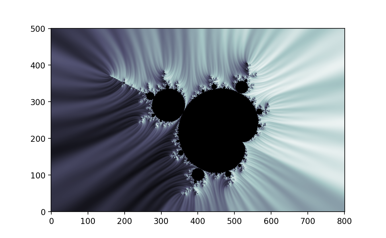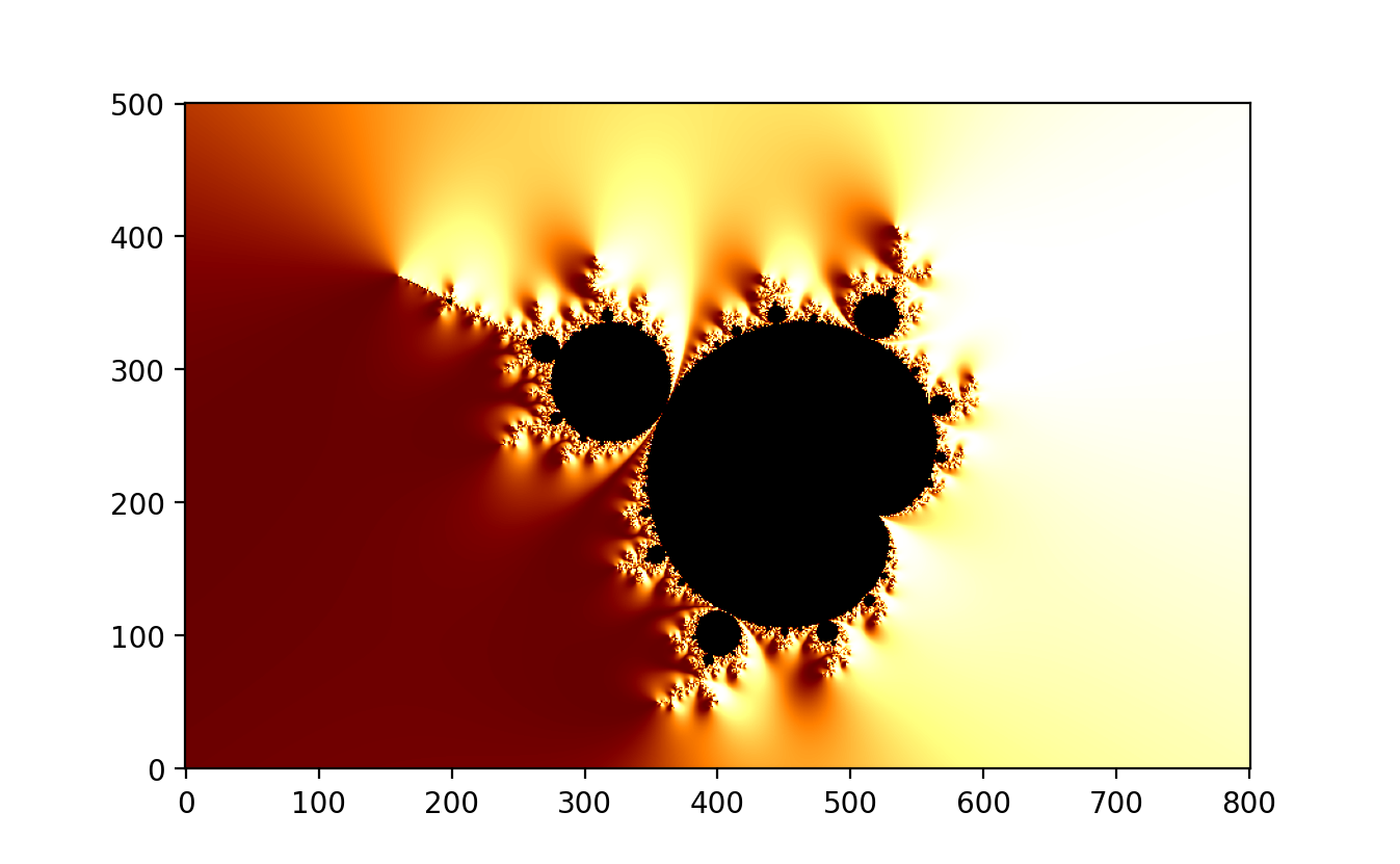:::### **Practical Applications**Platforms like Shadertoy showcase practical implementations of these methods, such as in sections "Mixing it all" and "Julia Stripes," allowing interactive visualizations of the Mandelbrot set. Normal Map Effect and Stripe Average Coloring enhance the visualization of the Mandelbrot set, revealing its intricate beauty and complexity. These advanced techniques provide deeper insights into fractal geometry and complex dynamics.## **Mercator Mandelbrot Maps and Zoom Images**A small modification in the code allows for the creation of Mercator maps of the Mandelbrot set, as demonstrated by [David Madore](https://perso.telecom-paristech.fr/madore/) and [Anders Sandberg](https://en.wikipedia.org/wiki/Anders_Sandberg). These maps offer a unique perspective on the fractal's structure, enabling detailed exploration and magnification. The maximum magnification achievable with this method is approximately:$$e^{2\pi. \frac{h}{d}} = e^{2\pi.5.5} \approx 535.5^{5.5} \approx 10^{15}$$This represents the maximum magnification for $64-$bit arithmetic. Anders Sandberg, however, employs a different scaling approach. He uses:$$10^{3.\frac{h}{d}} = 1000^{\frac{h}{d}}$$This scaling method results in images that appear slightly compressed compared to those generated using $e^{2\pi. \frac{h}{d}} \approx 535.5^{\frac{h}{d}}$. Despite this difference, the compression is minimal because:$$1000^{5.0} \approx 535.5^{5.5}$$With identical pixel density and maximum magnification, the height difference between the maps is only about $10$%.### **Zooming into the Mandelbrot Set & Julia Set**Zooming into the Mandelbrot set and Julia set reveals the intricate and infinitely complex nature of these famous fractals. The Mandelbrot set, plotted in the complex plane, is defined by iterating the function $f(z) = z^2+c$ and determining whether the sequence remains bounded. Each zoom into the Mandelbrot set unveils self-similar structures and increasingly detailed patterns, showcasing its fractal nature.Similarly, Julia sets are generated using a similar iterative process, but for each fixed complex parameter $c$. Each point in the complex plane is tested to see if the sequence remains bounded. Julia sets exhibit a variety of shapes, depending on the value of $c$, ranging from connected, cloud-like formations to disconnected, dust-like patterns.Advanced visualization techniques, such as deep zoom images and projections, enhance the exploration of these sets. These tools allow mathematicians and enthusiasts to delve into the fine details, revealing the endless complexity and beauty hidden within the Mandelbrot and Julia sets. This exploration not only serves as a source of aesthetic pleasure but also provides insights into the mathematical properties and dynamics of complex systems.#### **Zooming** $10^{13}$ **Times into Mandelbrot Set Animation**```{python}#| eval: falsefrom PIL import Imageimport colorsysimport mathpx, py =-0.7746806106269039, -0.1374168856037867#Tante RenateR =3max_iteration =2500w, h =1024,1024mfactor =0.5def Mandelbrot(x,y,max_iteration,minx,maxx,miny,maxy): zx =0 zy =0 RX1, RX2, RY1, RY2 = px-R/2, px+R/2,py-R/2,py+R/2 cx = (x-minx)/(maxx-minx)*(RX2-RX1)+RX1 cy = (y-miny)/(maxy-miny)*(RY2-RY1)+RY1 i=0while zx**2+ zy**2<=4and i < max_iteration: temp = zx**2- zy**2 zy =2*zx*zy + cy zx = temp + cx i +=1return idef gen_Mandelbrot_image(sequence): bitmap = Image.new("RGB", (w, h), "white") pix = bitmap.load()for x inrange(w):for y inrange(h): c=Mandelbrot(x,y,max_iteration,0,w-1,0,h-1) v = c**mfactor/max_iteration**mfactor hv =0.67-vif hv<0: hv+=1 r,g,b = colorsys.hsv_to_rgb(hv,1,1-(v-0.1)**2/0.9**2) r =min(255,round(r*255)) g =min(255,round(g*255)) b =min(255,round(b*255)) pix[x,y] =int(r) + (int(g) <<8) + (int(b) <<16) bitmap.save("Mandelbrot_"+str(sequence)+".jpg")R=3f =0.975RZF =1/1000000000000k=1while R>RZF:if k>100: break mfactor =0.5+ (1/1000000000000)**0.1/R**0.1print(k,mfactor) gen_Mandelbrot_image(k) R *= f k+=1```{{< video animation.mp4 >}}#### **Zooming** $10^{13}$ **Times into Julia Set Animation**```{python}#| eval: falsefrom PIL import Imageimport colorsyscx =-0.7269cy =0.1889R = (1+(1+4*(cx**2+cy**2)**0.5)**0.5)/2+0.001max_iteration =512print(R)w, h, zoom =1500,1500,1def julia(cx,cy,RZ,px,py,R,max_iteration,x,y,minx,maxx,miny,maxy): zx = (x-minx)/(maxx-minx)*2*RZ-RZ+px zy = (y-miny)/(maxy-miny)*2*RZ-RZ+py i=0while zx**2+ zy**2< R**2and i < max_iteration: temp = zx**2- zy**2 zy =2*zx*zy + cy zx = temp + cx i +=1return idef gen_julia_image(sequence,cx,cy,RZ): bitmap = Image.new("RGB", (w, h), "white") pix = bitmap.load()for x inrange(w):for y inrange(h):# smllaer: right,down c=julia(cx,cy,RZ,0.0958598997051,1.1501990019993,R,max_iteration,x,y,0,w-1,0,h-1) v = c/max_iteration hv =0.67-v*0.67 r,g,b = colorsys.hsv_to_rgb(hv,1,v/2+0.45) r =min(255,round(r*255)) g =min(255,round(g*255)) b =min(255,round(b*255)) pix[x,y] =int(r) + (int(g) <<8) + (int(b) <<16) bitmap.save("julia_"+str(sequence)+".jpg")# bitmap.show()f =0.95RZF =1/1000000000000RZ =1k=1while RZ>RZF:print(k,RZ) gen_julia_image(k,0.355,0.355,RZ) RZ *= f k+=1```{{< video zoomjulia.mp4 >}}### **Mathematical Insight**The Mercator projection, traditionally used for geographical maps, can be adapted to map the complex plane of the Mandelbrot set. The projection formula $e^{2\pi \cdot \frac{h}{d}}$ reflects the exponential growth in magnification as one zooms into the fractal. This exponential scaling is essential for revealing the intricate details of the Mandelbrot set, which are not apparent at lower magnifications. In contrast, Sandberg's use of the logarithmic scaling $10^{3 \cdot \frac{h}{d}}$ provides an alternative method for visualizing the fractal. This logarithmic approach, although slightly different, still captures the essential features of the Mandelbrot set, highlighting its complex boundaries and internal structures.The use of Mercator maps and innovative plotting techniques opens new avenues for exploring the Mandelbrot set. These methods reveal the fractal's rich and intricate structure, offering insights into its mathematical beauty. By leveraging different scaling approaches and visualization techniques, researchers can gain a deeper understanding of the complex dynamics underlying the Mandelbrot set. For further exploration, one can refer to works such as David Madore's "Mandelbrot set images and videos" and Anders Sandberg's "Mercator Mandelbrot Maps," which provide practical implementations and visualizations of these concepts.### **Practical Considerations**Creating high-quality zoom images of the Mandelbrot set requires careful consideration of computational limits. The maximum magnification achievable with 64-bit arithmetic imposes a constraint on the depth of zoom. This constraint necessitates efficient algorithms and data structures to handle the large numbers and extensive computations involved in rendering detailed fractal images.```{python}#| eval: false# Mercator Mandelbrot Maps and Zoom Imagesimport numpy as npimport matplotlib.pyplot as pltd, h =200, 1200# pixel density (= image width) and image heightn, r =8000, 10000# number of iterations and escape radius (r > 2)a =-.743643887037158704752191506114774# https://mathr.co.uk/web/m-location-analysis.htmlb =0.131825904205311970493132056385139# try: a, b, n = -1.748764520194788535, 3e-13, 800x = np.linspace(0, 2, num=d+1)y = np.linspace(0, 2* h / d, num=h+1)A, B = np.meshgrid(x * np.pi, y * np.pi)C =8.0* np.exp((A + B *1j) *1j) + (a + b *1j)Z, dZ = np.zeros_like(C), np.zeros_like(C)D = np.zeros(C.shape)for k inrange(n): M = Z.real **2+ Z.imag **2< r **2 Z[M], dZ[M] = Z[M] **2+ C[M], 2* Z[M] * dZ[M] +1N =abs(Z) >2# exterior distance estimationD[N] = np.log(abs(Z[N])) *abs(Z[N]) /abs(dZ[N])plt.imshow(D.T **0.05, cmap=plt.cm.nipy_spectral, origin="lower")plt.savefig("Mercator_Mandelbrot_map.png", dpi=200)X, Y = C.real, C.imag # zoom images (adjust circle size 100 and zoom level 20 as needed)R, c, z =100* (2/ d) * np.pi * np.exp(- B), min(d, h) +1, max(0, h - d) //20fig, ax = plt.subplots(2, 2, figsize=(12, 12))ax[0,0].scatter(X[1*z:1*z+c,0:d], Y[1*z:1*z+c,0:d], s=R[0:c,0:d]**2, c=D[1*z:1*z+c,0:d]**.5, cmap=plt.cm.nipy_spectral)ax[0,1].scatter(X[2*z:2*z+c,0:d], Y[2*z:2*z+c,0:d], s=R[0:c,0:d]**2, c=D[2*z:2*z+c,0:d]**.4, cmap=plt.cm.nipy_spectral)ax[1,0].scatter(X[3*z:3*z+c,0:d], Y[3*z:3*z+c,0:d], s=R[0:c,0:d]**2, c=D[3*z:3*z+c,0:d]**.3, cmap=plt.cm.nipy_spectral)ax[1,1].scatter(X[4*z:4*z+c,0:d], Y[4*z:4*z+c,0:d], s=R[0:c,0:d]**2, c=D[4*z:4*z+c,0:d]**.2, cmap=plt.cm.nipy_spectral)plt.savefig("Mercator_Mandelbrot_zoom.png", dpi=100)```::: {layout-ncol="2"}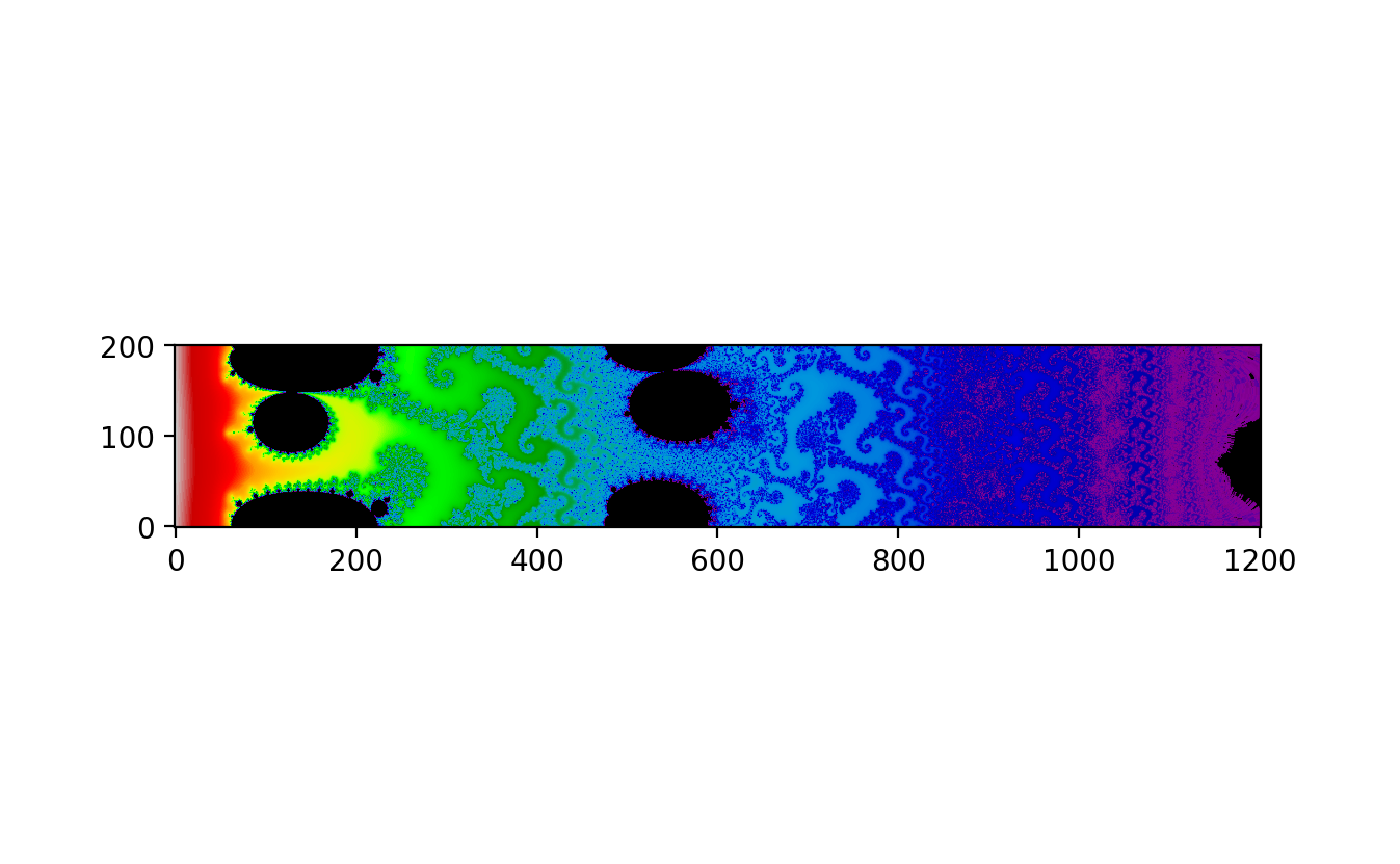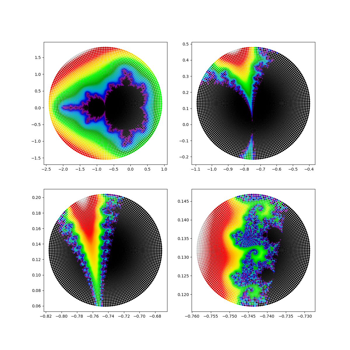:::## **Perturbation Theory and Deep Mercator Maps**For generating deep zoom images of the Mandelbrot set, a highly efficient technique involves calculating a single point with high precision and using perturbation theory to approximate all other points. This approach significantly reduces the computational burden while maintaining the accuracy of the fractal's intricate details.### **Mathematical Insight****Perturbation Theory:** Perturbation theory is a set of approximation schemes directly related to small changes in the known solutions of a problem. When applied to the Mandelbrot set, this theory allows us to use the high-precision calculation of a single point to estimate the behaviour of nearby points with standard accuracy. The primary advantage is that it minimizes the need for high-precision calculations across the entire image, which would otherwise be computationally prohibitive.$$z_{n+1}=z^2_n+c$$In the context of perturbation theory, the initial point $z$ is calculated with high precision. Then, small perturbations $\delta z$ are applied to approximate the positions of other points. The corrections needed to account for these perturbations are typically small, which makes this approach efficient.**Rebasing:** As the zoom level increases, small numerical errors can accumulate, potentially leading to glitches in the rendered image. Rebasing is a technique used to mitigate these errors. It involves periodically recalculating the base high-precision point and resetting the perturbation calculations to this new base. This step ensures that any accumulated errors are corrected, thereby maintaining the integrity of the deep zoom visualization.```{python}#| eval: false# Perturbation Theory and Deep Mercator Mapsimport numpy as npimport matplotlib.pyplot as pltimport decimal as dc # decimal floating point arithmetic with arbitrary precisiondc.getcontext().prec =80# set precision to 80 digits (about 256 bits)d, h =50, 1000# pixel density (= image width) and image heightn, r =80000, 100000# number of iterations and escape radius (r > 2)a = dc.Decimal("-1.256827152259138864846434197797294538253477389787308085590211144291")b = dc.Decimal(".37933802890364143684096784819544060002129071484943239316486643285025")S = np.zeros(n+1, dtype=np.complex128)u, v = dc.Decimal(0), dc.Decimal(0)for k inrange(n+1): S[k] =float(u) +float(v) *1jif u **2+ v **2< r **2: u, v = u **2- v **2+ a, 2* u * v + belse:print("The reference sequence diverges within %s iterations."% k)breakx = np.linspace(0, 2, num=d+1, dtype=np.float64)y = np.linspace(0, 2* h / d, num=h+1, dtype=np.float64)A, B = np.meshgrid(x * np.pi, y * np.pi)C =8.0* np.exp((A + B *1j) *1j)E, Z, dZ = np.zeros_like(C), np.zeros_like(C), np.zeros_like(C)D, I, J = np.zeros(C.shape), np.zeros(C.shape, dtype=np.int64), np.zeros(C.shape, dtype=np.int64)for k inrange(n): Z2 = Z.real **2+ Z.imag **2 M, R = Z2 < r **2, Z2 < E.real **2+ E.imag **2 E[R], I[R] = Z[R], J[R] # rebase when z is closer to zero E[M], I[M] = (2* S[I[M]] + E[M]) * E[M] + C[M], I[M] +1 Z[M], dZ[M] = S[I[M]] + E[M], 2* Z[M] * dZ[M] +1N =abs(Z) >2# exterior distance estimationD[N] = np.log(abs(Z[N])) *abs(Z[N]) /abs(dZ[N])plt.imshow(D.T **0.015, cmap=plt.cm.nipy_spectral, origin="lower")plt.savefig("Mercator_Mandelbrot_deep_map.png", dpi=200)```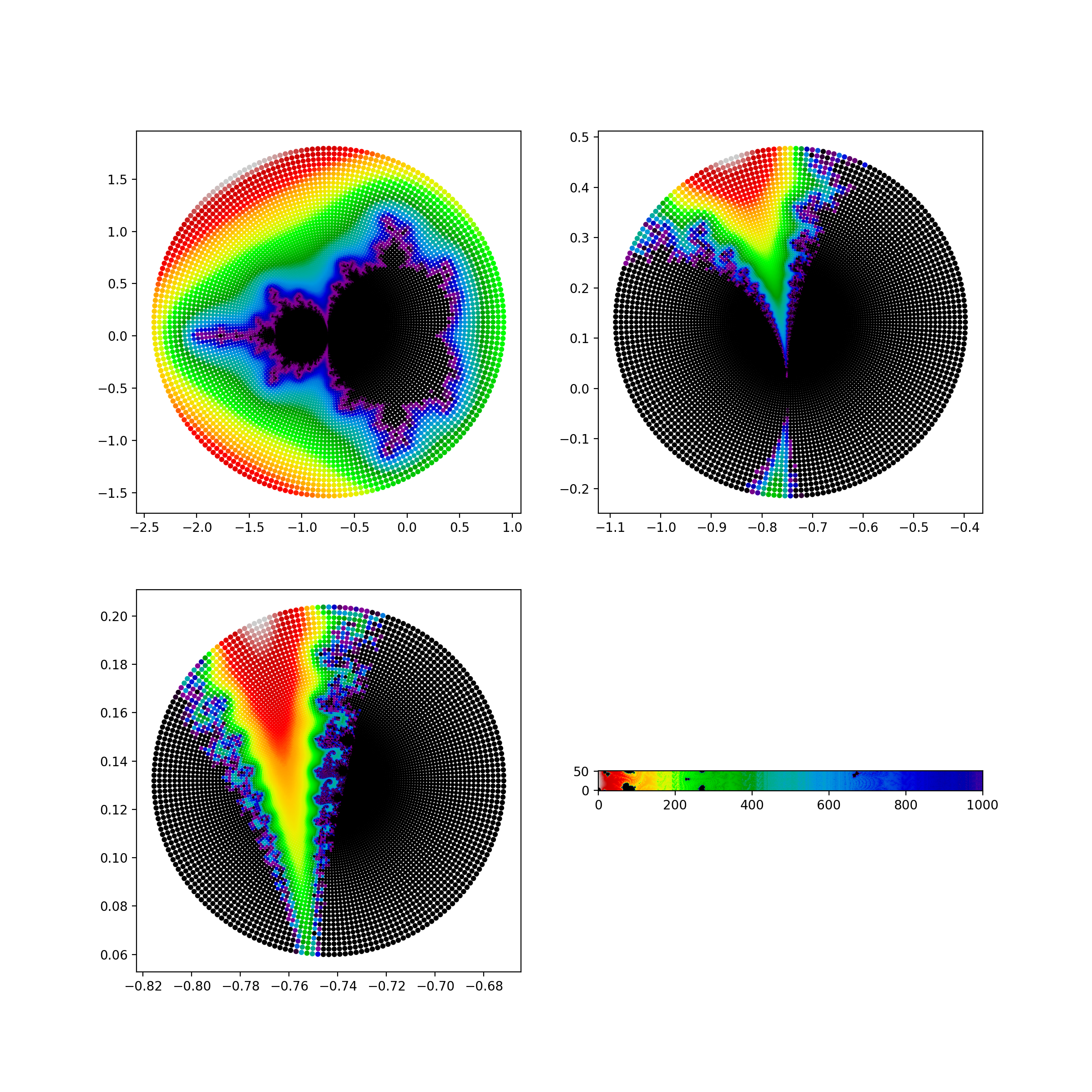{fig-align="center"}## **Advanced Techniques in Mandelbrot Set Visualization**The Mandelbrot set, a cornerstone of fractal geometry and complex dynamics, has been the subject of extensive research and visualization techniques. Through various methods, researchers have enhanced our ability to explore and understand this intricate set. The advanced techniques discussed here—Normalization, Distance Estimation, Boundary Detection, Normal Map Effect, Stripe Average Coloring, Mercator Projection, and Perturbation Theory—each contribute uniquely to the visualization and exploration of the Mandelbrot set.### **Integrating Techniques for Comprehensive Exploration**By integrating these advanced visualization techniques, researchers can explore the Mandelbrot set in ways that were previously unimaginable. Normalization, distance estimation, and boundary detection provide the groundwork for accurate and detailed images. The Normal Map Effect and Stripe Average Coloring add depth and highlight complex patterns. Mercator projection and perturbation theory enable deep zoom explorations, revealing the fractal’s infinite complexity at various scales.These techniques collectively push the boundaries of fractal visualization, allowing for a deeper understanding and appreciation of the Mandelbrot set. As computational methods and visualization tools continue to advance, we can expect even more detailed and insightful explorations of this fascinating mathematical object. The work of researchers like *Jussi Härkönen, Arnaud Chéritat, David Madore, and Anders Sandberg* exemplifies the innovative approaches that drive this field forward, opening new avenues for both mathematical research and artistic expression.# **Connection with the Mandelbrot Locally Connected Conjecture (MLC)**The MLC conjecture suggests that no matter how much you zoom into the Mandelbrot set, it will always appear as one connected piece. The tools and techniques mentioned above play a significant role in exploring and visualizing this conjecture:1. **Normal Map Effect**: Enhances the visual details of the Mandelbrot set, making it easier to see the connections and structures within the set at various zoom levels.2. **Mercator Projection**: Offers ways to represent and analyze different sections of the complex plane, aiding in understanding the global and local structure of the Mandelbrot set.3. **Deep Zoom Images**: Enable continuous and detailed examination of the Mandelbrot set, which is essential for investigating its local connectivity properties.# **Conclusion**Using advanced visualization techniques such as the normal map effect, projections like Mercator, and deep zoom images allows for a better exploration and understanding of the Mandelbrot set. These tools help in visualizing the complex, detailed structures of the set and are essential in investigating mathematical properties such as local connectivity. This local connectivity question, if it can be solved, will give us almost complete control and understanding of the Mandelbrot set. The hope is that once we fully comprehend quadratic polynomials, we can extend our insights to more complicated dynamical systems and describe them in greater detail. However, a complete understanding of the Mandelbrot set would not diminish our collective fascination with this famous fractal. The richness, complexity, and beauty of the Mandelbrot set continue to inspire and captivate mathematicians and enthusiasts alike, ensuring its lasting allure and significance in the realm of mathematics.# **Further Readings**[**The Quest to Decode the Mandelbrot Set, Math’s Famed Fractal**](https://www.quantamagazine.org/the-quest-to-decode-the-mandelbrot-set-maths-famed-fractal-20240126/)# **Related Article**1. [**The Map of Mathematics**](https://www.quantamagazine.org/the-map-of-mathematics-20200213/)2. [**In Noisy Equations, One Who Heard Music**](https://www.quantamagazine.org/in-noisy-equations-one-who-heard-music-20140812/)3. [**Dennis Sullivan, Uniter of Topology and Chaos, Wins the Abel Prize**](https://www.quantamagazine.org/dennis-sullivan-uniter-of-topology-and-chaos-wins-the-abel-prize-20220323/)4. [**A Brazilian Wunderkind Who Calms Chaos**](https://www.quantamagazine.org/artur-avila-is-first-brazilian-mathematician-to-win-fields-medal-20140812/){fig-align="center" width="447"}


