Creating Dynamic Patterns with Complex Functions in R
The Enchanting World of the Harmonograph
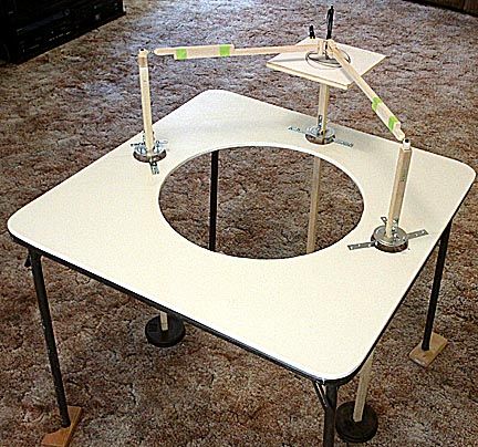
Principles of Harmonic Motion
# Required Packages
install.packages("gganimate")
install.packages("magick")

# Load necessary libraries
library(tidyverse)
library(gganimate)
library(magick)

# Parameters for the pendulum
g <- 9.81  # acceleration due to gravity (m/s^2)
L <- 1     # length of the pendulum (m)
theta0 <- 0.2  # initial angle (in radians)

# Time sequence for the animation
time <- seq(0, 10, length.out = 500)  # total time 10 seconds

# Function to calculate angular position over time
theta_t <- function(t) {
  return(theta0 * cos(sqrt(g / L) * t))
}

# Data frame to store pendulum positions
pendulum_data <- data.frame(
  time = time,
  theta = theta_t(time),
  x = L * sin(theta_t(time)),
  y = -L * cos(theta_t(time))
)

# Plotting the pendulum
p <- ggplot(pendulum_data, aes(x = 0, y = 0)) +
  geom_point(aes(x = x, y = y), color = "blue", size = 5) +  # bob
  geom_segment(aes(xend = x, yend = y), size = 1) +          # string
  geom_hline(yintercept = 0, linetype = "dashed") +          # equilibrium line
  coord_fixed(ratio = 1) +
  xlim(-L, L) +
  ylim(-L, 0) +
  labs(title = "Simple Pendulum Animation", x = "", y = "") +
  theme_minimal() +
  transition_reveal(time)

# Save the animation
anim <- animate(p, nframes = 100, fps = 10, width = 500, height = 500)
anim_save("simple_pendulum.gif", anim)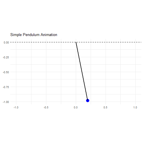
From Pendulum Swings to Digital Brushstrokes
f1=jitter(sample(c(2,3),1))
f2=jitter(sample(c(2,3),1))
f3=jitter(sample(c(2,3),1))
f4=jitter(sample(c(2,3),1))
d1=runif(1,0,1e-02)
d2=runif(1,0,1e-02)
d3=runif(1,0,1e-02)
d4=runif(1,0,1e-02)
p1=runif(1,0,pi)
p2=runif(1,0,pi)
p3=runif(1,0,pi)
p4=runif(1,0,pi)
xt = function(t) exp(-d1*t)*sin(t*f1+p1)+exp(-d2*t)*sin(t*f2+p2)
yt = function(t) exp(-d3*t)*sin(t*f3+p3)+exp(-d4*t)*sin(t*f4+p4)
t=seq(1, 100, by=.001)
dat=data.frame(t=t, x=xt(t), y=yt(t))
with(dat, plot(x,y,
               type="l",
               xlim =c(-2,2),
               ylim =c(-2,2),
               xlab = "",
               ylab = "",
               xaxt='n',
               yaxt='n'))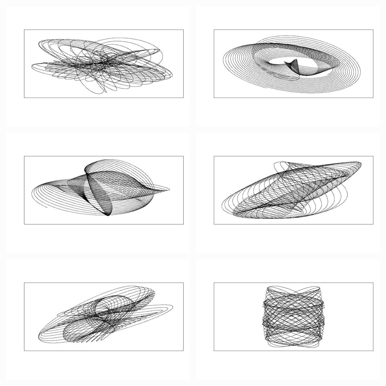
library(rgl)
library(scatterplot3d)
#Extending the harmonograph into 3d
#Antonio's functions creating the oscillations
xt = function(t) exp(-d1*t)*sin(t*f1+p1)+exp(-d2*t)*sin(t*f2+p2)
yt = function(t) exp(-d3*t)*sin(t*f3+p3)+exp(-d4*t)*sin(t*f4+p4)
#Plus one more
zt = function(t) exp(-d5*t)*sin(t*f5+p5)+exp(-d6*t)*sin(t*f6+p6)
#Sequence to plot over
t=seq(1, 100, by=.001)
#generate some random inputs
f1=jitter(sample(c(2,3),1))
f2=jitter(sample(c(2,3),1))
f3=jitter(sample(c(2,3),1))
f4=jitter(sample(c(2,3),1))
f5=jitter(sample(c(2,3),1))
f6=jitter(sample(c(2,3),1))
d1=runif(1,0,1e-02)
d2=runif(1,0,1e-02)
d3=runif(1,0,1e-02)
d4=runif(1,0,1e-02)
d5=runif(1,0,1e-02)
d6=runif(1,0,1e-02)
p1=runif(1,0,pi)
p2=runif(1,0,pi)
p3=runif(1,0,pi)
p4=runif(1,0,pi)
p5=runif(1,0,pi)
p6=runif(1,0,pi)
#and turn them into oscillations
x = xt(t)
y = yt(t)
z = zt(t)
#create values for colours normalised and related to x,y,z coordinates
cr = abs(z)/max(abs(z))
cg = abs(x)/max(abs(x))
cb = abs(y)/max(abs(y))
dat=data.frame(t, x, y, z, cr, cg ,cb)
#plot the black and white version
with(dat, scatterplot3d(x,y,z, pch=16,cex.symbols=0.25, axis=FALSE ))
with(dat, scatterplot3d(x,y,z, pch=16, color=rgb(cr,cg,cb),cex.symbols=0.25, axis=FALSE ))
#Set the stage for 3d plots
# clear scene:
clear3d("all")
# white background
bg3d(color="white")
#lights...camera...
light3d()
#action
# draw shperes in an rgl window
#spheres3d(x, y, z, radius=0.025, color=rgb(cr,cg,cb))
#create animated gif (call to ImageMagic is automatic)
#movie3d( spin3d(axis=c(0,0,1),rpm=5),fps=12, duration=12 )
#2d plots to give plan and elevation shots
plot(x,y,col=rgb(cr,cg,cb),cex=.05)
plot(y,z,col=rgb(cr,cg,cb),cex=.05)
plot(x,z,col=rgb(cr,cg,cb),cex=.05)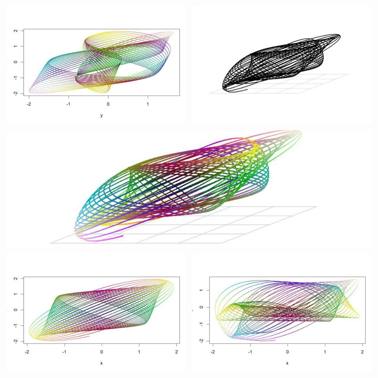
install.packages(c("devtools", "mapproj", "tidyverse", "ggforce", "Rcpp"))
devtools::install_github("marcusvolz/mathart")
library(devtools)
library(mathart)
library(ggforce)
library(Rcpp)
library(tidyverse)
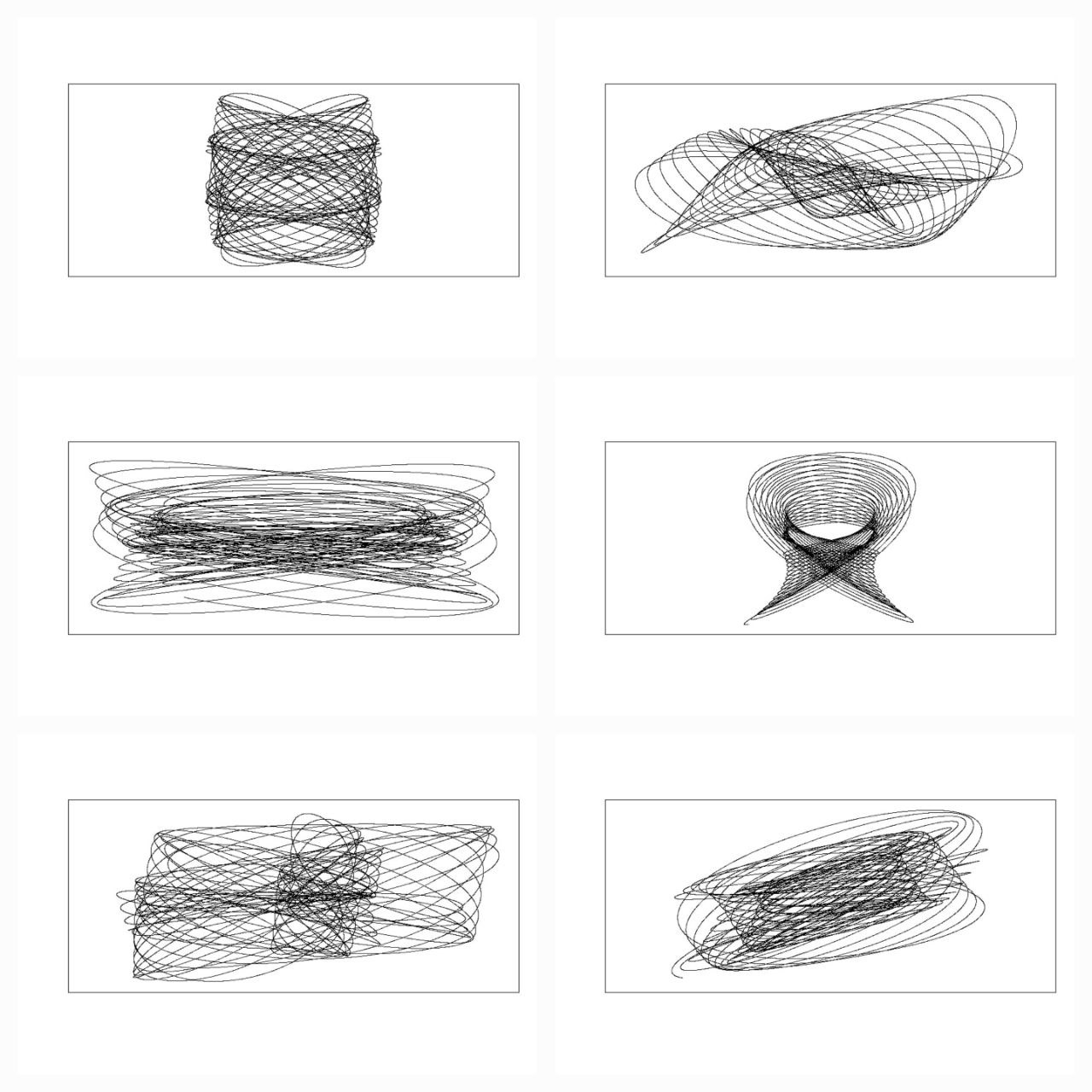
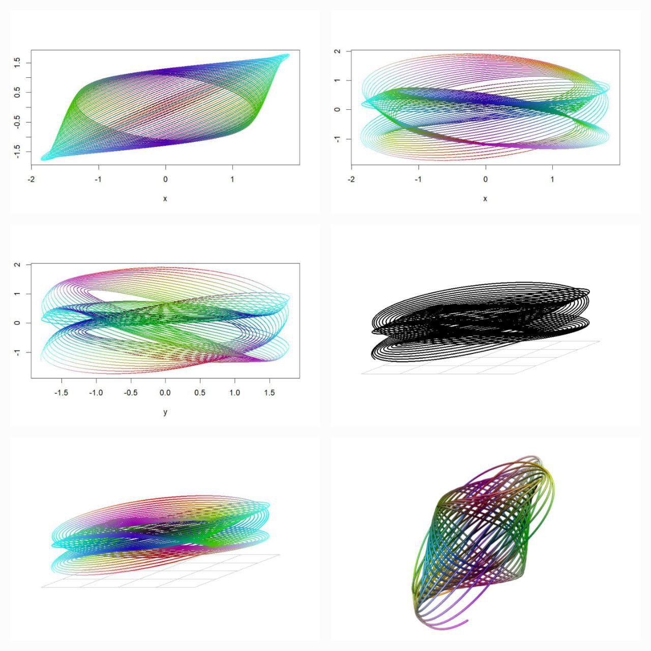
df1 <- harmonograph(A1 = 1, A2 = 1, A3 = 1, A4 = 1,
d1 = 0.004, d2 = 0.0065, d3 = 0.008, d4 = 0.019,
f1 = 3.001, f2 = 2, f3 = 3, f4 = 2,
p1 = 0, p2 = 0, p3 = pi/2, p4 = 3*pi/2) %>% mutate(id = 1)
df2 <- harmonograph(A1 = 1, A2 = 1, A3 = 1, A4 = 1,
d1 = 0.0085, d2 = 0, d3 = 0.065, d4 = 0,
f1 = 2.01, f2 = 3, f3 = 3, f4 = 2,
p1 = 0, p2 = 7*pi/16, p3 = 0, p4 = 0) %>% mutate(id = 2)
df3 <- harmonograph(A1 = 1, A2 = 1, A3 = 1, A4 = 1,
d1 = 0.039, d2 = 0.006, d3 = 0, d4 = 0.0045,
f1 = 10, f2 = 3, f3 = 1, f4 = 2,
p1 = 0, p2 = 0, p3 = pi/2, p4 = 0) %>% mutate(id = 3)
df4 <- harmonograph(A1 = 1, A2 = 1, A3 = 1, A4 = 1,
d1 = 0.02, d2 = 0.0315, d3 = 0.02, d4 = 0.02,
f1 = 2, f2 = 6, f3 = 1.002, f4 = 3,
p1 = pi/16, p2 = 3*pi/2, p3 = 13*pi/16, p4 = pi) %>% mutate(id = 4)
df <- rbind(df1, df2, df3, df4)
p <- ggplot() +
geom_path(aes(x, y), df, alpha = 0.25, size = 0.5) +
coord_equal() +
facet_wrap(~id, nrow = 2) +
theme_blankcanvas(margin_cm = 0)
ggsave("harmonograph01.png", p, width = 20, height = 20, units = "cm")
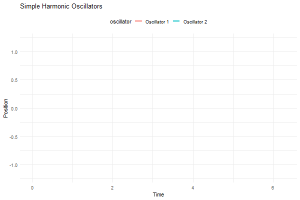
Mathematical Harmony in Motion
library(ggplot2)
library(gganimate)

# Function to calculate position of simple harmonic oscillator
sho_position <- function(t, A, omega, phi) {
  return(A * sin(omega * t + phi))
}

# Parameters
t <- seq(0, 2*pi, length.out = 100)
A1 <- 1  # Amplitude of oscillator 1
A2 <- 0.5  # Amplitude of oscillator 2
omega1 <- 1  # Angular frequency of oscillator 1
omega2 <- 1.5  # Angular frequency of oscillator 2
phi1 <- 0  # Phase of oscillator 1
phi2 <- pi/2  # Phase of oscillator 2

# Data for oscillator 1
df1 <- data.frame(t = t, position = sho_position(t, A1, omega1, phi1), oscillator = "Oscillator 1")

# Data for oscillator 2
df2 <- data.frame(t = t, position = sho_position(t, A2, omega2, phi2), oscillator = "Oscillator 2")

# Combine data
df <- rbind(df1, df2)

# Create plot
p <- ggplot(df, aes(x = t, y = position, group = oscillator, color = oscillator)) +
  geom_line(size = 1) +
  ylim(-1.2, 1.2) +
  labs(title = "Simple Harmonic Oscillators", x = "Time", y = "Position") +
  theme_minimal() +
  theme(legend.position = "top") +
  transition_reveal(t)

# Animate plot
animate(p, nframes = 100, duration = 10, width = 600, height = 400)

#___________________________________________________________________________

library(gifski)

# Function to calculate position of simple harmonic oscillator
sho_position <- function(t, A, omega, phi) {
  return(A * sin(omega * t + phi))
}

# Parameters
t <- seq(0, 2, by = 0.01)
A <- 1  # Amplitude
omega1 <- 2*pi  # Angular frequency of x-axis oscillator
omega2 <- 6*pi  # Angular frequency of y-axis oscillator
limits <- c(-1, 1)

save_gif(
  lapply(seq(0, 2, length.out = 100), function(i) {
    x <- sin(2 * pi * t)
    y <- cos(6 * pi * t)

    plot(x, y, type = "l", asp = 1, xlim = 1.2 * limits, ylim = 1.2 * limits)
    lines(x = c(sin(2 * i * pi), sin(2 * i * pi), -1.1),
          y = c(-1.1, cos(6 * pi * i), cos(6 * pi * i)), pch = 20, type = "o", lty = "dashed")
  }),
  delay = 1 / 10, width = 600, height = 600, gif_file = "sho_animation.gif"
)
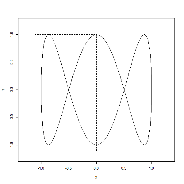
library(gifski)
# Parameters
t <- seq(0, 2, by = 0.01)
limits <- c(-1, 1)
save_gif(
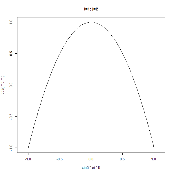
lapply(1:10, function(i) {
lapply(2:5, function(j) {
plot(x = sin(i * pi * t),
y = cos(j * pi * t),
type = "l", asp = 1, xlim = limits, ylim = limits,
main = sprintf("i=%d; j=%d", i, j))
})
}),
delay = 1/3, width = 600, height = 600, gif_file = "animation.gif"
)
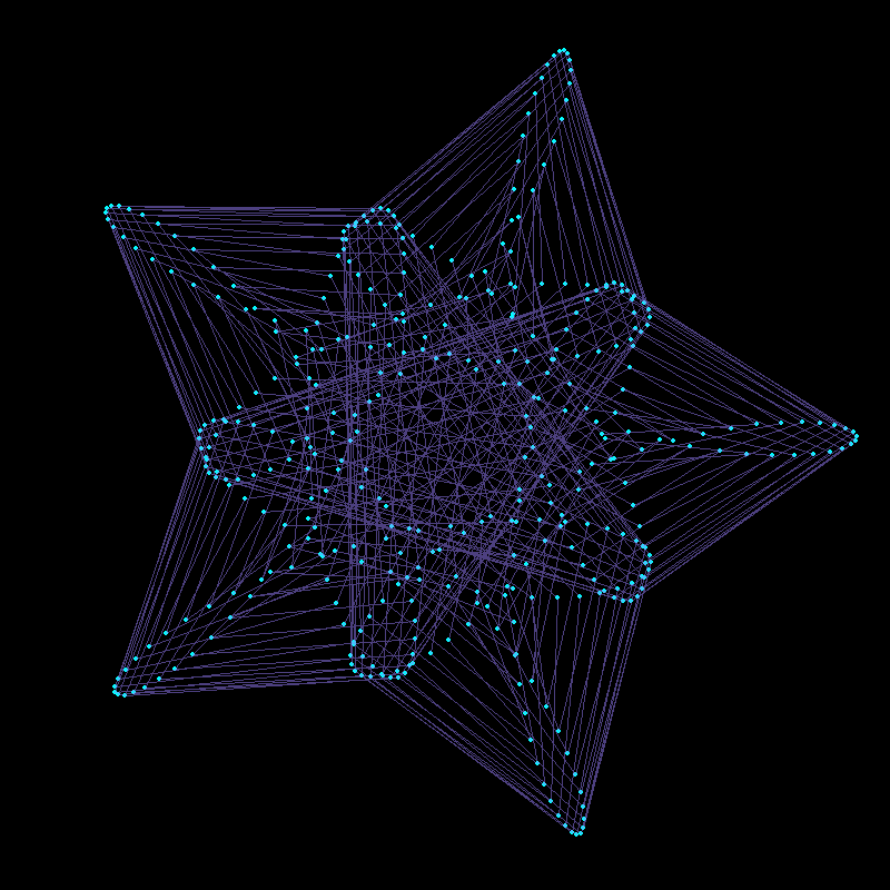
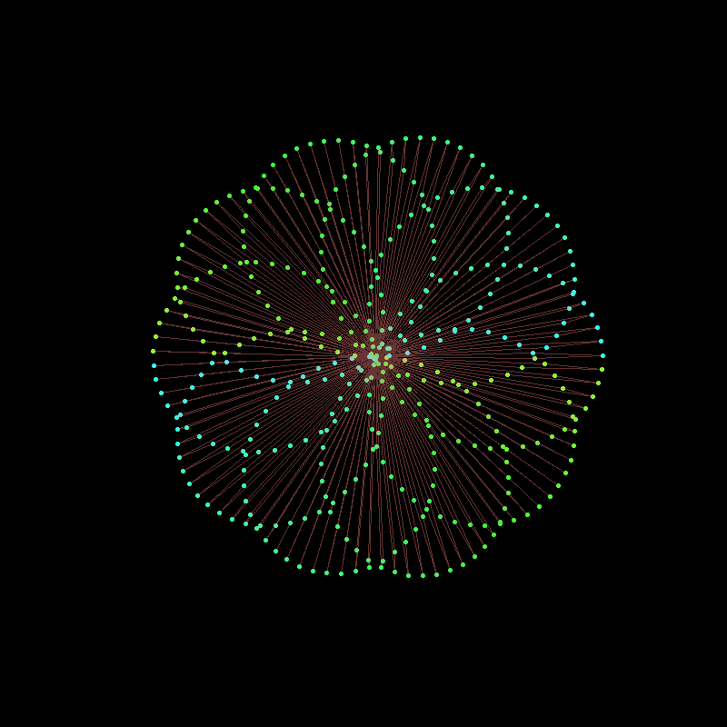
Visual Tapestry
set.seed(2)
df <- lissajous(a = runif(1, 0, 2), b = runif(1, 0, 2), A = runif(1, 0, 2), B = runif(1, 0, 2), d = 200) %>%
  sample_n(1001) %>%
  k_nearest_neighbour_graph(40)

p <- ggplot() +
  geom_segment(aes(x, y, xend = xend, yend = yend), df, size = 0.03) +
  coord_equal() +
  theme_blankcanvas(margin_cm = 0)

ggsave("knn_lissajous_002.png", p, width = 25, height = 25, units = "cm")
Mathematical Curves in Action
“Mathematics possesses not only truth but supreme beauty—a beauty cold and austere, like that of sculpture.” – Bertrand Russell
R Code & Visualization
funcionSecuenciaRecaman1<-function(numero) {
x<- vector()
y<- vector()
z<-0
i <- 1
while(i <= numero)
{
x[i] <- z
if(i == 1){
y[i] <- z
} else {
if(y[i-1] - x[i] > 0 & is.na(match(y[i-1] - x[i],y))) {
y[i] <- y[i-1] - x[i]
} else {
y[i] <- y[i-1] + x[i]
}
}
z<- z+1
i = i+1
}
return(cbind(x,y))
}
funcionSecuenciaRecaman1(25)
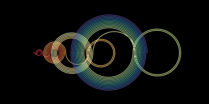
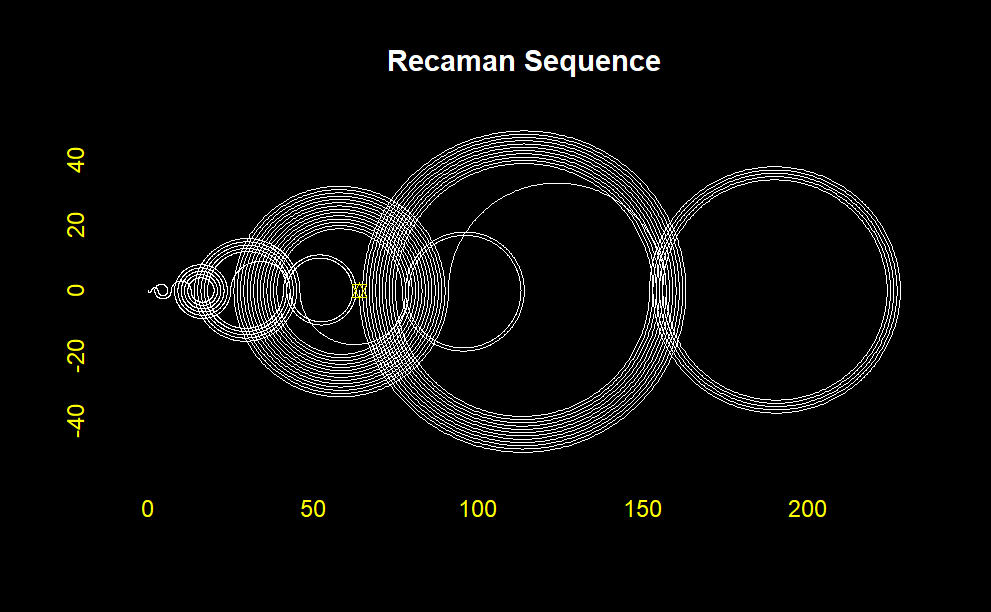
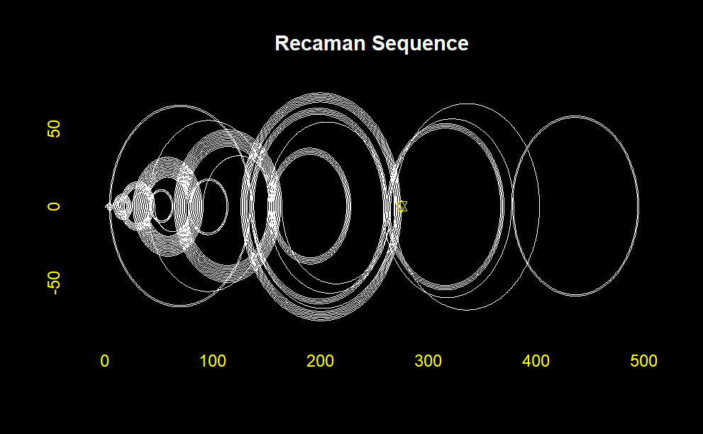
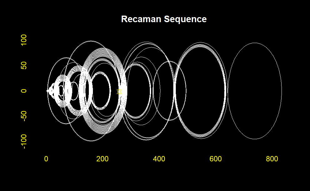
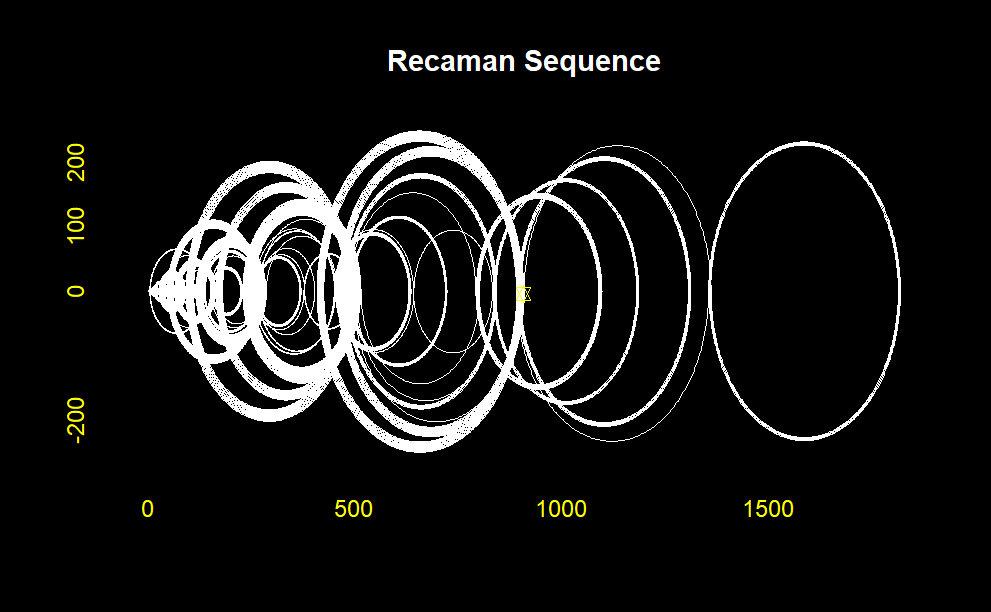
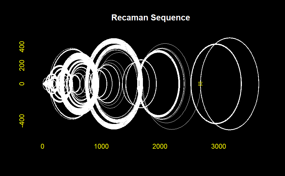
plottingChallenge<-function(numeral){
#Recaman Sequence: (only retrieving values)
laSecuencia <-funcionSecuenciaRecaman1(numeral)[,2]
#declarandoVectoresNecesarios
puntosEnx <- vector()
puntosEny <- vector()
ciclo <- vector()
degrees <- c(1:179) #to simulate semi-circle we will need degrees from 1 : 179
numeral2 <- numeral - 1
#Comienza el Ciclo
for(i in 1:numeral2)
{
##These are the edges of the semi-circle (diameter of circle)
x1<- laSecuencia[i]
x2<- laSecuencia[i+1]
##Evaluating whether semi-circle will curve upwards or downwards
if(i%%2 == 0){curvaturaHaciaArriba <- 1} else {curvaturaHaciaArriba <- -1}
radio <- abs(x2 - x1)/2 #radius of circle
if(x2>x1){puntoMedio <- x1+radio}else{puntoMedio <- x2+radio }
alturas<- sin(degrees*pi/180)*radio*curvaturaHaciaArriba #all heights
distancias <- cos(degrees*pi/180)*radio #all lengths
if(x2>x1){distancias1 <- sort(distancias,decreasing = F)
} else {distancias1 <- distancias}
puntosEnx <- c(puntosEnx,x1,distancias1 + puntoMedio,x2)
puntosEny <- c(puntosEny,0,alturas,0)
}
matriz<-cbind(puntosEnx,puntosEny)
matrizUnica<-unique(matriz)
par(bg="black")
plot(matrizUnica[,1],matrizUnica[,2], type = "l",
main = "Secuencia de Recaman",
xlab = "Seq. Recaman",
ylab = "",
col="white", #color del grafico
#col.axis = "white", #estos son los numeritos,
col.axis = "yellow", #titulos de los axis
cex.lab = 1
)
points( tail(matrizUnica[,1],1), tail(matrizUnica[,2],1), pch = 11, col = "yellow" )
title("Recaman Sequence", col.main = "white")
}
plottingChallenge(50)
plottingChallenge(100)
plottingChallenge(150)
plottingChallenge(200)
plottingChallenge(500)
plottingChallenge(1000)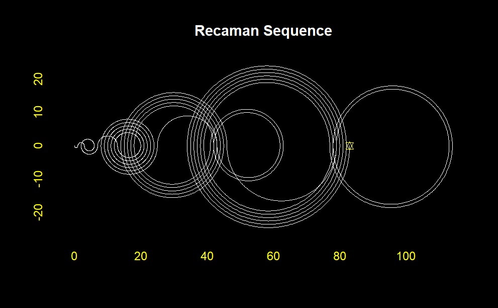
Clean and Effective Visualization
library(tidyverse)
# Generate the first n elements of the Recaman's sequence
get_recaman <- function(n) {
    recaman_seq <- numeric(n)
    for (i in 1:length(recaman_seq)) {
        candidate <- recaman_seq[i] - i
        if (candidate > 0 & !(candidate %in% recaman_seq)) {
            recaman_seq[i + 1] <- candidate
        } else recaman_seq[i + 1] <- recaman_seq[i] + i
    }
    recaman_seq <- recaman_seq[-length(recaman_seq)]
    recaman_seq
}

get_recaman(20)

# Get semicircle paths
construct_arc <- function(start, stop, type) {
    r <- abs(start - stop) / 2
    x0 <- min(c(start, stop)) + r
    y0 <- 0
    if (type == "up_forward") {
        theta <- seq(pi, 0, -0.01)
    } else if (type == "up_backwards") {
        theta <- seq(0, pi, 0.01)
    } else if (type == "down_forward") {
        theta <- seq(pi, 2 * pi, 0.01)
    } else if (type == "down_backwards") {
        theta <- seq(2 * pi, pi, -0.01)
    }
    x <- r * cos(theta) + x0
    y <- r * sin(theta) + y0
    df <- data.frame(x, y)
}

# Plot the first n elements of the Recaman's sequence
plot_recaman <- function(n, size = 1, alpha = 0.8) {
    recaman_seq <- get_recaman(n)
    df <- data.frame(start = recaman_seq,
                     stop = lead(recaman_seq),
                     # Alternating position of the semicircles
                     side = rep_len(c("down", "up"), length(recaman_seq))) %>%
        mutate(direction = ifelse(stop - start > 0, "forward", "backwards"),
               type = paste(side, direction, sep = "_")) %>%
        filter(!is.na(stop))
    l <- Map(construct_arc, start = df$start, stop = df$stop, type = df$type)
    df2 <- do.call("rbind", l)
    ggplot(df2, aes(x, y)) +
        geom_path(alpha = alpha, size = size) +
        coord_fixed() +
        theme_void()
}
plot_recaman(100, size = 2)
plot_recaman(300, size = 1)
plot_recaman(500, size = 0.5, alpha = 0.8)
plot_recaman(1000, size = 0.5, alpha = 0.8)
plot_recaman(1500, size = 0.5, alpha = 0.8)
plot_recaman(2000, size = 0.5, alpha = 0.8)

# Do you like the drawing? Save it!
 #ggsave("Recamán's sequence.png", height=3, width=5, units='in', dpi=800)
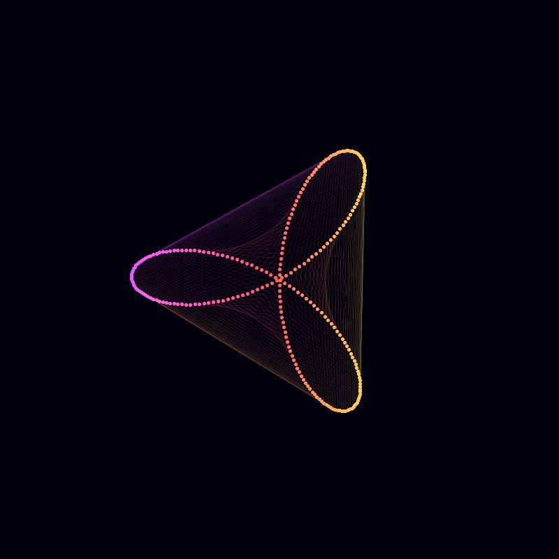
Unveiling the Beauty of Complex Curves
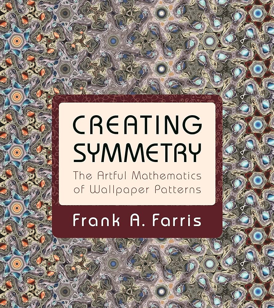
In the world where art meets mathematics, the concept of symmetry stands as a bridge between visual beauty and mathematical elegance. The exploration of wallpaper patterns is a testament to this harmonious convergence. Inspired by Frank A. Farris’s book “Creating Symmetry: The Artful Mathematics of Wallpaper Patterns,”
this article delves into the intricate and astounding mathematics that underpins these seemingly simple designs. Through the lens of R programming, we will embark on a journey to uncover the hidden symmetries and patterns that adorn walls and fabrics around the world.
Algorithmic Elegence
amp=0.5
freq=5
phase=1
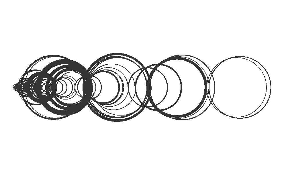
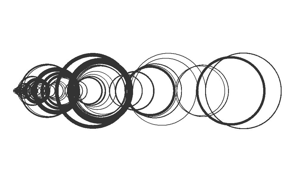
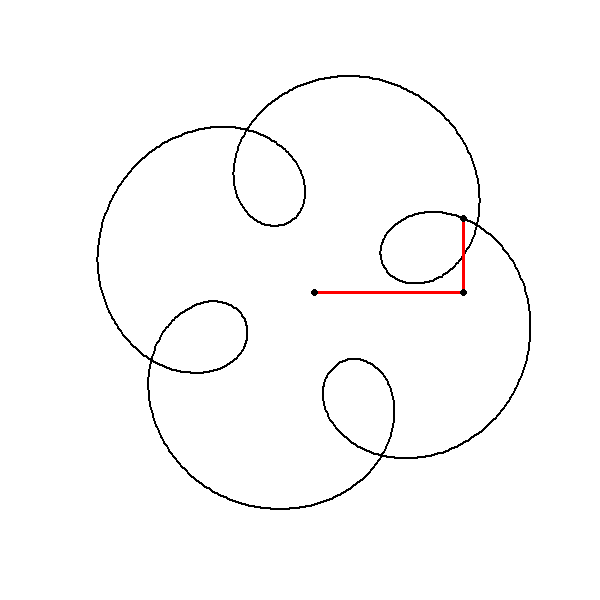
z = 1i^t + # Our original circle
amp*(1i^(freq*t + phase)) # A new cirlce
plot(z, axes=FALSE, ann=FALSE, type="l", lwd=2, asp=1)
#____________________________________________________________________
# ~~~~~~~~~~~~~~ Animation ~~~~~~~~~~~~~~~~~~~~~~~~
library(gifski)
# Define the parameters
amp <- 0.5
freq <- 5
phase <- 1
t <- seq(0, 4, length.out = 1000)
# Define the function to generate the complex function with the given parameters
mystery_function <- function(t, amp, freq, phase) {
1i^t + amp * 1i^(freq * t + phase)
}
# Create the animation
save_gif(
lapply(seq(1, 1000, by = 10), function(j) {
z <- 1i^t + amp * 1i^(freq * t + phase)
plot(z, axes = FALSE, ann = FALSE, type = "l", lwd = 2, asp = 1)
lines(c(0, (1i^t)[j], z[j]), lwd = 3, col = "red")
points(c(0, (1i^t)[j], z[j]), cex = 2, pch = 20)
}),
delay = 1 / 30, width = 600, height = 600,
gif_file = "mystery_function_animation.gif")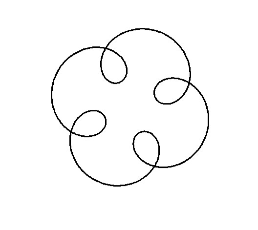
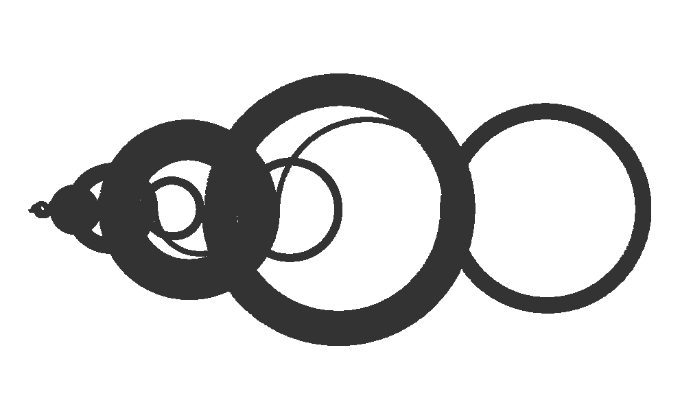
R Code & Algorithmic Elegance
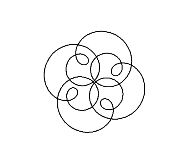
circle <- function(amp, freq, phase) amp*1i^(freq*seq(0,4,l=1000)+phase)

z = circle(1,1,0) + circle(0.5,5,0) + circle(0.6,9,1)

plot(z, axes=FALSE, ann=FALSE, type="l", lwd=2, asp=1)

#____________________________________________________________________
#         ~~~~~~~~~~~~~~ Animation ~~~~~~~~~~~~~~~~~~~~~~~~

library(gifski)

circle <- function(amp, freq, phase) amp * 1i^(freq * seq(0, 4, length.out = 1000) + phase)

save_gif(
  lapply(seq(1, 1000, by = 2), function(j) {
    z <- circle(1, 1, 0) + circle(0.5, 5, 0) + circle(0.6, 9, 1)
    plot(z, axes = FALSE, ann = FALSE, type = "l", lwd = 2, asp = 1)
    lps <- cumsum(c(0, circle(1, 1, 0)[j], circle(0.5, 5, 0)[j], circle(0.6, 9, 1)[j]))
    lines(lps, lwd = 3, col = "red")
    points(lps, cex = 2, pch = 20)
  }),
  delay = 1 / 30, width = 600, height = 600, gif_file = "circle_animation.gif"
)
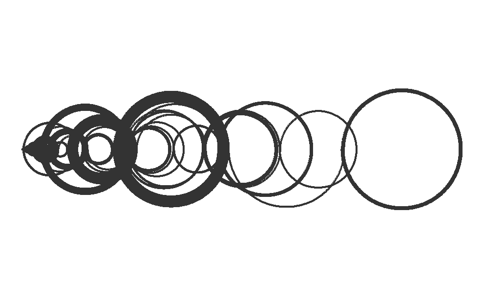
Visual Insight with Code
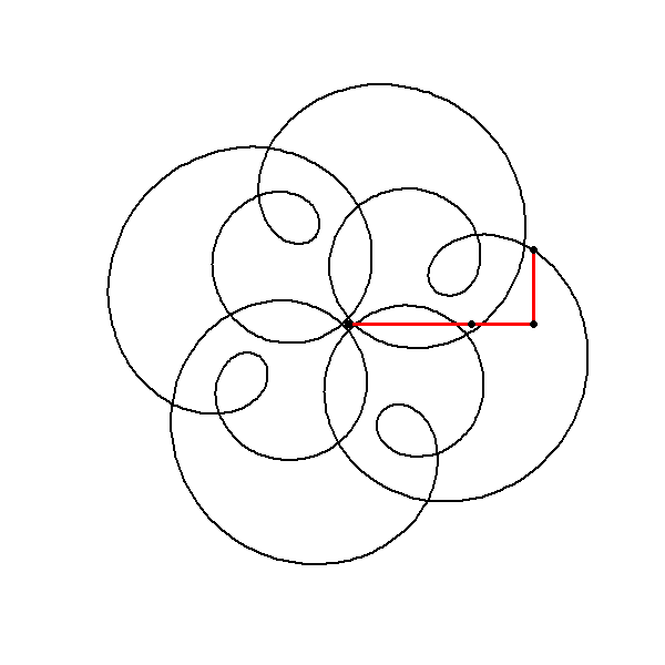
library(gifski)

circle <- function(amp, freq, phase) amp * 1i^(freq * seq(0, 4, length.out = 1000) + phase)

save_gif(
  lapply(seq(1, 1000, by = 2), function(j) {
    z <- circle(1, 1, 0) + circle(0.5, 5, 0) + circle(0.6, -7, 1)
    plot(z, axes = FALSE, ann = FALSE, type = "l", lwd = 2, asp = 1)
    lps <- cumsum(c(0, circle(1, 1, 0)[j], circle(0.5, 5, 0)[j], circle(0.6, -7, 1)[j]))
    lines(lps, lwd = 3, col = "red")
    points(lps, cex = 2, pch = 20)
  }),
  delay = 1 / 30, width = 600, height = 600, gif_file = "trajec_animation.gif"
)
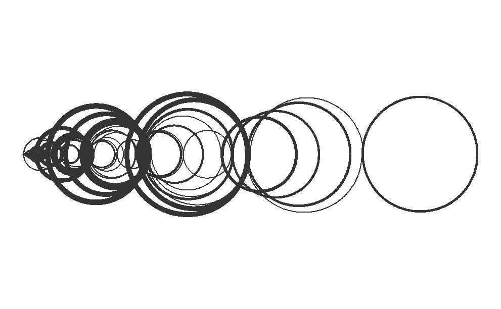
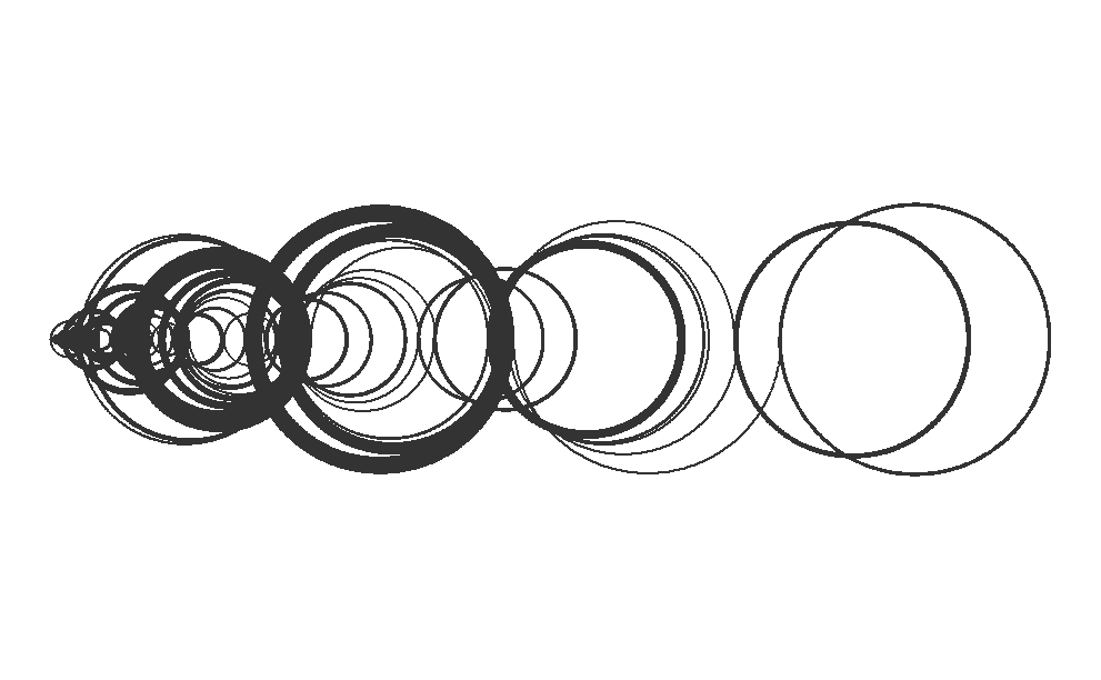
Code Behind Creation of the Visual Representation
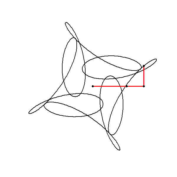
library(gifski)

circle <- function(amp, freq, phase) amp * 1i^(freq * seq(0, 4, length.out = 1000) + phase)
limits <- c(-1, 1) * 2

save_gif(
  lapply(seq(0, 4, length.out = 100)[-1], function(j) {
    z <- circle(1, 1, 0) + circle(0.5, 5, 0) + circle(0.6, -7, j)

    plot(z, xlim = limits, ylim = limits,
         axes = FALSE, ann = FALSE, type = "l",
         lwd = 2, asp = 1, mar = c(0, 0, 0, 0))
  }),
  delay = 1 / 30, width = 600, height = 600, gif_file = "animation-circ.gif"
)
Visual Elegance of Butterfly Curve
The butterfly curve is defined using parametric equations. Parametric equations express the coordinates of the points that make up a curve as functions of a parameter, often denoted as \(t\). In this case, the curve is described using polar coordinates, which are defined in terms of a radius \(r\) (or \(a\) in the code) and an angle \(t\). The equations in the provided below are:
Radius Function \(a(t)\):
\[ a(t) = e^{\cos(t)} - 2 \cos(4t) - \sin\Bigg(\frac{t}{12}\Bigg)^5 \]
Parametric Equations for \(x\) and \(y:\)
\[ x(t) = a(t) \sin(t) \]
\[ y(t) = a(t) \cos(t) \]These equations define how the coordinates \(x\) and \(y\) of each point on the butterfly curve are determined by the angle \(t\) and the function \(a(t)\).
#butterfly curve
#t sequence of angles
t = seq(0,12*pi,0.001)#from 0 to 12*pi , increasing by 0.01

a = exp(cos(t)) - 2*cos(4*t) -sin(t/12)^5
# coordinates
x = sin(t)*a
y = cos(t)*a

#customizing the plot
#par is for parameters
#background black & margins removed
par(bg='black',mar=rep(0,4))
#adding gradient colors
#this is a function to generate gradient colors
color.gradient <- function(x,colors=c('red','yellow','green'),colsteps=100){
  return(colorRampPalette(colors)(colsteps)[findInterval(x,seq(min(x),max(x),length.out=colsteps))])
}
#plot
#pch is point character (19 = dots)
#cex is to scale view

plot(x,y,type='p',col=color.gradient(x),pch=19,cex=1/9)#type = line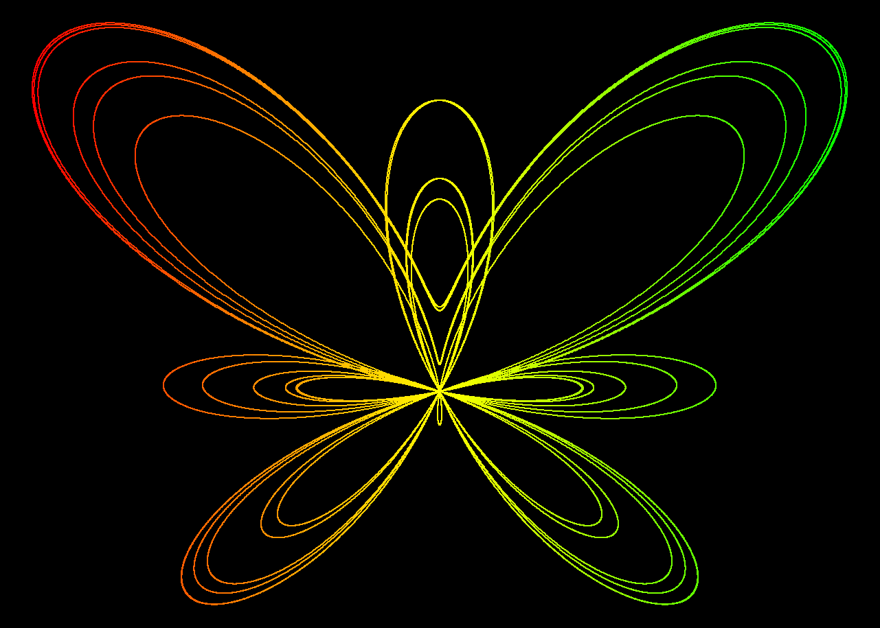
Symmetry: The butterfly curve displays symmetry, a characteristic feature that arises from the even and odd functions in its parametric representation.
Periodicity: The use of trigonometric functions introduces periodic behavior.
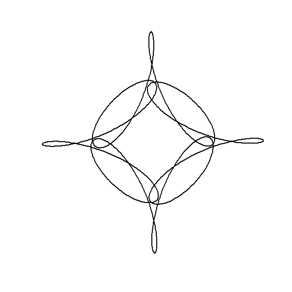
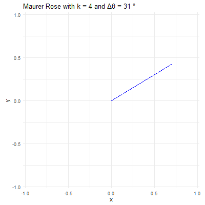
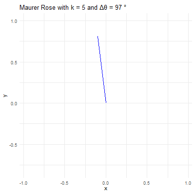
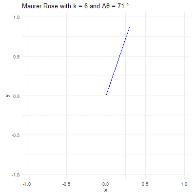
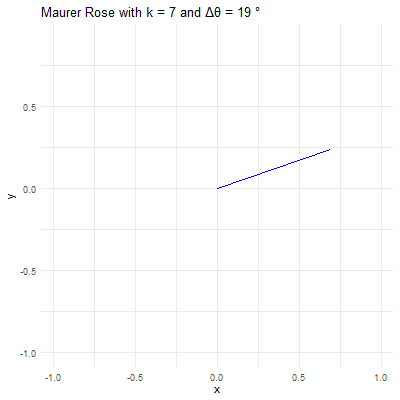
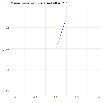
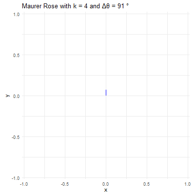
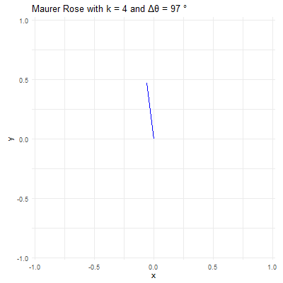
Visualizing the Maurer Rose
library(ggplot2)
library(gganimate)
library(gifski)

# Set parameters for the Maurer rose
k <- 4
n <- 360
delta_theta <- 97

# Generate the points
theta <- seq(0, n*delta_theta, by=delta_theta) * pi / 180
r <- sin(k * theta)
x <- r * cos(theta)
y <- r * sin(theta)

# Create a data frame to store the points
data <- data.frame(x = x, y = y, frame = seq_along(theta))

# Create the plot using ggplot2
p <- ggplot(data, aes(x = x, y = y, group = 1)) +
  geom_path(color = "blue") +
  coord_fixed() +
  theme_minimal() +
  ggtitle(paste("Maurer Rose with k =", k, "and Δθ =", delta_theta, "°"))

# Animate the plot using gganimate
anim <- p + transition_reveal(frame) +
  ease_aes('linear')

# Save the animation as a GIF
anim_save("maurer_rose_8.gif", animation = anim, renderer = gifski_renderer(), width = 400, height = 400, duration = 10)
Mathematical and Artistic Interplay in Plotting Out-of-Order Points
library(gifski)

circle <- function(amp, freq, phase) amp * 1i^(freq * seq(0, 400, length.out = 799) + phase)
limits <- c(-1, 1) * 3

save_gif(
  lapply(seq(0, 4, length.out = 100)[-1], function(j) {
    z <- circle(1, 1, 0) + circle(1, 6, 0) + circle(1, -9, j)

    par(bg = "black", mar = c(0, 0, 0, 0))  # Set a black background

    plot(
      xlim = limits, ylim = limits, col = "cyan", pch = 20,
      z, axes = FALSE, ann = FALSE, asp = 1
    )

    lines(z, col = hsv(0.7, 0.5, 1, 0.5))  # Connect points with lines
  }),
  delay = 1 / 30, width = 800, height = 800, gif_file = "circle_animation.gif"
)library(gifski)
circle <- function(amp, freq, phase) amp*1i^(freq*seq(0,400,l=799)+phase)
limits=c(-1,1)*2.5
# lapply here makes a 'list' of plots,
# save_gif turns this list into a gif
save_gif(lapply(seq(0,4,l=500)[-1],
function(j){
par(bg="black")
z = circle(1,1,0) + circle(sin(pi*j/2),6,0) + circle(cos(pi*j/2),-9,j)
hue = (j/4+seq(0,0.5,l=799))%%1
plot(xlim=limits, ylim=limits,col=hsv(hue,.8,1),pch=19,
z, axes=FALSE, ann=FALSE, asp=1, mar=c(0,0,0,0))
lines(z,col=hsv(hue[1],.5,1,0.4))
}),
delay=1/30,width = 800,height=800, gif_file = "mystery.gif")library(gifski)
circle <- function(amp, freq, phase) amp*1i^(freq*seq(0,600,l=260)+phase)
limits=3.5*c(-1,1)
li <- seq(0,1,l=500)[-1]
save_gif(lapply(1:length(li), function(ai){
a = li[ai]*5;
l = sin(pi*(2*a-.5))+1
z<-circle(1,1,0) +
circle(l, ceiling(a), -8*a) +
circle(l/2-1,ceiling(((-a+2.5)%%5)-5), -4*a)
par(mar=c(0,0,0,0), bg="#04010F")
hue=(a+(Re(z/10)))%%1
plot(z,
col=hsv(hue, 0.65,1),
pch=20, lwd=1, cex=1.5, type="p", axes=F,
xlim=limits, ylim=limits)
z2 <- c(z[-1], z[1])
segments(Re(z), Im(z), Re(z2), Im(z2),
col=hsv(hue, 0.65,1,.1), pch=20, lwd=1)
}), delay = 1/30, width=800, height=800, gif_file = "mystery2.gif")