Code
#install.packages("plotly")
library(plotly)Tools, Tips, Books, Resources
Abhirup Moitra
November 29, 2024
Plotly is a versatile library in R that allows users to create stunning interactive visualizations with ease. Known for its flexibility and intuitive syntax, Plotly has become a popular choice for data scientists, analysts, and researchers looking to enhance their data storytelling capabilities. With just a few lines of code, you can turn static visuals into interactive, web-ready graphics that add depth and dynamism to your data.
This article explores an elegant approach to working with Plotly in R, covering essential tools, practical tips, recommended books, and resources for mastering this powerful visualization library. Whether you’re an R novice or an experienced data wrangler, this guide provides a structured pathway to leverage Plotly’s full potential.
Plotly in RPlotly is known for its ability to seamlessly integrate with R’s ecosystem, making it ideal for adding interactivity to visualizations originally created in ggplot2 or other libraries. To get started, install Plotly in R by running:
Plotly provides both simple methods and advanced features for various chart types—scatter plots, bar charts, histograms, maps, and more.
To create a smooth workflow, Plotly pairs well with other packages in R. Here are some complementary tools that enhance its capabilities:
ggplot2: The ggplotly() function converts static ggplot2 charts into interactive Plotly graphics, combining the best of both worlds—ggplot2’s versatility and Plotly’s interactivity.
dplyr: Use dplyr for data manipulation before visualizing with Plotly. This package simplifies data wrangling, letting you focus on creating clean, organized data visualizations.
shiny: For building interactive dashboards, combining Plotly with Shiny allows you to create responsive applications with dynamic visualizations based on user inputs.
htmlwidgets: Plotly charts are htmlwidgets, which means you can easily embed them in R Markdown documents and Shiny apps or save them as HTML files for sharing.
Plotly VisualizationsEnhancing Plotly graphics involves careful design choices and customization. Here are a few tips to ensure your visuals stand out:
Choose Color Schemes Wisely: Plotly offers built-in color palettes, but you can customize colors to match your theme or branding. The colorway argument can be used for setting custom colors in Plotly charts.
Add Titles and Annotations: Clear titles, axis labels, and annotations add context to your visualizations. Use the layout() function to adjust these elements.
Incorporate Tooltips: Tooltips are a standout feature in Plotly, displaying detailed information on hover. The text argument allows you to add custom tooltips, improving data exploration.
Experiment with 3D Plots and Maps: Plotly offers advanced plot types such as 3D scatter plots, surface plots, and geographic maps. These add a new dimension to your analysis, especially for complex datasets.
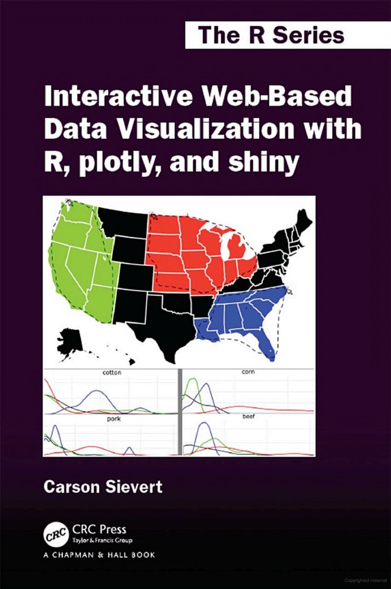
“Interactive Web-Based Data Visualization with R, Plotly, and Shiny” by Carson Sievert
This book provides a thorough guide to creating interactive graphics with Plotly and Shiny in R. Covering everything from basic plots to advanced web applications, it’s an invaluable resource for those looking to build dynamic, data-driven visualizations.
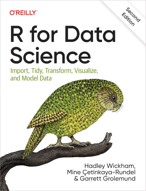
“R for Data Science” by Hadley Wickham and Garrett Grolemund
While not exclusively about Plotly, this book gives an excellent foundation in R, data manipulation, and visualization with ggplot2. Since Plotly works well with ggplot2, mastering the basics of data science in R will enhance your Plotly skills.
“Fundamentals of Data Visualization” by Claus O. Wilke
This book dives deep into data visualization principles, helping you design aesthetically pleasing and effective visualizations. It’s useful for anyone interested in improving the presentation of their Plotly visuals.

“Advanced R” by Hadley Wickham
This book provides an in-depth look at R programming, which can be helpful for building custom visualizations in Plotly. Understanding advanced R will enable you to manipulate data more effectively before visualizing it with Plotly.

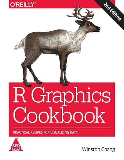
“R Graphics Cookbook” by Winston Chang
This cookbook-style guide covers a range of R visualization techniques, including interactive graphics. It’s an excellent resource for finding solutions to specific visualization challenges, which can often be adapted for use with Plotly.
Plotly in RPlotly’s Official Documentation: The Plotly R Documentation offers comprehensive guides and examples covering all chart types, layout adjustments, and advanced features.
RStudio Community: The RStudio Community provides a wealth of user-generated discussions and solutions for visualizations in R, including Plotly-specific topics.
DataCamp: DataCamp’s Interactive Data Visualization with Plotly in R course is a hands-on course that introduces users to Plotly, covering chart types, customization, and interactivity.
YouTube Tutorials: Channels like Data School and StatQuest have practical Plotly tutorials, showcasing how to create and customize visuals step-by-step.
Plotly and Shiny together can create powerful interactive dashboards. Shiny allows users to input and filter data in real-time, and Plotly’s graphics can react dynamically, providing a seamless user experience. Here’s a quick example:
library(shiny)
library(plotly)
ui <- fluidPage(
titlePanel("Interactive Plotly Chart with Shiny"),
sidebarLayout(
sidebarPanel(
sliderInput("mpgRange", "Select MPG Range:", min(mtcars$mpg), max(mtcars$mpg), value = c(15, 30))
),
mainPanel(
plotlyOutput("scatterPlot")
)
)
)
server <- function(input, output) {
output$scatterPlot <- renderPlotly({
filteredData <- subset(mtcars, mpg >= input$mpgRange[1] & mpg <= input$mpgRange[2])
plot_ly(filteredData, x = ~wt, y = ~mpg, type = "scatter", mode = "markers")
})
}
shinyApp(ui = ui, server = server)This simple app allows users to adjust a slider to filter car data based on miles per gallon (MPG), showcasing how responsive and interactive visualizations can be achieved using Plotly and Shiny together.
Plotly in R is an incredibly powerful tool for creating interactive, elegant, and web-ready visualizations. From basic scatter plots to complex dashboards, Plotly offers extensive customization options that make data exploration both insightful and visually appealing. By using complementary tools like ggplot2 and shiny, you can build sophisticated data narratives that engage your audience.
With the resources, tips, and best practices outlined in this guide, you’re well on your way to mastering Plotly in R. Unlock its full potential to communicate your data with elegance and interactivity.

---
title: "Elegant Approach Towards Plotly Graphics"
subtitle: "Tools, Tips, Books, Resources"
author: "Abhirup Moitra"
date: 2024-11-29
format:
html:
code-fold: true
code-tools: true
editor: visual
categories : [R Programming]
image: wallpaper.jpeg
---
# **Introduction**
Plotly is a versatile library in R that allows users to create stunning interactive visualizations with ease. Known for its flexibility and intuitive syntax, Plotly has become a popular choice for data scientists, analysts, and researchers looking to enhance their data storytelling capabilities. With just a few lines of code, you can turn static visuals into interactive, web-ready graphics that add depth and dynamism to your data.
This article explores an elegant approach to working with Plotly in R, covering essential tools, practical tips, recommended books, and resources for mastering this powerful visualization library. Whether you’re an R novice or an experienced data wrangler, this guide provides a structured pathway to leverage Plotly's full potential.
## **Getting Started with `Plotly` in R**
Plotly is known for its ability to seamlessly integrate with R’s ecosystem, making it ideal for adding interactivity to visualizations originally created in `ggplot2` or other libraries. To get started, install Plotly in R by running:
```{r,warning=FALSE,message=FALSE}
#install.packages("plotly")
library(plotly)
```
Plotly provides both simple methods and advanced features for various chart types—scatter plots, bar charts, histograms, maps, and more.
### **1. Essential Tools and Packages for Plotly Visualization**
To create a smooth workflow, Plotly pairs well with other packages in R. Here are some complementary tools that enhance its capabilities:
- **`ggplot2`**: The `ggplotly()` function converts static `ggplot2` charts into interactive Plotly graphics, combining the best of both worlds—ggplot2’s versatility and Plotly’s interactivity.
```{r}
library(ggplot2)
library(plotly)

p <- ggplot(mtcars, aes(x = wt, y = mpg, color = factor(cyl))) +
    geom_point(size = 3)

ggplotly(p)
```
- **`dplyr`**: Use `dplyr` for data manipulation before visualizing with Plotly. This package simplifies data wrangling, letting you focus on creating clean, organized data visualizations.
- **`shiny`**: For building interactive dashboards, combining Plotly with Shiny allows you to create responsive applications with dynamic visualizations based on user inputs.
- **`htmlwidgets`**: Plotly charts are `htmlwidgets`, which means you can easily embed them in R Markdown documents and Shiny apps or save them as HTML files for sharing.
### **2. Tips for Creating Elegant `Plotly` Visualizations**
Enhancing Plotly graphics involves careful design choices and customization. Here are a few tips to ensure your visuals stand out:
- **Choose Color Schemes Wisely**: Plotly offers built-in color palettes, but you can customize colors to match your theme or branding. The `colorway` argument can be used for setting custom colors in Plotly charts.
- **Add Titles and Annotations**: Clear titles, axis labels, and annotations add context to your visualizations. Use the `layout()` function to adjust these elements.
```{r}
fig <- plot_ly(mtcars, x = ~wt, y = ~mpg,
               type = 'scatter', mode = 'markers') %>%
  layout(title = "Weight vs. MPG",
         xaxis = list(title = "Weight"),
         yaxis = list(title = "Miles Per Gallon"))
```
- **Incorporate Tooltips**: Tooltips are a standout feature in Plotly, displaying detailed information on hover. The `text` argument allows you to add custom tooltips, improving data exploration.
```{r}
plot_ly(mtcars, x = ~wt, y = ~mpg, type = 'scatter', mode = 'markers',
        text = ~paste("Car: ", rownames(mtcars), "<br>Weight: ", wt, "<br>MPG: ", mpg))
```
- **Experiment with 3D Plots and Maps**: Plotly offers advanced plot types such as 3D scatter plots, surface plots, and geographic maps. These add a new dimension to your analysis, especially for complex datasets.
```{r}
plot_ly(mtcars, x = ~wt,
        y = ~mpg,
        z = ~hp, type = "scatter3d", mode = "markers")
```
### **3. Recommended Books on Plotly and Data Visualization**
**"Interactive Web-Based Data Visualization with R, Plotly, and Shiny" by Carson Sievert**\
This book provides a thorough guide to creating interactive graphics with Plotly and Shiny in R. Covering everything from basic plots to advanced web applications, it’s an invaluable resource for those looking to build dynamic, data-driven visualizations.
{fig-align="center" width="249"}
**"R for Data Science" by Hadley Wickham and Garrett Grolemund**\
While not exclusively about Plotly, this book gives an excellent foundation in R, data manipulation, and visualization with `ggplot2`. Since Plotly works well with `ggplot2`, mastering the basics of data science in R will enhance your Plotly skills.
{fig-align="center" width="254"}
**"Fundamentals of Data Visualization" by Claus O. Wilke**\
This book dives deep into data visualization principles, helping you design aesthetically pleasing and effective visualizations. It’s useful for anyone interested in improving the presentation of their Plotly visuals.
{fig-align="center" width="288"}
**"Advanced R" by Hadley Wickham**\
This book provides an in-depth look at R programming, which can be helpful for building custom visualizations in Plotly. Understanding advanced R will enable you to manipulate data more effectively before visualizing it with Plotly.
{fig-align="center" width="236"}
**"R Graphics Cookbook" by Winston Chang**\
This cookbook-style guide covers a range of R visualization techniques, including interactive graphics. It’s an excellent resource for finding solutions to specific visualization challenges, which can often be adapted for use with Plotly.
{fig-align="center" width="246"}
### **4. Online Resources and Tutorials for `Plotly` in R**
- **Plotly’s Official Documentation**: The [Plotly R Documentation](https://plotly.com/r/) offers comprehensive guides and examples covering all chart types, layout adjustments, and advanced features.
- **RStudio Community**: The RStudio Community provides a wealth of user-generated discussions and solutions for visualizations in R, including Plotly-specific topics.
- **DataCamp**: DataCamp’s [Interactive Data Visualization with Plotly in R](https://www.datacamp.com/) course is a hands-on course that introduces users to Plotly, covering chart types, customization, and interactivity.
- **YouTube Tutorials**: Channels like Data School and StatQuest have practical Plotly tutorials, showcasing how to create and customize visuals step-by-step.
### **5. Combining Plotly with Shiny for Interactive Dashboards**
Plotly and Shiny together can create powerful interactive dashboards. Shiny allows users to input and filter data in real-time, and Plotly’s graphics can react dynamically, providing a seamless user experience. Here’s a quick example:
``` r
library(shiny)
library(plotly)

ui <- fluidPage(
  titlePanel("Interactive Plotly Chart with Shiny"),
  sidebarLayout(
    sidebarPanel(
      sliderInput("mpgRange", "Select MPG Range:", min(mtcars$mpg), max(mtcars$mpg), value = c(15, 30))
    ),
    mainPanel(
      plotlyOutput("scatterPlot")
    )
  )
)

server <- function(input, output) {
  output$scatterPlot <- renderPlotly({
    filteredData <- subset(mtcars, mpg >= input$mpgRange[1] & mpg <= input$mpgRange[2])
    plot_ly(filteredData, x = ~wt, y = ~mpg, type = "scatter", mode = "markers")
  })
}

shinyApp(ui = ui, server = server)
```
This simple app allows users to adjust a slider to filter car data based on miles per gallon (MPG), showcasing how responsive and interactive visualizations can be achieved using Plotly and Shiny together.
# **Conclusion**
Plotly in R is an incredibly powerful tool for creating interactive, elegant, and web-ready visualizations. From basic scatter plots to complex dashboards, Plotly offers extensive customization options that make data exploration both insightful and visually appealing. By using complementary tools like `ggplot2` and `shiny`, you can build sophisticated data narratives that engage your audience.
With the resources, tips, and best practices outlined in this guide, you’re well on your way to mastering Plotly in R. Unlock its full potential to communicate your data with elegance and interactivity.
# Further Readings
- [**Plotly R Open Source Graphing Library**](https://plotly.com/r/)
- [**Interactive charts R-Graph Gallery**](https://r-graph-gallery.com/plotly.html)
{fig-align="center" width="414"}